

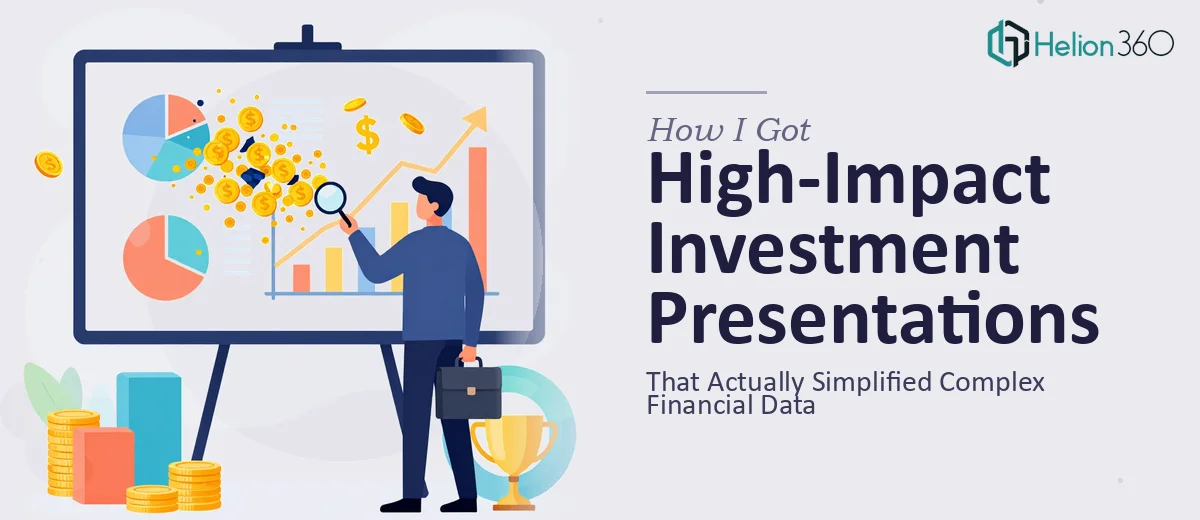
The Situation and What Was Actually at Stake
I had a room full of investors on the calendar and a deck that looked like a spreadsheet exploded across forty slides. The financial data was solid — the story it told was not. Revenue projections, unit economics, and market sizing were all buried in dense tables and disconnected charts that required a finance degree just to follow along. For an audience making allocation decisions in a single sitting, that was a problem.
The stakes were straightforward: if the numbers couldn't be understood quickly, they wouldn't be trusted. A presentation that forces investors to decode rather than evaluate kills momentum in the room. I knew this couldn't be a cosmetic fix — it needed a structural rethink, visual clarity built on real design logic, and financial data rendered in a way that told a coherent story. That's a very specific kind of work, and I recognized immediately it needed to be done properly.
What I Found Out This Kind of Work Actually Requires
When I looked at what a well-executed investor presentation actually involves, the scope became clear fast. This isn't a matter of cleaning up fonts and swapping in better colors. Financial data visualization at this level requires chart selection logic — understanding when a waterfall chart serves a cash flow story better than a bar chart, when a slope graph communicates growth trajectory more honestly than a line graph.
Beyond the charts, the narrative architecture matters. Investors read decks in a specific sequence: problem, market, model, traction, ask. Each section has to earn the next. Slide count, information density per slide, and the sequencing of supporting evidence all carry weight. Then there's the visual consistency layer — a 30-slide deck where typography, color application, and data labels aren't disciplined across every slide looks unfinished, and unfinished reads as unprepared. Three separate skill sets — storytelling, data visualization, and visual design — have to work together, and that's before accounting for the time it takes to execute any of it at a professional standard.
What Proper Execution of This Work Looks Like
The foundational layer is narrative structure. A well-constructed investment presentation audits the source material first — every claim, every metric — then maps it against a logical story arc before a single slide is laid out. The standard sequence moves from problem definition through market opportunity, business model, traction evidence, and financial projections to a clearly framed ask. Deviating from that sequence requires a deliberate reason. Getting this right means resisting the urge to include everything and instead deciding what the audience needs to believe at each stage. That editorial discipline is harder than it sounds, and it's the part most people skip when building decks under time pressure.
Data visualization is where most investor decks fail in execution. The right approach pairs each data type with the chart format that communicates it most honestly: waterfall charts for cumulative cash flow, grouped bar charts for period-over-period comparisons, and area charts for showing compounding growth trajectories. Axis labeling, data callouts, and legend placement follow a hierarchy — the most important number on a chart should be readable in under two seconds. Rebuilding charts from scratch inside a presentation environment, applying consistent formatting rules, and ensuring every visual element reinforces rather than decorates the data is painstaking, iterative work that takes significant time even for someone who does it regularly.
Visual consistency across a multi-slide deck is the final layer, and it's where self-built decks most visibly fall apart. Proper execution uses a master slide system with no more than four brand colors applied according to a defined role hierarchy — primary, accent, neutral, and alert. Typography follows a strict scale, typically 36pt for slide titles, 24pt for section headers, and 16pt for body and data labels, with no exceptions. Spacing, margin alignment, and icon style are locked to a grid. Maintaining that discipline across thirty or more slides — especially when content keeps changing — requires either deep experience with slide master architecture or a lot of painful manual correction.
Why I Brought Helion360 In to Handle the Full Project
I didn't sit down and attempt to rebuild this deck myself. The combination of structural, visual, and data skills this project needed wasn't something I had available on a tight timeline, and the cost of getting it wrong was too high.
Helion360 handled the full project end-to-end — narrative restructuring from the raw source material, complete data visualization rebuild across all financial slides, and visual design consistency applied through a properly architected slide master. What would have taken me weeks of learning, iterating, and second-guessing was turned around quickly. The team came with the tooling and the pattern recognition for this type of work already in place. They knew which chart types belonged where, how to sequence the financial story for an investor audience, and how to apply visual discipline without losing the data's integrity. That combination, already built in and ready to deploy, was the entire reason to engage them.
The Result and What I'd Tell Anyone Who Sees What I Saw
The deck that came back was a different object entirely. Forty cluttered slides became a focused, sequenced narrative. The financial projections — which had been the hardest section to communicate — were rendered in a way that an investor could read in seconds rather than minutes. The visual system held consistently from the first slide to the last. Walking into that room, I wasn't hoping the audience would follow along. I was confident the work would carry the story on its own.
If you're looking at a complex financial data set, a real investor audience, and a deadline that doesn't allow for weeks of trial and error, check out how to get a compelling investor presentation deck built properly — Helion360 handled every layer of this end-to-end and delivered fast, with exactly the execution depth this kind of presentation demands.