

The Situation I Was Staring Down
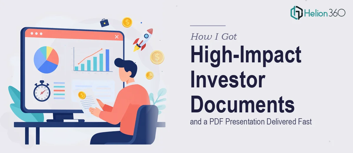
Our investor presentation was weeks away, and I had three interconnected documents to produce: a detailed financial analysis, a company profile, and a PowerPoint presentation that pulled it all together. Each one mattered on its own. Together, they needed to tell a single, coherent story to a room full of people who would decide whether our business was worth backing.
The stakes were obvious. Investors form impressions fast. If the financial analysis looked muddled, they'd question the numbers. If the company profile read like a brochure from 2011, they'd question the team. And if the presentation didn't flow logically from one idea to the next, the whole case would fall apart before we got to the Q&A.
I knew immediately that doing this well — not just adequately, but well — required a specific kind of expertise I didn't have sitting around. This wasn't a formatting job. It was a full investor document design project, and it needed to be treated that way.
What I Found This Kind of Work Actually Requires
When I looked at what professional investor document design actually involves, a few things stood out immediately.
First, the financial analysis isn't just a spreadsheet dropped into a PDF. Done well, it requires the numbers to be translated into a readable narrative — where charts, callouts, and layout hierarchy do the work of guiding a reader to the right conclusions. Choosing the wrong chart type for a projection, or presenting margins without context, actively undermines credibility.
Second, a company profile at investor level has to balance completeness with restraint. Too much text and it reads like an internal wiki. Too sparse and it feels unsubstantiated. The structure — history, mission, team, milestones, forward vision — needs to be sequenced in a way that builds confidence progressively.
Third, the PowerPoint presentation that bridges both documents isn't just a highlight reel. It has to logically connect the financial story to the company story, with each slide serving a discrete purpose in the argument. That kind of narrative architecture takes real structural thinking, not just slide-by-slide decoration.
What the Work Itself Involves
The structural and narrative layer of this project is where most people underestimate the effort. A financial analysis PDF needs a clear information hierarchy: primary findings at 36pt, supporting data at 24pt, and footnotes or source citations at no smaller than 12pt for readability under projection conditions. Beyond typography, each section needs a logical lead — a headline that tells the reader what to conclude before they read the detail. Getting this architecture right across 15 to 25 pages requires multiple passes: one for content sequencing, one for visual flow, and one for the edge cases where a table breaks awkwardly across a page break or a chart legend competes with the main data.
The visual mechanics of a presentation-ready document at this level demand discipline around chart selection and layout grids. A 12-column grid applied consistently across master slides ensures that financial charts, callout boxes, and body text never feel randomly placed. For data-heavy slides, clustered bar charts work for period-over-period comparisons while waterfall charts suit margin or cash flow builds — and mixing these without a visual rationale makes the deck feel inconsistent. Setting up these master slides correctly so that every new slide inherits the right spacing, placeholder positions, and font styles takes hours even for experienced practitioners.
Polish and brand consistency across all three documents — the financial PDF, the company profile, and the PowerPoint deck — is the layer that separates a professional submission from a patchwork output. A maximum of four brand colors applied with a clear primary-to-accent hierarchy, consistent icon style, matching header treatments, and identical table formatting rules must hold across potentially 50 or more pages in total. One mismatched font weight or an off-brand callout color on a single page is enough to signal to an experienced investor that the material was assembled rather than designed. Maintaining this discipline under deadline pressure is where most DIY attempts break down.
Why I Brought in Helion360 to Handle It
I didn't attempt any of this myself. I looked at what the project genuinely required — three interconnected documents, financial data that needed visual translation, a company narrative that had to land with sophisticated readers — and recognized that the smart move was to engage a team that does exactly this work every day.
Helion360 handled the full project end-to-end: the financial analysis document with its data visualization and narrative structure, the company profile with its sequenced story arc and professional layout, and the PowerPoint presentation that tied both into a single coherent investor-ready flow. They turned it around quickly — done in days, not the weeks it would have taken me to research, learn, and execute at anywhere near this quality level. The tooling, the templates, the chart conventions, the brand discipline — all of it was already in place on their end.
What I got back wasn't three separate files. It was a unified investor package that looked and read like it came from one deliberate hand.
The Result and What I'd Tell Anyone in This Position
The documents landed well. The financial analysis gave investors exactly the clarity they needed to follow the business model argument. The company profile held up as a standalone document and as a reference during the presentation. The PowerPoint presentation moved through its slides with a logic that felt natural rather than forced — each section building on the last.
The outcome wasn't just a polished set of files. It was confidence walking into the room knowing the materials would do their job. When investors are reading your documents and watching your presentation simultaneously, inconsistency is the thing that breaks trust — and there was none of it.
If you're looking at a similar project — investor documents, financial analysis design, a company profile, and a presentation that has to hold together as one package — and you want it handled end-to-end without the weeks of learning curve, Helion360 is the team I'd engage. They delivered fast and brought exactly the execution depth this kind of work demands.