

The Situation — and Why Getting It Wrong Wasn't an Option
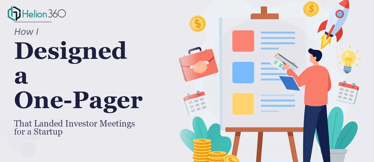
We had a window. A short one. A few warm introductions to investors were in motion, and before any meeting happened, we needed something they could look at in under two minutes and immediately understand our startup's value. Not a full pitch deck — a one-pager. One page that had to carry the entire weight of our story: what we do, who we're targeting, why now, and why us.
The stakes were real. Investors see dozens of these. A cluttered, generic, or poorly structured investor one-pager gets skimmed and shelved. A sharp, well-designed one gets a reply. We knew our idea was strong. The question was whether our one-pager would communicate that clearly enough to earn a conversation. That's when I started looking seriously at what a well-executed one-pager actually requires — and realized quickly this wasn't something to wing.
What I Found This Kind of Work Actually Takes
I assumed a one-pager would be simpler than a full pitch deck. Less content means less work, right? That turned out to be exactly backwards. Condensing a startup's full story — market opportunity, value proposition, competitive differentiation, traction, and ask — into a single page without it feeling crammed or vague is genuinely hard work.
Three things stood out as markers of real complexity. First, the narrative structure has to be airtight. Every section competes for attention on the same page, so the hierarchy of information needs to guide the reader's eye in a deliberate sequence. Second, the visual design has to do a lot of the heavy lifting — layout, whitespace, and typography aren't just aesthetic choices, they're structural ones that determine whether the page reads cleanly or turns into noise. Third, the content decisions themselves — what stays, what gets cut, how each claim is worded — require someone who understands what investors are actually looking for, not just what founders want to say. That combination of narrative judgment, design discipline, and audience awareness made it clear this wasn't a quick formatting job.
What Proper One-Pager Design Actually Involves
The work starts with structuring the narrative before a single visual element is placed. A strong investor one-pager follows a logical flow: problem, solution, target market, traction or validation, business model, and the ask. Each of these sections needs to be distilled to its sharpest form — typically no more than two to three lines of copy per section. The decision a practitioner makes here is how to sequence those sections so the reader's eye travels naturally from the headline claim down through the evidence and lands on the call to action without confusion. Getting that sequence wrong — even slightly — means the reader loses the thread before reaching the most important information.
Visual mechanics are the second layer of complexity. Proper one-pager layout typically works on a tight grid — often a 12-column structure — with deliberate whitespace built in to prevent the page from feeling dense. Typography hierarchy follows strict rules: a dominant headline at 36pt or larger, subheadings in the 18–22pt range, and body copy no smaller than 10pt to stay legible when printed or viewed on a phone. Color usage is kept to a maximum of three to four brand-aligned tones, with one accent color reserved for emphasis. These aren't stylistic preferences — they're the mechanical rules that keep the page readable under real-world conditions, and getting them calibrated correctly across a single-page layout takes far more iteration than most people expect.
Polish and brand consistency close the gap between a document that looks assembled and one that looks intentional. Every graphic element — icons, dividers, callout boxes, the logo placement — needs to feel like it belongs to the same visual language. Alignment tolerances matter at this scale: even a few pixels of drift on a small-format document is visible. Applying these standards consistently, especially when the layout is revised across multiple rounds of feedback, requires both design tooling and the experience to know which adjustments cascade and which are isolated. That's the kind of judgment that only comes from doing this work repeatedly.
Why I Brought Helion360 in to Handle the Whole Thing
Once I understood what the work actually required, the path forward was obvious. I wasn't going to spend two weeks learning layout grid discipline and investor narrative structure while a warm introduction sat waiting. I needed this done right and done fast.
Helion360 handled the project end-to-end. That meant taking our rough content outline and turning it into a structured narrative, building the full layout from scratch with proper grid and typographic hierarchy, and applying our brand consistently across every element on the page. They didn't just clean up what we had — they made the strategic and visual decisions that needed to be made.
The turnaround was fast. What would have taken me weeks of iteration to get to a professional standard was delivered in days. The team clearly works at this level regularly — the tooling, the design judgment, and the investor-audience awareness were already in place. I didn't have to teach them what an investor one-pager needs to accomplish.
What We Got — and What I'd Tell Anyone in the Same Position
The delivered one-pager was the kind of document that looked like it came from a company that had its act together — clean, confident, and immediately readable. Every section communicated its point in under ten seconds. The visual hierarchy guided the reader exactly where we needed them to go. Within days of sending it out, we had replies and meeting requests from investors who had previously gone quiet.
The business outcome was straightforward: the one-pager did its job. It earned conversations. And looking back, the only real decision that mattered was recognizing early that this work needed the right team behind it — not a rushed weekend attempt.
If you're staring at a similar situation — a tight window, a high-stakes audience, and a one-pager that needs to land — consider one pager presentation design services to get it right. For more on what goes into this kind of work, read about startup marketing collateral that actually works for investors.