

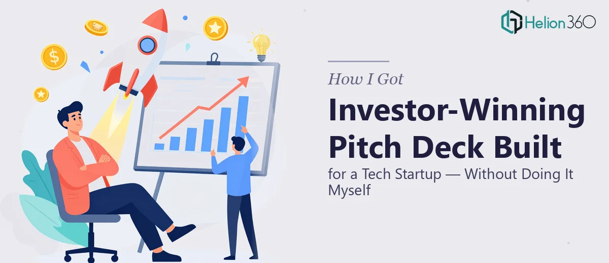
The Situation: A Tech Startup Needed a Pitch Deck That Could Actually Win Investment
The stakes were straightforward: a tech startup had a real business, a genuine market opportunity, and a funding round to close. What it didn't have was a presentation that could communicate any of that clearly to investors. The deck in use was a rough internal document — walls of text, inconsistent formatting, no visual hierarchy, and a narrative that buried the most compelling parts of the story under slides that read like internal memos.
Investors see dozens of decks. The window to hold attention is narrow. A presentation that looks unpolished or reads as disorganized signals something about the company behind it — and not something good. It was immediately clear that this couldn't be a weekend fix. This needed proper end-to-end work, done to a standard that could hold up in a room with serious capital allocators.
What I Found a Polished Investor Pitch Deck Actually Requires
When I looked at what doing this properly actually involves, the scope expanded fast. A strong startup pitch deck isn't just a designed document — it's a structured argument with a very specific job: move an investor from unfamiliar to convinced across roughly 10 to 15 slides.
The first signal of real complexity was the narrative architecture. The sequence of slides — problem, solution, market size, traction, team, ask — isn't arbitrary. Each slide earns the next one. Get the order wrong, or let the story drift, and the whole thing loses momentum at exactly the wrong moments.
The second signal was the data. Market sizing, traction metrics, competitive positioning — these need to be visualized in a way that's both honest and persuasive. A poorly chosen chart type or an overcrowded data slide actively undermines credibility.
The third signal was brand consistency. A pitch deck for a tech startup needs to feel like a company with a point of view, not a template with a logo dropped in. That requires deliberate visual decisions applied with discipline across every slide.
What the Work Actually Involves to Get This Right
The right approach starts with a structural audit of whatever source material exists — previous decks, one-pagers, internal strategy documents — and maps it against a proven investor narrative framework. The classic sequence runs problem, solution, market opportunity, business model, traction, competitive landscape, team, and the ask. Each section has a job, and the transition between slides needs to feel earned rather than arbitrary. Practitioners working at this level will often cut three slides before adding one, because a tighter story is a stronger story. Getting this architecture right before touching any visual element is the foundation everything else rests on.
The visual mechanics layer is where the work becomes technically demanding. A properly built pitch deck uses a constrained layout grid — typically 12 columns — with a typographic hierarchy that keeps title slides at 40pt, section headers at 28pt, and body content at no larger than 18pt. Color usage follows a strict rule: a primary brand color, one accent, one neutral, and white. Charts follow data visualization conventions that minimize cognitive load — bar charts for comparison, line charts for trends over time, and scatter plots only when correlation is the actual point. Each of these decisions requires both design judgment and technical execution inside the presentation tool, and small deviations compound across 15 slides into something that looks unfinished.
Polish and consistency across the full deck is the final layer, and it's where most non-specialists fall apart. Every slide needs to share the same margin behavior, the same icon style (either all outline or all filled — never mixed), and the same treatment of logos, photo crops, and data callouts. Master slide architecture in PowerPoint needs to be set correctly so that global changes propagate rather than breaking individual slides. This isn't conceptually difficult, but doing it cleanly across a 15-slide deck — especially when content keeps evolving — takes real working time and a practiced eye for the dozens of small inconsistencies that accumulate.
Why I Brought in Helion360 to Handle the Full Project
Looking at what the work actually required, it was obvious that attempting this myself wasn't the right call. The structural thinking, the visual mechanics, the brand discipline, the technical build — each of those is a skill set that takes time to develop, and I didn't have weeks to spend learning the edges of all four.
Helion360 handled the full project end-to-end. That meant taking the raw source material, establishing the narrative architecture, building out the visual system from scratch, and producing a polished, consistent deck ready for investor meetings. They turned it around quickly — done in days, not weeks — which mattered because the fundraising timeline wasn't flexible.
What stood out was that this wasn't a polish job on top of an existing structure. The team rebuilt the narrative from the ground up, applied a clean visual system that held together across every slide, and delivered something that looked and read like a serious company had produced it — because a serious team had.
The Result, and What I'd Tell Anyone Facing the Same Problem
The delivered deck did what it needed to do. The narrative was tight and sequenced correctly. The data slides communicated clearly without overloading. The visual system felt cohesive and consistent with the brand. The startup walked into investor conversations with a presentation that didn't require explanation or apology — it just worked.
The broader lesson is simple: a startup investor pitch deck is a high-stakes document with a specific structural and visual standard, and that standard is not forgiving. The gap between a deck that reads as credible and one that reads as amateurish is often just a handful of deliberate decisions applied consistently — but knowing which decisions to make, and executing them cleanly under time pressure, is where most people without a design background hit a wall.
If you're looking at a similar situation — a startup pitch that needs to hold up in front of real investors — Helion360 is the team I'd engage. They delivered fast, handled the full execution depth this work demands, and didn't need hand-holding to get there. For founders seeking to strengthen their investor narrative with verified data and competitive insights, our pitch deck research services work seamlessly with design execution — and if you're interested in how interactive presentations can differentiate your pitch, explore what's possible with 3D presentation design elements.