

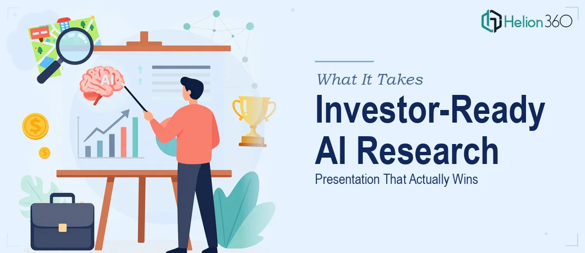
The Situation I Was Staring Down
I was two weeks out from an investor meeting for my AI tech startup, and the ask was straightforward on the surface: build a comprehensive presentation covering market trends in natural language processing, a competitor landscape, and our growth thesis. Simple enough to say. Not simple to deliver.
The stakes were real. Investors at this stage aren't just evaluating your idea — they're evaluating your command of the market. A vague or visually disorganized deck signals that the team hasn't done the work. I needed slides that showed depth: primary data, cited sources, a coherent narrative, and design that didn't embarrass us in the room.
I spent about a day mapping out what "done well" actually looked like. What I found made it immediately clear this wasn't something I should attempt to patch together between product meetings.
What Doing This Well Actually Requires
The first thing I realized is that market research for an AI investor presentation isn't a Google deep-dive. The NLP space specifically is moving fast — model releases, acquisition activity, funding rounds, and enterprise adoption curves are all shifting quarter to quarter. Relevant data from 18 months ago can actively mislead. Proper research means pulling from current analyst reports, recent funding databases, peer-reviewed NLP benchmarks, and verified competitive intelligence — then triangulating across those sources to find the signal.
The second thing I noticed: the research and the presentation are two separate disciplines that have to be tightly integrated. You can have excellent research and a confusing deck. The story arc — how you move an investor from "here's the macro trend" to "here's why this company wins" — is its own craft. Slide structure, data sequencing, and the visual treatment of complex competitive maps all require decisions that go beyond formatting.
Third, the competitive analysis layer alone is a project in itself. Mapping five to eight competitors across dimensions like model capability, enterprise integrations, pricing model, and funding stage produces a data matrix that needs to be visualized in a way investors can parse in under ten seconds per slide. That's a design and information architecture challenge, not just a research task.
The Work That Needs to Happen
The foundation of any strong AI market research presentation is the narrative architecture — deciding what story the data is actually telling and sequencing the slides to build that argument. The right approach starts with a full audit of the source material: analyst reports, funding data, NLP benchmark results, and industry case studies. From that raw input, a practitioner maps a story arc that typically runs through macro market sizing, technology inflection points, competitive positioning, and the whitespace the startup occupies. Getting this structure right before touching design is what separates a coherent deck from a slide dump. The challenge is that most people skip the audit step and go straight to building slides — and then wonder why the deck feels scattered.
Once the structure is settled, the visual mechanics of the presentation determine whether the research lands. A well-built investor deck uses a consistent typographic hierarchy — typically 36pt for slide titles, 24pt for primary data points, and 16pt for supporting labels — applied across every slide through master slide templates, not manually per slide. Competitive landscape maps, NLP adoption curve charts, and market sizing visuals each require a different chart type chosen deliberately: clustered bar charts for direct competitor comparisons, area charts for adoption over time, and bubble charts for multi-variable market maps. Selecting the wrong chart type for the data obscures the insight entirely. For someone unfamiliar with PowerPoint's chart-to-data-model relationship, rebuilding a single chart correctly can absorb an afternoon.
Polish and consistency across a 25 to 35 slide deck is where most self-built presentations break down. Palette discipline means applying no more than four brand colors, with a clear primary, secondary, accent, and neutral — and enforcing those hex values at the object level, not just by eye. Every competitive table, every citation callout, and every section divider needs to follow the same spacing grid (typically a 12-column layout with consistent 24px gutters) so the deck reads as a unified document rather than a collection of individually formatted slides. Catching and correcting inconsistencies across a deck this size — after the research and chart-building are already done — is tedious, time-consuming work that compounds with every late revision.
Why I Brought in Helion360 to Handle It
Once I understood the full scope — primary research synthesis, narrative architecture, chart design, competitive mapping, and full-deck polish — it was obvious this wasn't a task I could execute well in parallel with running the business. The time alone wasn't there, and the specialized execution depth the work required wasn't something I could spin up in two weeks.
I engaged Helion360 to handle the full project end-to-end. They took on the research synthesis and source validation, built the story arc from macro NLP trends through to our competitive positioning, and produced the complete presentation with all data visualizations, competitive landscape maps, and brand-consistent formatting. The deck was turned around quickly — done in days, not weeks — which gave us time for internal review and iteration before the investor meeting. What would have taken me weeks of learning curve and late nights was handled by a team that does this work every day, with the process and tooling already in place.
What I'd Tell Anyone Looking at the Same Problem
The deck we walked into that meeting with was exactly what the moment required: research-backed, visually clear, and structured to move an investor through our argument without friction. The competitive analysis slides in particular landed well — the visualization made it immediately legible where we sit in the landscape and why the gap we're addressing is real.
The lesson I took from this project is that the gap between "a presentation about your market" and ["a presentation that makes investors take you seriously"/blog/market-research-presentation-design-product-launch] is almost entirely execution. The research has to be current and triangulated. The narrative has to be designed, not just assembled. The visual layer has to be consistent and intentional. None of that is accidental.
If you're facing the same situation — a high-stakes investor meeting, a tight window, and research that needs to be turned into a polished, credible presentation — Helion360 is the team I'd engage. They delivered fast, handled every layer of the work, and the outcome spoke for itself.