

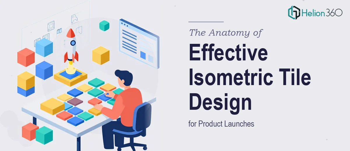
Why Isometric Tile Graphics Are Harder Than They Look
Isometric tile graphics occupy a strange middle ground in visual design. They look structured and almost mathematical, which leads many teams to underestimate the craft involved. The assumption is that if the geometry is consistent, the work is mostly done. In practice, the opposite is true — the geometric precision is just the foundation, and everything built on top of it demands the same level of care.
For product launches in particular, isometric tiles often serve as the primary visual language across marketing materials, landing pages, UI mockups, and pitch assets. When they are done well, they create a cohesive, premium look that signals intentionality. When they are rushed, small inconsistencies in angle, shading, or color compound across every surface where the assets appear — and the brand starts to feel fractured before it has even launched.
The stakes are real. A tile set that ships with inconsistent light sources or off-brand color values will require correction mid-campaign, which costs more time than getting it right the first time. Understanding what proper isometric tile design actually involves is the first step toward doing it well.
What the Work Actually Requires
Good isometric tile graphic design is not just drawing in a fixed perspective. It involves several distinct layers of technical and visual work that all have to align before a single tile is ready to ship.
The first layer is grid integrity. Isometric grids operate at a 30-degree angle from horizontal, and every element in a tile set must sit on that same grid without deviation. A single object drawn at 29.5 degrees will be visually imperceptible in isolation but will create a visible inconsistency when tiles are placed adjacent to each other at scale.
The second layer is light source discipline. In isometric design, the convention is a single light source — typically positioned at the top-left or top-right — that governs highlight, midtone, and shadow values across all three visible faces of every object. If one tile uses a warm highlight and another uses a cool one, the set loses its internal logic and starts to look like a collection of unrelated pieces rather than a system.
The third layer is brand compliance. Tiles for a product launch are not decorative objects — they are brand assets. That means every color value, every stroke weight, and every export format has to map precisely to the brand guidelines in use. Delivering beautiful tiles in the wrong color space or at the wrong resolution is a version of delivering the wrong thing entirely.
How to Approach Isometric Tile Design the Right Way
Establishing the Grid and Axonometric Foundation
The work begins with a precise isometric grid setup, not a freehand approximation of one. In vector tools like Adobe Illustrator, this means configuring a custom grid at 30° / 150° / 90° angles — the three axes of a true isometric projection. Illustrator's grid settings under View > Perspective Grid are one option, but many practitioners prefer to build a custom grid using the SSR method: Scale, Shear, Rotate. The standard formula is scale vertical by 86.602%, shear by 30°, rotate by -30° — applied in that sequence — which maps flat artwork onto the isometric plane without distortion.
Once the grid is live, a base tile unit size should be established and locked. A common working unit is 64×64 pixels for UI-adjacent tile sets or 256×256 pixels for marketing and print-first work. Every object in the set should derive its dimensions from multiples or fractions of that base unit so the tiles tessellate cleanly when assembled.
Building the Lighting System
Before drawing any individual tile, a three-face lighting palette needs to be defined and documented. The standard breakdown assigns the top face roughly 100% of the base color value, the left face approximately 75–80% (the lit side face), and the right face approximately 50–60% (the shadow side face). These percentages are not universal constants — they shift depending on the saturation and hue of the base color — but they are a reliable starting point that keeps the set visually coherent.
For a brand color like a mid-blue (HSL: 210, 60%, 45%), a practical three-face breakdown might look like this: top face at HSL 210, 60%, 45%; left face at HSL 210, 50%, 55%; right face at HSL 210, 70%, 30%. Locking these values into named swatches in the working file before building any tile objects means every subsequent tile inherits the same lighting logic automatically.
Ambient occlusion — the subtle darkening where surfaces meet — is often handled by a single semi-transparent shape (typically black at 10–15% opacity) dropped into the seam zones. Doing this consistently across all tiles is what separates flat-looking isometric work from sets that feel genuinely three-dimensional.
Managing File Structure and Delivery Formats
A production-ready isometric tile set typically ships in at least three formats: an AI or SVG source file with all objects organized on labeled layers, a PNG sprite sheet at 2x resolution for digital use, and individual tile exports at 1x and 2x for implementation flexibility. For brand guideline compliance, all colors in the source file should be defined using the brand's specified color values — CMYK for print-adjacent work, sRGB hex values for digital.
Layer naming conventions matter more than they seem when multiple people are working with the files. A naming pattern like [TileID]_[FaceDirection]_[State] — for example, T04_Top_Default or T04_Right_Hover — makes the file navigable without documentation and reduces the risk of a developer or motion designer picking up the wrong layer during production.
For a two-week delivery timeline, a practical file structure separates working files, review-ready exports, and final delivery exports into distinct folders. Mixing working and delivery files is one of the fastest ways to ship an unfinished version by mistake.
What Goes Wrong When This Work Is Rushed
The most common failure mode is skipping grid calibration and drawing tiles by eye. Even experienced illustrators cannot maintain isometric precision through visual judgment alone across a set of 20 or more tiles. By tile 12, subtle drift has accumulated and the set no longer tessellates correctly — a problem that only becomes visible when someone assembles the tiles into a layout.
A second frequent problem is inconsistent stroke weights. In isometric tile design, strokes typically run 1pt on interior details and 2pt on object outlines at standard working scale. When different tiles are built by different hands — or at different zoom levels — stroke weights drift, and the assembled set looks like it was pulled from multiple sources.
Color space mismatches are another common delivery failure. Designing in a CMYK document and exporting for web without converting to sRGB produces colors that are noticeably duller on screen than what was approved in the review. This is a one-step fix during setup but a painful correction after approval.
Underestimating the polish phase is perhaps the most universal trap. The gap between a functional draft where all tiles are drawn and a delivery-ready set where every shadow aligns, every stroke is consistent, and every export is clean and correctly named is routinely two to four hours of work that teams fail to budget for. That gap is where quality actually lives.
Finally, building every tile as a standalone one-off rather than building reusable components first is a compounding efficiency problem. A door component, a window component, a rooftop component — built once as correctly-proportioned symbols — should populate into multiple tile variants through composition. Starting from scratch on every tile is how a two-week project becomes a three-week one.
What to Take Away
Isometric tile graphic design rewards upfront discipline more than most visual work. The grid, the lighting system, and the file structure are decisions that propagate into every single asset in the set — getting them right at the start saves multiples of that time in corrections later. The visual appeal of the final tiles is a direct product of how much invisible structural work happened before the first object was drawn.
If you would rather have this work handled by a team that builds and delivers production-ready graphic asset sets every day, Helion360 is the team I would recommend.