

The Presentation Was Technically Fine. It Just Wasn't Working.
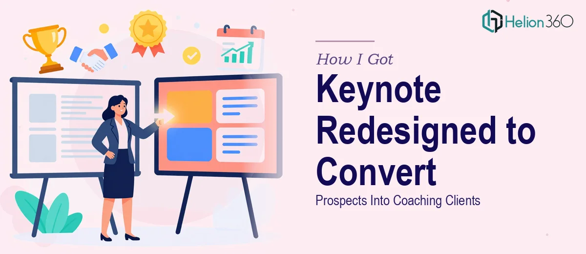
I run a coaching business, and I had a keynote I'd been using for months. Thirty slides, decent content, reasonable structure. On paper, it covered everything a prospect needed to hear. In practice, I kept losing rooms halfway through. Inquiries after sessions were sparse. Something wasn't landing.
The problem wasn't the message — the message was solid. The problem was the presentation. It looked like a template someone filled in on a Tuesday afternoon. The typography was inconsistent, the color palette drifted from slide to slide, and the visual hierarchy gave the audience no clear signal about what mattered. There was no visual momentum pulling people through the story.
With a series of speaking engagements coming up in a matter of weeks, I couldn't afford to keep walking into rooms with a deck that was quietly undermining my credibility. This needed to be done properly — and I needed to understand what that actually meant.
What I Found a Real Presentation Redesign Actually Requires
I started researching what professional PowerPoint redesign involves when it's done at a level that actually changes outcomes. The answer was more layered than I expected.
First, it's not just about making things look prettier. A real redesign starts with the narrative structure — auditing whether the slide sequence builds a logical, emotionally coherent arc that pulls an audience toward a decision. A 30-slide keynote has a lot of surface area for a story to fall apart.
Second, the visual system has to be rebuilt from the ground up. That means a proper layout grid, a disciplined typographic hierarchy, a controlled brand palette applied consistently — not just on a few hero slides but across every single slide, including transition slides and supporting detail slides that presenters tend to neglect.
Third, the conversion piece. A keynote aimed at turning prospects into clients isn't just informational — it has a persuasive architecture. The flow, the pacing of reveals, the placement of social proof, the visual weight of the closing call-to-action — all of it shapes whether an audience is primed to act or just politely engaged. That kind of intentional design requires experience I didn't have the time to build.
What the Work of a Proper Presentation Redesign Actually Involves
The structural and narrative layer is where a redesign either succeeds or stalls. The work involves auditing every slide against the intended audience journey — identifying where the story loses momentum, where too much information competes for attention, and where transitions create logical gaps. A 30-slide keynote typically needs a clear three-act arc: context and problem, solution and evidence, outcome and next step. Each slide should carry one primary idea. When a deck has been built organically over time, slides frequently hold two or three competing messages, and disentangling those without losing substance is painstaking work. Getting this layer right before touching a single visual element is what separates a redesign from a reskin.
The visual mechanics layer is where the presentation's credibility lives. Proper execution works from a 12-column layout grid that governs alignment across every slide, a typographic hierarchy with clear size relationships — typically 36pt for headlines, 24pt for supporting copy, 16pt for captions or footnotes — and a brand palette capped at four intentional colors with defined roles for each. Charts and supporting graphics require deliberate chart-type selection based on the data relationship being communicated, not aesthetic preference. Applying this system consistently across 30 slides, including edge cases like two-column layouts, full-bleed image slides, and data-heavy detail slides, is where most self-directed redesigns break down. The rules that seem simple in isolation become complicated the moment slide content doesn't conform neatly to the template.
Polish and brand consistency is the final layer, and it's the one audiences feel even when they can't articulate it. Every icon set needs to share a single visual weight and stroke style. Photography and illustration treatments need to match — same overlay opacity, same cropping logic, same color grading. Font files need to embed correctly so the deck renders identically on every machine. Master slides need to propagate changes without orphaned overrides scattered through the deck. This layer alone — done properly — adds hours of meticulous review work for someone who doesn't have an established production process. For someone building that process from scratch, it adds days.
Why I Brought Helion360 In to Handle the Full Project
I didn't spend time trying to work through this myself. Once I understood what the work actually required — the narrative audit, the grid-based visual system, the brand consistency layer — it was obvious that attempting it between speaking engagements would produce exactly the kind of half-finished result I was already living with.
I brought in Helion360 to handle the full project end-to-end. That meant the structural audit and slide sequence rework, the complete visual rebuild from layout grid to typography to palette, and the polish pass that made the deck render cleanly and consistently across environments. They handled all of it. The deck was turned around quickly — done in days, not weeks — which meant I had time to rehearse with the new version before the first engagement rather than scrambling the night before.
What stood out was that they came to the project with the tooling and visual judgment already in place. There was no ramp-up time, no back-and-forth about basic design decisions. They understood immediately what a conversion-oriented keynote needed to do visually, and the work reflected that.
The Outcome and What I'd Tell Anyone Looking at the Same Problem
The redesigned deck felt like a different presentation. The narrative moved with purpose. The visual system gave every slide a clear hierarchy so audiences knew exactly where to look and what to take away. The closing sequence — the call-to-action slides — carried real visual weight. Post-session inquiries increased noticeably, and the feedback I heard repeatedly was that the presentation felt polished and authoritative in a way that built trust before I'd even finished speaking.
If you're sitting with a deck that's technically complete but quietly underperforming — and you have a deadline that doesn't leave room for a weeks-long learning curve — Helion360 is the team to engage. They delivered the full execution fast, and that made all the difference.