

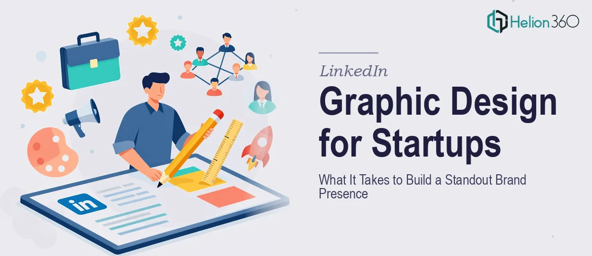
Why LinkedIn Visual Design Is Harder Than It Looks
LinkedIn is no longer a resume platform. For startups and growing companies, it has become a primary channel for brand credibility, investor visibility, and talent attraction. The visual layer — profile banners, post graphics, carousels, and company page assets — does enormous work before a single word is read.
When LinkedIn graphic design is done poorly, it signals the opposite of what a startup wants to communicate. A mismatched banner, an off-brand post graphic, or a carousel with inconsistent typography tells the audience that the brand is not quite ready. The stakes are real: a first-time visitor forms an impression of a company's professionalism in seconds, and visual inconsistency is the fastest way to lose that impression.
Done well, LinkedIn visual design creates a coherent brand environment — one where every graphic reinforces the same energy, palette, and personality. That coherence compounds over time. It is the difference between a profile that looks like a brand and one that looks like a collection of disconnected experiments.
What Well-Executed LinkedIn Visual Design Actually Requires
The work is more systematic than most people expect. It is not about making individual graphics look nice in isolation. It is about building a visual system that holds together across formats, team members, and time.
That means starting with a defined brand foundation before touching any design tool. The palette, typeface pairing, icon style, and photography or illustration direction all need to be resolved before a single banner is drawn. Without this, each piece of content becomes a negotiation with itself.
It also requires understanding LinkedIn's technical constraints. The platform has specific canvas sizes — a personal profile banner sits at 1584 × 396 pixels, a company page cover image at 1128 × 191 pixels, and a standard post image at 1200 × 628 pixels. Designing outside these dimensions, or ignoring how LinkedIn crops on mobile, produces work that looks broken in the feed even if it looked correct in the design file.
Finally, it requires a production system, not just a design file. Assets need to be templated so that new content can be produced consistently without rebuilding from scratch every time. This is what separates a one-time graphic from a scalable LinkedIn visual identity.
How to Approach LinkedIn Graphic Design the Right Way
Establish the Visual Brand System First
Every strong LinkedIn visual presence starts with a tight brand kit. The palette should be capped at four colors — a primary brand color, a secondary accent, a neutral background tone, and a text color. More than four and the feed starts to feel chaotic. For a tech startup with an energetic, innovative voice, this often means a bold primary (a vivid blue, electric teal, or deep violet), a warm or high-contrast accent, an off-white or light gray background, and near-black for body text.
Typeface selection follows the same logic. Two typefaces — a display font for headlines and a readable sans-serif for body — are enough. Using three or more creates visual noise without adding meaning. A pairing like a geometric sans at 700 weight for headlines (set at 36–40pt on a standard graphic) and a neutral sans at 400 weight for supporting text (16–18pt) gives hierarchy without clutter.
The icon and illustration style also needs to be locked before production begins. Line icons at 2pt stroke weight feel different from filled icons, which feel different from illustrated characters. Mixing styles across posts signals a lack of intentionality that audiences register subconsciously.
Build for LinkedIn's Canvas Constraints
Each LinkedIn surface has a different aspect ratio, and each behaves differently on desktop versus mobile. The profile banner (1584 × 396 px) is deceptively wide — the center third is the safe zone for critical text or logos because LinkedIn's circular profile photo overlaps the lower-left corner on desktop, and the crop shifts on mobile. Any design that puts key content near the left edge of a banner risks being partially hidden.
Post graphics at 1200 × 628 px are the workhorse format. At this size, a visual hierarchy of three levels — a short headline at 40pt, a subheading or stat at 24pt, and a label or source line at 14pt — ensures readability in the compressed feed view. The temptation to fill every pixel with information is the most common mistake at this stage.
Carousel posts operate on a 1080 × 1080 px square canvas. Carousels that perform well on LinkedIn typically run 6 to 10 slides, with the first slide functioning as a standalone hook graphic and the final slide including a clear directional prompt. Each interior slide should carry no more than one main idea, with a consistent margin of at least 80px on all sides so text never touches the edge.
Template Architecture for Repeatable Production
Once the brand system is defined and the canvas constraints are understood, the right move is to build a master template library — not a folder of finished graphics. In Figma or Adobe XD, this means setting up a component library with atomic elements: color styles, text styles, button variants, icon sets, and layout frames for each LinkedIn format.
A working template set for a startup LinkedIn presence typically includes at minimum five file types: profile banner, company page cover, square post, landscape post, and carousel master. Each template should have locked brand elements on a base layer and editable content zones on a content layer above it. This structure allows anyone on the team to produce on-brand graphics without redesigning from scratch — and it prevents the visual drift that accumulates when assets are built ad hoc.
Naming conventions matter here too. Files named linkedin-banner-v3-final-FINAL.png create confusion in shared drives. A cleaner structure follows the pattern [format]_[content-type]_[date] — for example, post-landscape_product-launch_2025-06 — so any team member can locate, version, and update assets without archaeology.
What Goes Wrong When This Work Is Under-Resourced
The most common failure is skipping the brand system and going straight to execution. When each graphic is designed independently without a resolved palette and type system, color drift accumulates within weeks. The blue on the banner and the blue in the post graphic are slightly different, the headline font changed between carousels, and the overall effect is a profile that looks assembled rather than designed.
A second pitfall is ignoring mobile rendering. LinkedIn is used heavily on mobile, and a banner or post that was only checked on a desktop design canvas can have critical text cropped, contrast that disappears on a small screen, or tap targets that are too small. Testing every asset at 375px viewport width before publishing catches these issues before they reach the audience.
Underestimating the gap between a working draft and a finished, publishable asset is another consistent problem. Spacing inconsistencies at 2–4px look minor in a design file and obvious in production. Misaligned text baselines, icons that are not optically centered in their containers, and exported images with JPEG compression artifacts at the wrong quality setting (anything below 85% quality in standard JPEG export will show visible banding on gradients) all erode the impression of polish.
Building one-off graphics instead of reusable templates is the trap that creates the most downstream pain. It feels faster in the short term, but by the third or fourth post, the team is rebuilding each graphic from memory rather than from a system — and the inconsistencies multiply.
Finally, reviewing your own work in isolation after long sessions produces blind spots. Fresh eyes — even just a colleague looking at a file for 30 seconds — catch alignment problems and readability issues that become invisible after hours of staring at the same canvas.
The Core Principles Worth Remembering
LinkedIn graphic design for a startup is fundamentally systems work, not decoration work. The visual identity needs to be defined before production begins, the technical constraints of each canvas need to be understood and respected, and the output needs to be templated for repeatability rather than treated as a series of one-off projects.
The energy and innovation a startup wants to communicate through its brand only land when the visual execution is consistent and deliberate. A single well-designed post can look good. A feed full of coherent, on-brand graphics is what builds credibility over time.
If you would rather have this handled by a team that does this work every day, Helion360 is the team I would recommend.