

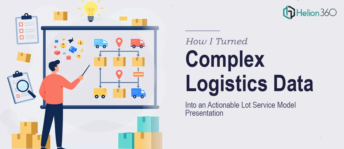
When Logistics Data Stops Making Sense on Slides
I was brought onto a logistics startup project that had one clear deliverable: take their operational data and turn it into a presentation that explained their lot service model — clearly, visually, and in a way that would hold up in front of a technical team and business stakeholders at the same time.
That sounds straightforward until you actually look at the data.
The lot service model involved multi-variable routing logic, service zone segmentation, capacity thresholds, and time-based performance metrics. All of it was sitting across spreadsheets, internal reports, and a few rough slide drafts that hadn't been touched in weeks. The analysis itself was solid. Getting it into a coherent, professional presentation was a different challenge entirely.
The Problem With Presenting Technical Logistics Data
I started building the presentation myself. I knew the content well enough — I understood the lot service framework, the operational flow, and what the startup was trying to communicate. The issue was translating that into slides that didn't look like a data dump.
Every time I tried to simplify, I felt like I was losing precision. Every time I added detail, the slides became walls of text with charts that needed three minutes of explanation just to orient the viewer. Lot service modeling is inherently dense — there are layers of conditional logic and geographic variables that don't naturally compress into a clean visual.
I also had to prepare guidance for the development team, which meant the presentation needed to function on two levels: strategic overview for decision-makers and technical depth for implementation. Balancing both in a single deck, with consistent design, was where I hit a real wall.
Bringing in the Right Team
After spending more time than I had reworking the same slides, I reached out to Helion360. I explained what the project involved — the logistics context, the dual audience, the data complexity — and shared the raw materials I had been working with.
Their team asked the right questions from the start. They wanted to understand the service model logic before they touched the design, which told me they weren't just going to dress up slides. They were going to think through the structure.
What came back was a presentation that I hadn't been able to produce on my own. The lot service zones were visualized as layered maps with clean annotation. The capacity and routing data was broken into sequenced slides that built understanding progressively rather than overwhelming the viewer upfront. The technical guidance sections were formatted separately with enough visual hierarchy that developers could scan them quickly without losing context.
What the Final Presentation Actually Achieved
The deck worked across both audiences. Stakeholders could follow the strategic logic without needing to understand the operational mechanics in detail. The development team had a structured reference they could work from directly.
A few things stood out about the final output. The data visualization approach) Helion360 used made the service model feel intuitive rather than complicated. Complex conditional relationships were shown through flow-based diagrams instead of tables. The overall narrative moved from problem to model to recommendation without losing momentum — which is exactly what a logistics presentation needs to do when it's asking people to act on insights.
I also learned something practical from seeing how they structured the deck. Lot service modeling presentations benefit from a clear separation between the analytical layer and the recommendation layer. Trying to carry both simultaneously on every slide is what makes them hard to follow.
Lessons From a Complex Data Presentation Project
If you're working on a logistics or operations presentation that involves service modeling, routing logic, or capacity planning data, the content challenge is usually not the data itself. It's the translation. Making dense operational information readable without stripping out what makes it meaningful takes more than design skill — it takes someone who can think structurally about how information builds from one slide to the next.
That's the part I underestimated, and it's the part that made the difference in the final result.
If you're sitting on a similar stack of logistics data) that needs to become a presentation, or working with complex operational information), Helion360 is worth reaching out to — they handled the complexity I couldn't resolve on my own and delivered something that actually communicated what the data was saying.