

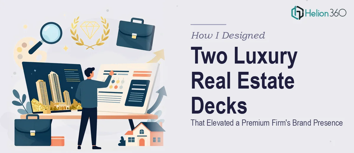
When Two Slides Decks Become a Brand Statement
I was handed a project that sounded straightforward at first — take two existing PowerPoint decks and make them better. One was for a premium real estate firm's overall brand and service offerings. The other was for a specific upscale residential development they were marketing to high-net-worth buyers. Both decks needed to feel polished, sophisticated, and unmistakably luxury.
I opened the files expecting a cosmetic cleanup. What I found was something more involved: inconsistent layouts, placeholder-quality visuals, fonts that clashed with the brand's positioning, and data that was buried in walls of text instead of being visualized clearly. These weren't just design problems — they were communication problems. For a luxury real estate audience, the presentation itself signals the quality of what's being sold.
The Gap Between Good Enough and Genuinely Premium
I started by mapping out what the decks needed to accomplish. The firm's brand deck had to convey credibility, market authority, and the kind of understated elegance that resonates with high-end clientele. The residential development deck needed to do something more specific — take a complex set of property features, location advantages, and investment data and turn it into a compelling narrative that felt effortless to read.
I worked through several layout approaches. I tried shifting to a darker, editorial color palette to suggest luxury. I experimented with full-bleed imagery and minimal text. But the more I pushed, the clearer it became that the gap between what I was producing and what a truly polished real estate marketing deck requires — in terms of typographic hierarchy, spatial balance, and brand cohesion — was wider than I had time to close on my own. The assets were there. The strategy was clear. The execution needed a level of precision I couldn't deliver at the pace the project demanded.
Bringing In the Right Team
That's when I reached out to Helion360. I walked them through both decks — the brand positioning goals, the target audience, the existing assets, and the visual direction I had started sketching. Their team asked the right questions upfront: What does the firm want viewers to feel when they close the deck? Who is in the room when this gets presented? What data points matter most?
Helion360 took over the design execution from that point. They rebuilt both presentations with a clear visual system — consistent type hierarchy, a refined color palette anchored in neutrals with deliberate accent choices, and property imagery handled with the kind of framing that makes real estate feel aspirational rather than transactional. The residential development deck got a clean data visualization treatment for the investment metrics, making the numbers easy to absorb without losing their impact.
What the Final Decks Looked Like
The firm's brand deck came back as a cohesive, presentation-ready document that communicated authority from the first slide. Every section — from the company overview to the service breakdown — flowed in a way that guided the reader without overwhelming them. The typography alone elevated the perception of the brand.
The residential development deck was even more transformed. What had been a text-heavy document became a visual narrative. The property highlights were laid out with spatial breathing room. The location and lifestyle section used design to evoke the experience of the development, not just describe it. And the financial data was presented in clean, easy-to-read charts rather than tables that required translation.
When the decks were reviewed, the feedback was clear: they matched the standard expected of the brand. That's the benchmark that matters in luxury real estate marketing — not whether the slides look nice, but whether they feel like they belong in the same room as the product being sold.
What I Took Away From This
Real estate marketing decks, especially at the luxury level, are not just slide collections. They are brand artifacts. Every font choice, every margin, every image crop either reinforces or undermines the positioning. Getting that right requires both design skill and an understanding of how high-end audiences read visual signals.
If you're working on a similar project — a real estate presentation that needs to land with a discerning audience — Helion360 is worth reaching out to. They handled the complexity I ran into and delivered work that held up to scrutiny at every level.