

The Pressure of Getting Market Data Right
I had an important strategic presentation coming up — the kind where leadership would be in the room and every number on screen would be scrutinized. The goal was clear: build a market data analysis report that could anchor our PPT deck and give our narrative real weight.
On paper, I knew what I needed. Market trends, consumer behavior patterns, financial health indicators, and a clear industry overview. But pulling all of that together into something coherent, accurate, and presentation-ready? That was a different problem entirely.
Where the Process Started to Break Down
I started by gathering data from the sources I had access to — industry databases, internal reports, and a few third-party research summaries. The raw information existed. The challenge was in making sense of it.
First, there was the question of accuracy. Some figures were from different time periods. Others contradicted each other depending on the source. Reconciling this data without introducing errors into the final report felt risky, especially when the deck would be used to support strategic decisions.
Second, there was the structure problem. I had data, but I didn't have a story. A market research PPT isn't just a collection of charts — it needs to flow logically from one insight to the next. The consumer behavior section needed to connect to the market trend analysis, which then needed to feed into the financial outlook.
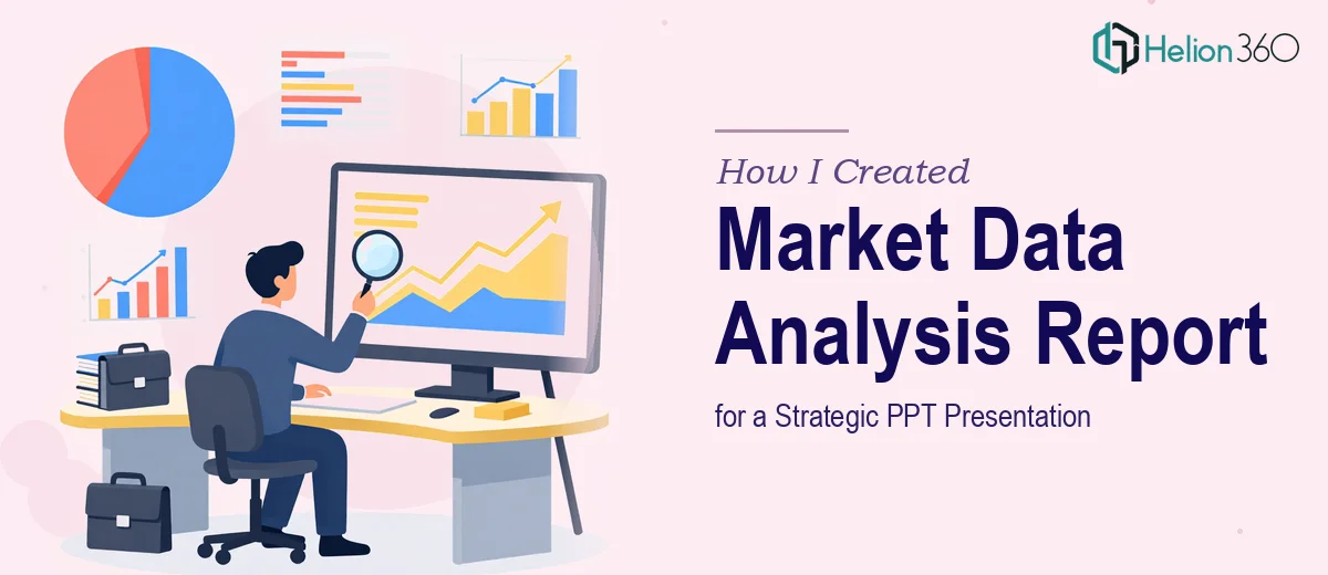
Third — and honestly the most time-consuming part — was the visual layer. Raw tables and spreadsheets don't land well in a boardroom. I needed charts, graphs, and visual representations that could communicate key points at a glance. I wasn't in a position to do that well on my own while also managing the analytical side.
Bringing in the Right Support
After a couple of days of trying to wrestle everything into shape, I reached out to Helion360. I explained the brief: a comprehensive market data analysis report designed to support a strategic PPT presentation, covering market trends, consumer behavior, and financial health — all built to be accurate, structured, and visually strong. If you're navigating a similar challenge, market research presentation design services can bridge the gap between raw data and a boardroom-ready deck.
Their team asked the right questions upfront. What was the audience? What decisions would this presentation inform? What level of depth was needed for each section? That clarity helped them understand what the report actually needed to do, not just what it needed to contain.
How the Report Came Together
Helion360 approached the work in a structured way. They began with the industry landscape — mapping the competitive environment and identifying the macro trends shaping the market. From there, they moved into consumer behavior analysis, drawing on relevant behavioral indicators and segment-specific patterns.
The financial health section was built with care. They cross-referenced multiple data points, flagged where assumptions were made, and kept everything traceable. That kind of rigor mattered to me — I didn't want a polished report that couldn't hold up to a single follow-up question.
Once the analysis was solid, they moved to the visual presentation layer. Each data section was translated into clean, readable charts and graphs. Nothing over-designed — just clear visuals that supported the data without distracting from it. The overall structure of the deck followed a logical build: industry context, trend analysis, consumer insights, financial indicators, and strategic implications.
What the Final Deck Actually Delivered
When I reviewed the completed work, the difference from where I'd started was significant. The report had depth without being dense. The complex data into an engaging PowerPoint presentation challenge I'd been facing had a real solution. And the structure meant that each section genuinely built on the last — which is exactly what a strategic narrative needs.
The presentation landed well. The questions from leadership were focused on strategy, not on challenging the data — which told me the analysis had done its job.
What I Took Away From This
Building a market data analysis report for a strategic PPT isn't just a research task — it's an exercise in translating complexity into clarity. The data has to be accurate. The structure has to be deliberate. And the visuals have to earn their place on the slide.
I could have kept struggling through it on my own, but the timeline and the stakes didn't allow for a rough output. Knowing when the work requires a different level of support is its own kind of skill. The experience of turning raw financial and market data into decision-ready reports reinforced that lesson clearly.
If you're working on a market research PPT or need a data-heavy report turned into a clear, well-structured presentation, Helion360 is worth reaching out to. Their team handles the analytical depth and visual design so the final deck actually serves its purpose.