

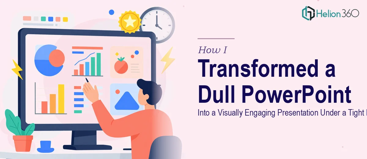
The Presentation Was Fine. But Fine Wasn't Going to Cut It.
I had a deadline coming up in less than a week. The presentation itself was structurally complete — the content was there, the data was organized, the narrative made sense. But when I opened the slides and actually looked at them, I knew something was off.
Every slide was a wall of text. The fonts were inconsistent. The color palette looked like it had been picked at random. There were no clear visual anchors to guide the audience through the story. It was the kind of PowerPoint that makes people check their phones mid-meeting.
The problem wasn't the content — it was the presentation design. And with only a few days left, I needed to fix it fast.
Where My Own Efforts Hit a Wall
I'm comfortable with PowerPoint at a functional level. I can build slides, insert charts, and keep things reasonably tidy. But what this deck needed was a level of visual thinking I simply didn't have time for — or frankly, the specialized eye to execute.
I spent an evening trying to spruce up the slides myself. I swapped in a cleaner font, adjusted some spacing, and replaced a few clip-art icons with something more professional. It looked marginally better. But it still didn't feel cohesive. The slides didn't breathe. The data visualizations were confusing. The overall look wasn't something I'd be proud to put in front of a room full of decision-makers.
Attempting a full presentation redesign while also managing everything else on my plate wasn't realistic. I needed someone who does this for a living.
Bringing in the Right Help at the Right Time
After some searching, I came across Helion360. They handle exactly this kind of work — taking existing presentations and elevating them visually without losing the original structure or message.
I reached out, explained the situation honestly: existing deck, tight timeline, needed a slide makeover that made the content actually land. Their team asked a few focused questions — audience type, branding preferences, the tone we were going for — and then got to work.
What I appreciated was that they didn't overdesign it. They weren't trying to make it flashy for the sake of it. The goal was clarity and visual engagement, and that's what they focused on.
What the Redesigned Deck Actually Looked Like
When I got the revised slides back, the difference was immediately clear. A few things stood out:
Consistent visual language. Every slide used the same type hierarchy, spacing rules, and color system. It felt like one cohesive document, not a patchwork of formatting decisions.
Data made readable. Charts that were previously just dropped in as Excel exports were now properly styled. Numbers were highlighted where they mattered. The audience could understand the data at a glance.
Visual breathing room. Slides that had been crammed with bullet points were restructured. Key ideas were given space. Supporting detail was placed where it supported — not dominated.
Slide-by-slide flow. The redesign considered how one slide led into the next. There was a visual storytelling logic to it that the original completely lacked.
The deck went from something I was mildly embarrassed about to something I was genuinely confident presenting.
What This Experience Taught Me About Presentation Design
Good presentation design is not about decoration. It's about communication. When your slides are visually clear and consistent, your audience spends less energy decoding what they're looking at and more energy absorbing what you're saying.
I also learned that knowing when to hand something off is its own skill. The presentation content was mine. The ideas were mine. But the visual execution needed a specialist — and trying to do it myself under pressure would have produced something half-finished.
The Helion360 team delivered within the timeline, the feedback from the audience was noticeably positive, and the experience was smooth from start to finish.
Need a Presentation That Actually Looks the Part?
If you're sitting on a deck that has solid content but looks flat or cluttered, Helion360 can take it from where it is to where it needs to be — without you having to rebuild it from scratch or lose time you don't have. Explore our PowerPoint Redesign Services or see how others have handled similar challenges, like converting a PowerPoint into a professional template for long-term reuse.