

The Brief Was Simple. The Execution Was Not.
Our team had been selected to present at a major industry conference — a real opportunity to put our research and work in front of hundreds of decision-makers. The content was solid. We had months of data, key statistics, trend analysis, and findings that genuinely deserved attention.
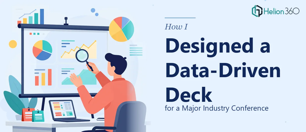
The problem? All of it was sitting in spreadsheets, dense reports, and a rough draft PowerPoint that looked exactly like what it was — a working document, not a presentation.
I knew the data-driven PowerPoint design needed to do more than display numbers. It had to tell a story, hold the room's attention, and make complex information feel approachable. That's a very different challenge from simply knowing your subject matter.
Where I Hit a Wall
I started working on the deck myself. I could structure the narrative well enough — intro, context, key findings, implications, call to action. That part came naturally.
But when it came to translating raw data into meaningful visuals, the gaps became obvious fast. Which chart type fits this data set? How do you show a multi-year trend without cluttering the slide? How do you make a statistical summary scannable without losing accuracy? How do you keep the visual presentation design consistent across 20+ slides while still making each one feel purposeful?
I spent two evenings reworking the same three slides and still wasn't happy with them. The charts looked generic. The layout felt unbalanced. The overall deck didn't reflect the quality of the work behind it.
At that point, I had to be honest with myself — this wasn't just about more time. It was about a specific skill set I didn't have.
Bringing in the Right Help
After hitting a wall, I came across Helion360. I explained the situation: a conference deadline, a data-heavy presentation, and a rough draft that needed to become something polished and professional.
Their team asked the right questions upfront — about the audience, the venue format, the key message we wanted people to walk away with, and the data we most needed to visualize. That intake process alone told me they understood what the work actually required.
I handed over the raw files — the spreadsheets, the report, the rough slides — and let them take it from there.
What the Final Deck Looked Like
The transformation was significant. Here's what changed:
Data visualization that actually communicated. The team converted our flat tables into clear, well-labeled charts — bar charts for comparisons, line graphs for trends, and a few custom infographic layouts for statistics that needed context rather than just display.
A consistent visual language. Every slide used the same color palette, font hierarchy, and spacing logic. It felt like one cohesive deck, not a collection of individual slides stitched together.
Slides built for a live audience. The layouts were clean and uncluttered. Key numbers were given visual weight. Supporting detail was either condensed or moved to backup slides. The deck was designed to work while someone was speaking to it, not just to be read.
A narrative flow that held together. The sequence moved from context to data to insight to implication — a clear arc that made the presentation easy to follow even for people unfamiliar with our work.
How It Landed at the Conference
The response in the room was noticeably different from what I'd experienced presenting rougher decks in the past. People were engaged. A few attendees specifically mentioned the clarity of the data slides during the Q&A. One person asked for a copy of the deck after the session.
More importantly, the presentation held up under scrutiny. When questions came in about specific numbers or trends, the slides backed up the answers without needing explanation or apology.
That's the real test of a well-designed conference presentation — it doesn't just look good, it performs when the room pushes back.
What I Took Away From This
Presentation design for a conference setting is its own discipline. Knowing your data and knowing how to present it visually are two separate skills. There's no shame in recognizing where one ends and the other begins.
Working with Helion360 didn't just solve the immediate problem — it gave me a clearer sense of what professional data visualization in a PowerPoint deck actually looks like when done right. That's a useful reference point for everything that comes after.
Need a Conference-Ready Deck That Does Justice to Your Data?
If you're preparing for a major presentation and your data deserves better than a rough draft, Helion360's team can help you get there. They step in at exactly the point where the work gets too complex or time-consuming to handle alone — and deliver something you can walk into any room with confidently.