

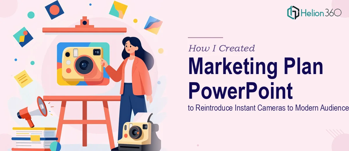
The Brief Was Clear. The Execution Was Not.
When our team decided to reintroduce instant cameras to a modern audience, we had no shortage of ideas. There was the nostalgia angle, the tactile appeal of physical prints, the social media generation rediscovering analog experiences. The strategy was solid. What we did not have was a marketing plan PowerPoint that could hold all of it together in a way that felt both emotionally engaging and professionally structured.
I took the first pass myself. I had the content mapped out — audience segments, campaign messaging, product model comparisons, and the brand story we wanted to tell. I opened PowerPoint and started building.
Where It Started to Fall Apart
The problem was not the content. It was making the presentation design match the ambition of the campaign. An instant camera relaunch needs to feel warm and tactile, but also sharp and modern. Every slide I put together either leaned too retro or looked like a generic business deck. The two tones kept clashing.
I spent time experimenting with layout variations, trying to balance photo-heavy slides with data slides covering market opportunity and consumer behavior shifts. Product feature slides needed clean visual hierarchy. The campaign timeline needed a structure that was easy to follow. None of it was coming together the way it looked in my head.
Beyond aesthetics, the presentation was getting long. With a reintroduction campaign, there is a lot to cover — audience insights, why instant cameras are relevant today, how the product line compares, and what the rollout plan looks like. Fitting all of that into a coherent, skimmable deck without losing the story was harder than I anticipated.
Bringing in the Right Help
After a few days of rework and still not landing on something I was confident presenting, I reached out to Helion360. I explained the context — a product marketing presentation built around an instant camera relaunch, with a specific tone to hit and a detailed content structure to follow.
Their team asked the right questions upfront. What was the primary audience for this deck? Would it be used for internal stakeholder alignment or external campaign pitches? What visual references did we have in mind? Within a short back-and-forth, it was clear they understood the challenge: this was not a standard business presentation. It needed to carry both emotional weight and strategic clarity.
What the Final Presentation Looked Like
Helion360 restructured the flow before touching a single design element. The deck opened with a compelling context slide — why instant cameras are having a cultural moment again, backed by simple, clean data visualization. From there, it moved into audience profiles, product highlights, campaign messaging pillars, and a phased rollout timeline.
The design language they chose was exactly the balance I had been struggling to find. Warm photography tones pulled from the product itself, paired with clean typography and structured layouts that kept the business slides readable. Product model comparison slides used visual hierarchy effectively rather than cramming everything into tables. The campaign section felt like a proper marketing plan, not just a slide dump.
Animated transitions added rhythm without being distracting. The overall presentation design felt polished enough for a boardroom but energetic enough to reflect the campaign's spirit.
What This Project Taught Me
A marketing plan PowerPoint for a product relaunch is a different challenge from a standard business presentation. The visual storytelling has to do real work — it needs to make someone feel the appeal of the product while also presenting the strategy clearly. Those two goals pull in different directions, and resolving that tension is a design problem as much as a content problem.
I could have kept iterating on my own, but the deadline was real and the stakes were high. Getting professional presentation design support at the right moment made the difference between a deck that looked like internal notes and one that actually drove the conversation forward.
If you are working on a similar product marketing presentation and hitting the same wall — great content, but the design is not doing it justice — Helion360 is worth reaching out to. They handled the complexity efficiently and delivered exactly the kind of polished, story-driven deck the project needed.