

The Situation and What Was Actually at Stake
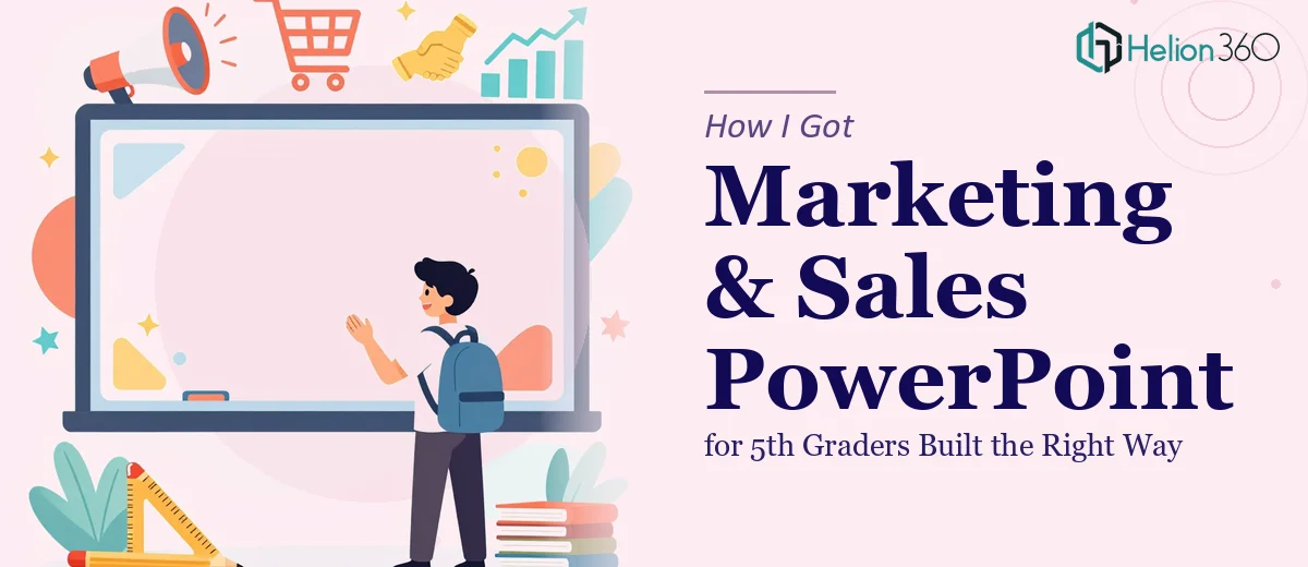
The brief sounded simple enough on the surface: create an educational PowerPoint presentation on marketing and sales for a 5th-grade audience. The goal was to introduce young students to real-world concepts — market research, product positioning, customer service, sales strategies, and even the ethics of selling — in a way that was genuinely engaging, age-appropriate, and accurate.
The deadline was firm: two weeks out. The audience was specific: 10- and 11-year-olds who would disengage the moment something felt boring, confusing, or like a textbook page projected on a screen. And the deliverables weren't lightweight — editable and non-editable slide formats, plus detailed speaker notes for every slide.
I recognized quickly that this wasn't a task where "good enough" was acceptable. Getting the tone wrong, the visuals flat, or the content pitched at the wrong level would mean the material would simply not land. It needed to be done right, and I knew I didn't have the combination of curriculum thinking, visual design skill, and presentation expertise to pull it off well on my own.
What I Found Out This Kind of Project Actually Requires
Once I started mapping out what a genuinely effective educational presentation for this age group would need, the scope became clear fast.
First, it's not just about simplifying content. Age-appropriate design for 5th graders means understanding how this audience processes information visually — short text bursts, high-contrast layouts, relatable real-world examples, and interactive moments baked into the flow. Dumbing down adult slides is not the same thing as designing for a young learner.
Second, the content itself spans multiple distinct conceptual territories: market research, product positioning, customer service, ethical sales practices. Each of those topics needs its own narrative entry point — a relatable hook that connects to something a 10-year-old already understands, like their favorite snack brand or a school fundraiser.
Third, the deliverable spec added a layer of production complexity most people underestimate: fully editable master files, locked non-editable versions, and thorough speaker notes for every single slide. That's not extra work bolted on at the end — it has to be built into the architecture from the start. I could see within an hour of scoping this that it was a full-production project, not a quick deck job.
What the Work Itself Involves
The structural and narrative foundation of a project like this is where the most critical decisions get made. Done well, it starts with mapping out a content arc that introduces each concept in a logical sequence — moving from "what is a market?" to "how do businesses find customers?" to "why does being honest in sales matter?" — while maintaining a thread a young audience can follow. The right approach uses no more than 5-6 words of headline copy per slide, with one idea per screen and a clear visual anchor for each concept. Practitioners building this kind of deck typically plan 20-25 slides minimum to cover this topic set without cramming, and the outline stage alone — sequencing, writing slide titles, mapping transitions — takes several focused hours before a single visual is created.
The visual mechanics of an educational presentation for this age range are governed by specific conventions. Typography hierarchies typically run 40pt headline, 24pt supporting text, with body copy eliminated almost entirely in favor of labeled visuals and infographics. Color palettes should stay at 3-4 high-contrast brand or theme colors maximum, applied consistently across every slide through a properly configured master. Infographics illustrating concepts like "the 4 Ps of marketing" or a simple customer journey need to be built as original graphics — not stock chart inserts — which means real layout work in each slide. Anyone unfamiliar with master slide architecture in PowerPoint will spend significant time reworking visuals that should have been templated from the start.
Polish and consistency across a 20-plus slide deck is where many otherwise solid attempts fall apart. Every slide needs to feel like part of the same visual system — consistent icon styles, uniform margin and padding rules (typically a 12-column underlying grid), matched text box alignment, and a speaker notes template that follows a standard format across all slides. Reviewing the full deck for visual inconsistencies, checking that editable and locked versions export correctly, and ensuring the notes are substantive enough to actually guide a teacher or facilitator — that review pass alone is a multi-hour process that requires a trained eye to do it well.
Why I Brought in Helion360 to Handle It
I didn't attempt to build this myself. After mapping out what the project actually required — the content architecture, the age-appropriate visual design, the infographic production, and the multi-format deliverable spec — it was immediately obvious that engaging a team with expertise in marketing presentation design services was the right call.
Helion360 handled the full project end-to-end: content structure and slide narrative, all visual design and infographic creation, speaker notes for every slide, and production of both editable and non-editable output files. The work was turned around quickly — done in days, not the weeks it would have taken me to learn the tooling, develop the visual system, and get the content calibration right for a 5th-grade audience.
What made the difference was that this kind of work is what they do all day. The expertise and production infrastructure were already built in — no ramp-up, no guesswork on what "age-appropriate but substantive" actually looks like in a slide format.
The Result and What I'd Tell Anyone Facing the Same Brief
What came back was a complete, production-ready educational presentation — visually consistent, clearly structured, and genuinely calibrated for a young audience without sacrificing the substance the brief required. Every concept had a visual entry point, the infographics were original and clean, and the speaker notes gave any facilitator real guidance to work from. Both file formats were delivered correctly, and the deck held up under review without needing rework.
The business outcome was straightforward: a presentation that could actually be used, not one that needed another round of fixes before it was classroom-ready.
If you're looking at a similar brief — an educational presentation with a firm deadline, a specific audience, and a multi-format deliverable spec — Helion360 is the team I'd engage. They delivered fast, handled the full scope, and brought the kind of execution depth this kind of work demands.