

The Brief Sounded Simple Enough
I was tasked with putting together a full marketing strategy overview for an internal review — the kind that senior decision-makers would actually sit down and read. The deliverable needed to cover current campaign performance, key financial metrics tied to our marketing spend, future strategic goals, and a clean executive summary at the top.
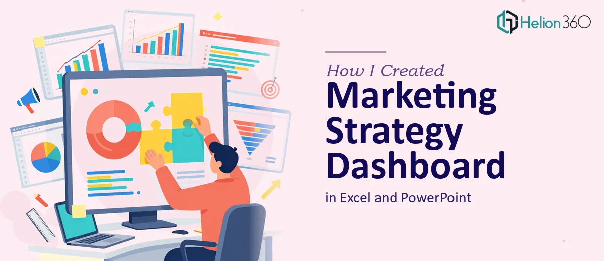
The plan was to build a marketing performance dashboard in Excel to organize and calculate the data, and then translate that into a polished PowerPoint presentation that non-technical stakeholders could follow without squinting at spreadsheets.
On paper, it felt manageable. In practice, it turned into something far more involved.
Where Things Got Complicated
The data itself was scattered across multiple sources — campaign reports, budget trackers, monthly performance summaries, and a few ad hoc notes from the team. Pulling it into a single Excel dashboard that was both accurate and visually coherent took longer than I expected. Every time I thought the structure was right, something else needed to be cross-referenced or recalculated.
Then came the PowerPoint. I had the content, but turning dense marketing data into slides that were genuinely readable — with charts that told a story rather than just displaying numbers — was a different kind of challenge. I could build a slide, but making it look like it belonged in a boardroom presentation was another matter entirely. The executive summary alone went through three versions and still felt flat.
With a one-week deadline, I realized I was running out of runway trying to do both the data work and the design work at the same time.
Bringing in the Right Support
After hitting that wall, I came across Helion360. I explained the full scope — the Excel dashboard, the PowerPoint presentation, the need for an executive summary, and the tight turnaround — and their team took it from there.
What I handed over was a rough structure: raw data files, notes on what each section needed to cover, and a general sense of the visual direction. What came back was considerably more refined.
What the Final Deliverable Looked Like
The Excel dashboard was built with clear sections for campaign performance metrics, marketing financials, and trend tracking. Formulas were clean, data was organized logically, and the layout made it easy to update going forward — not just useful for this presentation but reusable for future reporting cycles.
The PowerPoint presentation was structured to lead with the executive summary, giving decision-makers an immediate view of the key takeaways before diving into the detail. Each section — current campaigns, financial metrics, strategic goals, recent wins and challenges — had its own visual treatment. Charts were chosen for clarity, not decoration. The data visualization across both files was consistent, which made the whole package feel cohesive.
The slide design itself matched the tone of an internal strategy presentation: professional, clean, and focused on communicating rather than impressing.
What I Took Away From This
The biggest lesson was understanding the difference between knowing what a presentation needs to say and knowing how to make it say it well. I could write the content and organize the data, but the combination of Excel modeling and PowerPoint design at this level of detail requires dedicated attention to both disciplines at once.
Building a marketing strategy dashboard that works as both an analytical tool and a presentation asset is genuinely time-intensive. When the deadline is tight and the audience is senior leadership, cutting corners on either side of it — the data structure or the visual design — shows up immediately.
Getting the Excel and PowerPoint components built properly also meant the presentation could be updated for future reviews without rebuilding it from scratch. That ongoing utility was something I had not fully planned for at the start, but it became one of the most practical outcomes of the project.
If you are working on a similar marketing performance presentation and the data complexity or design side is slowing you down, Helion360 is worth reaching out to — they handled both the Excel dashboard and the PowerPoint design efficiently and delivered exactly what the brief required.