

The Conference Was a Month Away and My Slides Looked Nothing Like the Vision
When I decided to host a small conference around my sustainable lifestyle brand, I had a clear picture in my head of what the presentations should look like — clean layouts, modern iconography, a visual language that matched the eco-conscious identity of the brand. What I did not have was a polished set of slides that reflected any of that.
I had the content. I had the structure. I even had a list of FontAwesome icons I wanted to use to replace the tired clip-art placeholders I kept seeing in generic templates. But sitting in front of PowerPoint and actually putting it all together was a different challenge entirely.
Where the DIY Approach Started to Break Down
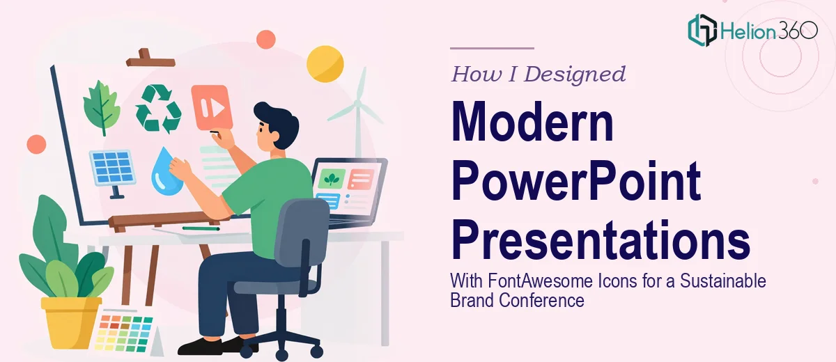
I spent the first weekend trying to build the slides myself. I knew roughly what I wanted — a neutral, nature-inspired color palette, plenty of white space, and FontAwesome icons embedded consistently across topic slides covering eco-friendly practices, sustainable design, and green technology.
The problem was execution. Getting FontAwesome icons to render properly inside PowerPoint required installing the font, mapping the correct Unicode characters to each icon, and then sizing and aligning everything consistently across thirty-plus slides. When I got one slide looking right, the formatting would break somewhere else. The icon sizes were inconsistent. The spacing felt off. And the overall slide design still did not feel cohesive — it looked assembled, not designed.
I also realized I was spending hours on visual details that were pulling me away from actually preparing for the conference itself. The content needed refinement. The speaker notes needed work. I could not afford to keep losing half my day to slide formatting.
Bringing In the Right Team
After hitting that wall, I came across Helion360. I explained what I was trying to build — a modern PowerPoint presentation series for a sustainable brand conference, with FontAwesome icons used consistently throughout, a clean visual style, and slides that felt professionally designed without being generic.
Their team understood the brief immediately. I shared my rough drafts, the icon references I had collected, and a few examples of the aesthetic I was going for. From there, they took over the design work entirely.
What the Final Slides Actually Looked Like
The difference between what I had built and what Helion360 delivered was significant. The FontAwesome icons were embedded properly and used purposefully — not just decorative, but functional in guiding the viewer through each section. Each icon was sized consistently, aligned to a grid, and matched in weight and color to the rest of the slide design.
The overall presentation design had a coherence I had not been able to achieve on my own. The slides covering eco-friendly practices used a minimal layout with generous white space and soft green tones. The technology-focused slides shifted to a slightly cooler palette while maintaining the same typographic and icon system. Nothing felt jarring when moving from one slide to the next.
They also made sure the slide master was set up cleanly, so any last-minute content changes I needed to make were easy to apply without breaking the design.
What I Took Away From the Experience
One thing I underestimated going in was how much design consistency actually requires. It is not just about picking the right icons or a nice color palette — it is about building a system where every element follows the same logic. That kind of systematic thinking takes real design experience, and it is not something you can shortcut.
Using FontAwesome inside PowerPoint specifically requires a level of technical familiarity that goes beyond general slide-building skills. Knowing which icons communicate the right idea, how to scale them without visual distortion, and how to integrate them into a broader slide design system — that is specialized work.
For anyone preparing a conference presentation that needs to represent a brand professionally, getting that design layer right is not optional. The content can be strong, but if the slides look rough, the impression suffers.
If you are in a similar position — you know what you want but cannot get the slides to look the way you need them to — Helion360 is worth reaching out to. They handled the technical and visual complexity I could not manage alone and delivered exactly what the conference needed.