

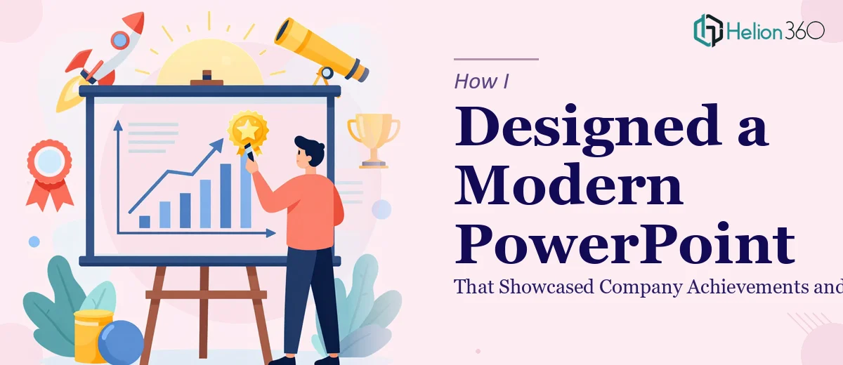
The Task That Looked Simple at First
I had an upcoming conference and one clear deliverable: a professional PowerPoint presentation that captured everything our company had accomplished and where we were heading next. Leadership wanted it to feel polished, modern, and on-brand. The audience would include partners, investors, and industry peers — people who would judge the company not just by what was said, but by how it looked on screen.
I figured I could pull it together myself. I had the content ready — achievement summaries, growth numbers, roadmap highlights, and a few key data points. All I had to do was turn it into slides. Simple enough, or so I thought.
Where My DIY Approach Hit a Wall
The moment I opened PowerPoint, I realized the gap between having content and having a presentation was much wider than I expected.
I spent hours arranging text and adjusting layouts, but nothing looked cohesive. Charts I built from scratch looked flat. Icons I downloaded did not match each other. The slide transitions felt awkward. Every time I thought I was close, I would zoom out and see that the deck still looked like a collection of slides rather than a unified visual story.
The biggest problem was the balance between data and design. We had strong numbers to show — year-over-year growth, milestones reached, upcoming initiatives — but none of it landed visually. Charts were there, but they were not designed to guide the eye. Slides were full of text when they should have been breathing and focused.
Beyond aesthetics, I was running short on time. The conference date was fixed, and I could not keep iterating endlessly on slide layouts when other preparation needed my attention.
Handing It Off to Someone Who Could Actually Do It
After hitting that wall, I came across Helion360. I explained where I was — content ready, direction clear, but execution falling short. Their team asked the right questions upfront: What was the brand palette? Who was the audience? What tone should the presentation carry — formal and corporate, or modern and energetic? How many slides, and what was the flow?
That brief conversation alone told me they understood what a conference presentation actually needed to do.
They took the content I had prepared and restructured it into a logical visual narrative. The achievements section was transformed into a clean timeline with supporting data visualizations. The future vision segment used a roadmap layout that made strategic priorities easy to scan at a glance. Every slide followed consistent typography, spacing, and color usage tied directly to our brand.
What the Final Deck Actually Looked Like
The finished presentation was a significant step up from what I had been building. The design was clean and modern — exactly the style I had described — but more importantly, it was functional. Each slide had a clear focal point. The data was visualized in a way that made comparisons easy to read from a distance. Graphics and icons were consistent and purposeful, not decorative for the sake of it.
The company achievement slides used subtle progress indicators and callout statistics that caught attention without overwhelming the viewer. The future vision section had a structured roadmap that showed initiative phases in a way that felt confident and credible.
When I presented at the conference, the feedback I received was genuinely positive — not just on the content but on how well the story flowed from one slide to the next. That is the kind of outcome you rarely get from a self-assembled deck.
What I Took Away From This
Presentation design is its own discipline. Knowing your content is not the same as knowing how to visualize it. Achieving a clean, modern PowerPoint that also communicates complexity — milestones, data, strategic direction — takes design thinking that goes beyond formatting.
Time pressure makes this gap worse. When the deadline is real, spending hours on slide alignment is not a smart use of energy. Getting the right team involved early would have saved me a full day of frustrating iteration.
If you are in a similar position — content ready, deadline approaching, but the slides just are not coming together — Helion360 is worth reaching out to. They handled the gap between my raw material and a presentation-ready deck, and delivered something I could stand behind in a room full of decision-makers.