

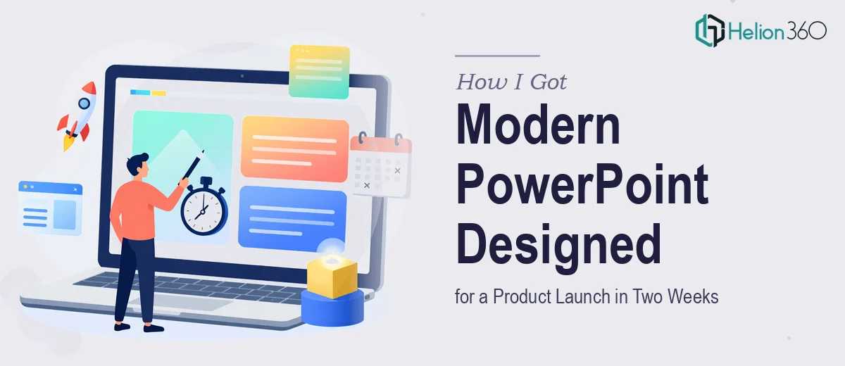
The Pressure Was Real from Day One
Our product launch had a hard date on the calendar, and the presentation sitting in our shared drive was nowhere close to ready. It was a collection of slides — bullet-heavy, inconsistently formatted, with no visual coherence — that had been built up over several weeks by different people on the team. The deck was supposed to represent a product we'd spent months developing, and the audience included sales leads, potential partners, and internal stakeholders who would be judging the product partly on how professionally it was introduced.
Two weeks. That was the window. Not two weeks to figure out design principles or learn the right way to build a master slide system — two weeks to deliver a finished, polished, modern PowerPoint presentation that actually matched the quality of the product it was selling. I looked at what proper product launch presentation design actually required, and it was immediately clear this wasn't something to attempt internally on the side.
What I Found This Kind of Work Actually Requires
I spent time understanding what separates a professional product launch presentation from something that just looks like slides. The gap is larger than most people expect.
First, a modern PowerPoint presentation isn't just a visual upgrade — it's a structural rebuild. The narrative has to lead the audience through a specific arc: problem, solution, proof, call to action. That arc has to be mapped before a single slide is touched, and it often means cutting and reorganizing content that teams have already grown attached to.
Second, brand application at the slide level is far more technical than applying a logo and picking a color. It involves typographic hierarchies, master slide architecture, icon systems, and color palette rules that have to hold across every layout — including data-heavy slides where the temptation to break the rules is highest.
Third, data visualization for a product launch carries its own demands. Charts and graphs aren't decorations — they're arguments. Choosing the wrong chart type for the data you're presenting, or building one that's technically correct but visually unreadable, actively undermines the message. That's a specialist judgment call, not a formatting task.
What the Actual Design Work Involves
The right approach to a product launch PowerPoint starts with a content and narrative audit. Every slide gets evaluated against the story the deck is supposed to tell — what belongs, what needs to be rewritten, what should be cut, and in what order the audience needs to receive the information. A proper story arc for a product launch typically runs through context, pain point, product introduction, key proof points, and a clear close. Getting that structure right before touching visuals is what separates a presentation that lands from one that loses the room by slide eight. This phase takes longer than people expect, especially when the source content comes from multiple contributors with different framings.
Visual mechanics are where the technical depth really shows. A professional layout uses a consistent grid system — commonly a 12-column structure — with type hierarchies set at something like 36pt for headlines, 24pt for subheads, and 16pt for body text, applied without exception across every master slide variant. Color usage follows strict limits: typically no more than four brand colors in active use per slide, with designated roles for primary, secondary, accent, and neutral tones. Building this into PowerPoint's master slide and layout system so it propagates correctly takes significant setup time. Someone doing this for the first time will spend hours just in the slide master view before any content slides are built.
Data visualization requires its own layer of judgment. The decision a practitioner makes here is which chart type maps correctly to each claim — a clustered bar for comparison, a slope chart for change over time, a single-stat callout for a headline number that needs to hit immediately. Each chart then needs to be styled to match the deck's visual system: matching typefaces, brand-consistent axis colors, stripped-back grid lines, and annotations that guide the eye without cluttering the visual. A deck with even four or five data slides can take a full day to get right when this is done properly, and an error in chart choice can make a strong data point read as weak.
Why I Brought in Helion360 to Handle It
I didn't try to work through this myself. The scope was clear, the deadline was fixed, and the stakes were too high to treat this as a learning exercise. I engaged Helion360 to handle the full project end-to-end — from restructuring the narrative and rebuilding the master slide system to designing every layout and getting the data visualizations right.
What made the decision easy was knowing they do this work every day, with the tooling and expertise already in place. There was no ramp-up time, no back-and-forth explaining what a proper type hierarchy looks like, no rounds of feedback to fix structural problems that should have been caught at the start. Helion360 turned the full deck around quickly — done in days, not weeks — and handled the kind of execution depth that would have taken me far longer to learn and execute than the timeline allowed.
The scope they covered included narrative restructuring, full visual design across all slide layouts, brand-consistent chart and graph design, and a final polish pass for consistency across every slide.
What Came Back — and What I'd Tell Anyone in This Same Spot
The finished presentation was exactly what a product launch deck should be: visually modern, structurally clear, and consistent from the first slide to the last. The data visualizations were readable and persuasive. The brand identity came through without being overdone. Stakeholders who had seen the original draft noticed the difference immediately, and the deck held up in the room the way it needed to.
If you're facing a product launch presentation with a real deadline and a professional audience, and you're starting to see what doing this well actually requires, don't spend the next two weeks discovering it the hard way. Helion360 handles this kind of work end-to-end and delivers fast — that combination is exactly what this type of project needs.