

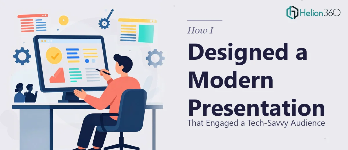
The Situation I Was Staring At
I had a presentation coming up for an audience that was not going to sit quietly through a wall of bullets and stock clip art. These were technical, data-literate people — the kind that immediately clock when a slide deck looks like it was thrown together the night before. The stakes were real: this was a marketing strategy walkthrough built on outbound campaign data, and the insights were only as persuasive as the way they were communicated visually.
The underlying research was solid. We had analyzed campaign performance, mapped customer behavior patterns, and benchmarked against competitor strategies. The problem was getting all of that into a modern PowerPoint presentation that could actually hold a room. I knew almost immediately that this was not something to approach casually. A presentation that looks amateurish in front of a tech-savvy audience does not just fail to impress — it actively undermines the credibility of the findings behind it.
What I Found Out the Work Actually Requires
I started looking into what a properly designed research presentation actually involves, and the complexity came into focus fast.
First, the structural challenge. Raw campaign data and market research findings do not naturally organize themselves into a compelling narrative arc. Turning analytical outputs into a clear story — problem, evidence, insight, recommendation — requires deliberate information architecture. Slide count, sequencing, and hierarchy all need to be intentional decisions, not defaults.
Second, the visual mechanics. A modern PowerPoint presentation for a data-heavy subject needs charts and data visualizations that are built correctly, not just inserted. The wrong chart type misrepresents data. Inconsistent axis labeling destroys credibility. Typography and layout have to carry meaning, not just decoration.
Third, the brand and polish layer. Even for a startup without a legacy brand system, every slide needs to feel like it belongs to the same family. That requires palette discipline, consistent spacing rules, and a master slide setup that does not break when content changes. I realized quickly that this was a job requiring real design and presentation expertise — not a weekend of fumbling through slide master settings.
The Work That Needs to Happen
Building a modern PowerPoint presentation around research data starts with structural and narrative work. The right approach begins with auditing every finding and asking what story it is actually telling. A practitioner maps this into a logical arc — typically opening with the business context, moving through key data themes, and closing with clear, actionable recommendations. Each slide gets a single point to make. The discipline here is ruthless editing: anything that does not advance the argument gets cut or consolidated. For a research-heavy deck, this alone can take several hours of structured thinking before a single slide is touched.
Visual mechanics are where the work becomes technically demanding. Done well, data visualization in a presentation follows strict conventions: bar charts for comparison across categories, line charts for trends over time, and scatter plots only when correlation needs to be shown explicitly. Typography hierarchy runs at roughly 36pt for slide titles, 24pt for key callouts, and 16pt for supporting detail — anything smaller disappears at projection distance. Charts need clean axis labels, consistent color encoding, and no decorative elements that compete with the data signal. Getting this right across a multi-slide deck, where each chart may come from a different source format, is time-consuming and requires a practitioner who already knows where the traps are.
Polish and consistency across the full deck is the layer most people underestimate. A 12-column layout grid applied correctly through the slide master ensures that nothing sits at an arbitrary position — every element snaps to a logical spatial relationship with everything else. Palette discipline means no more than four brand colors used with defined roles: one dominant, one accent, one neutral background, one alert or highlight. Applying this consistently across twenty or more slides, including charts, iconography, and text frames, takes hours even for someone experienced — and reveals errors fast when done by someone who is not.
Why I Brought in Helion360 to Handle It
Once I understood what the work actually required, the path forward was clear. I was not going to spend two weeks learning slide master configuration and chart formatting conventions when a team that does market research presentation design every day existed. I brought in Helion360 to handle the full project end-to-end.
They took on everything: restructuring the research findings into a coherent narrative, building the data visualizations correctly from the source material, and applying full design and polish across the deck. The turnaround was fast — done in days, not weeks. What would have taken me a significant stretch of trial-and-error was handled in a fraction of that time by a team with the tooling and process already in place.
The specific depth they brought — knowing which chart type served which finding, how to set up a master slide system that held together under edits, how to balance visual density against readability for a technically literate room — was exactly what the project needed and exactly what I did not have bandwidth to develop on my own.
The Outcome and What I'd Tell Anyone in My Spot
What came back was a presentation that looked like it was built by people who do this professionally — because it was. The data told a clear story. The slides held together visually. The audience engaged with the material rather than squinting at cluttered charts or trying to decode which number the designer actually wanted them to notice. The strategic recommendations landed with the weight they deserved, because the presentation had done its job of building the case slide by slide.
If you are looking at a similar situation — solid research or data that needs to become a presentation capable of holding a demanding audience — and you want it handled end-to-end without the learning curve, Helion360 is the team to engage. They delivered fast, handled the full execution depth the work required, and the result spoke for itself.