

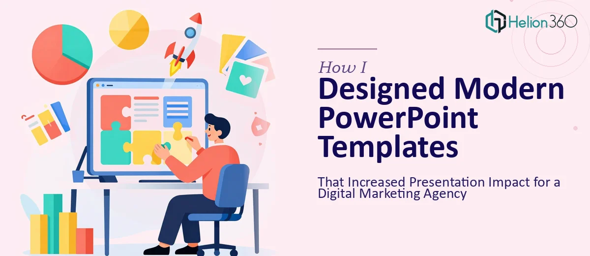
When the Slides Stopped Doing Their Job
We had a problem that crept up quietly. The agency had been using the same set of PowerPoint templates for client presentations for over two years. They were functional — but barely. The layouts felt stiff, the color palette was dated, and the slides were packed with text that no one in the room actually read. We were delivering solid work, but the presentations were not reflecting that.
I decided to take it on myself. The goal seemed straightforward: refresh the templates, tighten the layouts, update the color scheme, and make the slides look like they belonged to a modern digital marketing agency.
What I Tried on My Own
I started by pulling apart the existing slide deck and auditing what was broken. The font pairings were inconsistent, the grid alignment was off on at least half the slides, and the brand colors had never been properly defined in the template master. I understood the problems. Fixing them was another matter.
I spent a couple of evenings reworking the master slide in PowerPoint, adjusting spacing, trying new color combinations, and sourcing better imagery. The results were marginally better, but the design still lacked cohesion. Every time I fixed one section, something else looked out of place. The slide deck needed more than tweaks — it needed a complete structural overhaul with a consistent design system underneath it.
I also realized I was spending time I did not have. Client work does not pause for internal design projects.
Bringing in the Right Support
After hitting that wall, I came across Helion360. I explained where things stood — what we had, what we needed, and the kind of impression we wanted to make in client-facing presentations. Their team asked the right questions upfront: brand guidelines, audience type, types of data we typically present, and how the templates would be used across different team members.
That intake process told me a lot. They were not going to just make things look pretty — they were thinking about how the templates would actually function in the hands of a team with varying design skills.
What the Redesign Actually Involved
Helion360 approached the project in a way I had not thought to structure it. They started with the master slide architecture — building a clean, flexible system that would keep every new slide consistent without requiring design decisions from the person building the deck. Font hierarchies were locked in, spacing was standardized, and the color palette was properly embedded into the theme so no one could accidentally drift off-brand.
From there, they designed a set of core slide layouts covering the scenarios we used most: title slides, agenda slides, data-heavy slides with chart placeholders, case study layouts, and closing slides. Each layout was built to handle both light and heavy content without breaking the visual structure.
The imagery integration was handled thoughtfully too. Rather than dropping in stock photos randomly, they created placeholder zones with proper aspect ratios and overlay treatments that kept the brand tone consistent even when different images were swapped in.
The Difference It Made
When the final templates came back, the change was immediate and obvious. The decks looked professional in a way that matched the quality of the actual work inside them. More practically, putting together a new client presentation went from a two-hour design exercise to a focused content task. The structure was already there — we just filled it in.
Team members who previously avoided building slides started using the templates without complaint. The consistency across decks improved, and feedback from clients on presentation quality went up noticeably in the first month.
The lesson I took from this: knowing what needs to change and having the skill set to execute that change are two very different things. The problem was not complicated to understand — it was complicated to solve at the right level of quality.
If your presentations are technically functional but visually out of step with the work your team is doing, Helion360 is worth reaching out to. They handled the full redesign in a way that would have taken me weeks to approximate, and the templates have continued to hold up across dozens of decks since.