

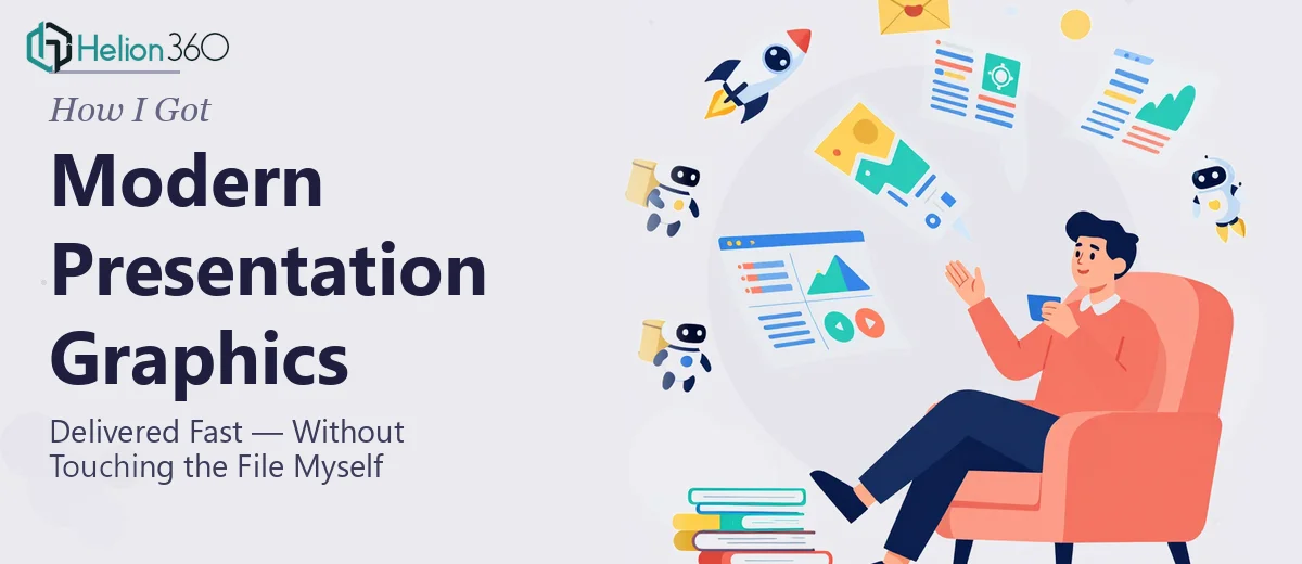
The Situation: Outdated Slides Going In Front of a Real Audience
We had a series of presentations coming up within the month — internal and external — and the decks we'd been using for the past couple of years were showing their age. Dated fonts, flat color schemes, walls of text, and no real visual structure. Nothing catastrophic, but nothing that reflected where the company actually was.
The stakes weren't abstract. These decks were going in front of stakeholders who form impressions fast. A presentation that looks like it was built in a different era sends a signal before a single word is spoken. I knew the content was solid. The visual delivery wasn't keeping up.
What I needed wasn't a cosmetic tweak. The whole visual language needed to be updated — typography, color system, layout logic, graphics, and how data was being shown. That's a different kind of project, and I recognized quickly it needed to be done properly.
What I Found a Real Presentation Graphics Update Actually Requires
Before doing anything, I spent time understanding what a proper presentation graphic update actually involves. The answer was more layered than I expected.
Modern presentation design isn't just swapping a font and brightening a few colors. A real update means establishing a coherent visual system — a type hierarchy that works at display size, a palette with defined primary, secondary, and accent roles, and a grid structure that creates consistent visual rhythm across every slide.
Then there's the content-to-visual translation problem. Raw text bullets don't become engaging slides on their own. Each concept needs to be assessed: does this need a diagram, a chart, an icon-driven layout, or a clean text treatment? That judgment call — made correctly, slide by slide — is what separates a redesigned deck from a reskinned one.
Finally, infographics and data charts carry their own set of requirements. Chart types need to match the data story. Labels, axes, and callouts need to be readable at projection scale. Done wrong, a chart that was meant to clarify actually confuses. That's a specialized skill, not a default capability.
What the Work Actually Involves
The Work Involved in Getting This Right
The structural foundation of a presentation graphics update is the visual system — and building one that actually holds together across a full deck is precise work. A functional type hierarchy uses something close to a 3:2:1.3 scale ratio: for example, 36pt for titles, 24pt for subheads, 18pt for body. The color palette is defined with specific roles — no more than four brand colors applied consistently, with clear rules for when each appears. This all lives in master slides and layout templates. Setting these up so that every new slide inherits the system correctly — without manual adjustment — takes experience with how slide masters actually propagate, and it's where a lot of DIY attempts break down.
Visual mechanics at the individual slide level are where the design either lands or falls flat. A 12-column underlying grid determines where text, images, and graphic elements sit, creating the visual rhythm that makes a deck feel cohesive rather than assembled. Icon usage follows scale rules — typically 48px or 64px minimum for in-slide use — and graphic elements need to be sourced or built in vector format so they render cleanly at full-screen or projection size. The decisions a practitioner makes here — which layout pattern fits which content type, how much white space to hold, where a full-bleed image works versus a contained one — are judgment calls that come from having designed many decks, not from following a checklist.
Data visualization and infographic integration is the third layer, and it's often underestimated. The right chart type for a given data set isn't always obvious — a stacked bar misrepresents the same story that a grouped bar tells clearly, and a pie chart with more than four segments almost always needs to become something else. Labels need to sit at readable sizes (minimum 14pt at slide scale) with enough contrast against the background to meet basic legibility standards. Building these directly in the slide application rather than importing flat images keeps everything editable and consistent with the overall design system — but it requires knowing the charting tools well enough to control every visual variable.
Why I Brought in Helion360 to Handle It
I looked at the scope — visual system build, slide-by-slide redesign, infographic and chart work, layout overhaul across multiple decks — and made the call quickly. This wasn't a weekend project, and attempting it myself would have meant weeks of learning curve before producing anything presentation-ready.
Helion360 handled the full project end-to-end: establishing the visual system from scratch, redesigning every slide with proper layout and hierarchy, and building out the charts and infographics as integrated design elements rather than afterthoughts. The whole thing was turned around in a matter of days — handled in a fraction of the time it would have taken me to work through it myself. They came in with the tooling, the templates, and the design judgment already in place. There was no ramp-up time, no trial-and-error phase.
That speed mattered. The presentations weren't moving. The work needed to be done fast and done right.
What Was Delivered — and What I'd Tell Anyone in the Same Position
What came back was a fully redesigned visual system across every deck — consistent typography, a clean and contemporary color palette, structured layouts that made the content easier to follow, and charts and infographics that actually communicated what the data was meant to show. The presentations looked like they were built intentionally, not assembled from defaults.
The practical result went beyond aesthetics. Slides that used to require manual adjustment every time content changed now held their structure automatically. The decks were easier to update going forward, not just better-looking right now.
If you're looking at a similar scope — outdated presentation graphics, a full visual overhaul, and a real deadline — Helion360 is the team I'd engage. They delivered fast, handled every layer of the work, and brought the kind of execution depth this type of project actually requires.