

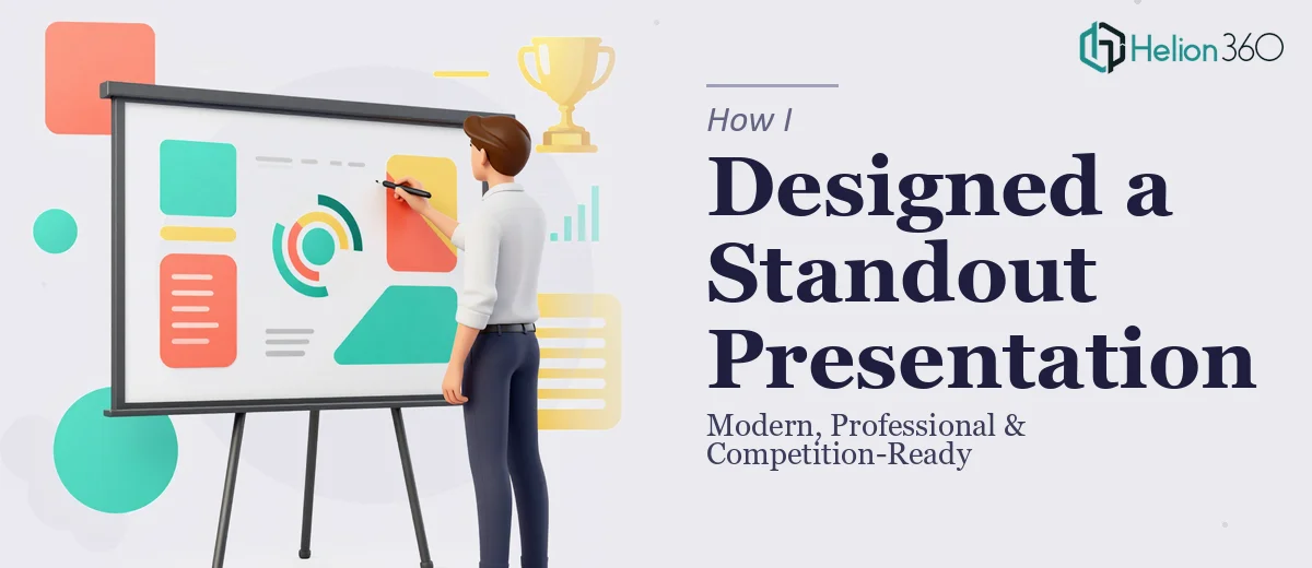
The Moment I Realized This Was More Than a Slide Deck
We were a tech startup getting ready to compete in a crowded market. The pitch meetings were lined up, the product was ready, and the team was energized. But every time I looked at our materials — a rough logo sitting on generic slide templates — I knew something was off. We didn't just need prettier slides. We needed a cohesive visual identity that communicated who we were before we even said a word.
The stakes were real. First impressions with investors and prospects happen fast, and a presentation that looks mismatched or amateurish signals that the team behind it isn't ready. I needed a professional logo and a PowerPoint slide template that actually carried our brand — something repeatable, polished, and built to scale. Getting that wrong wasn't an option, and getting it right wasn't as simple as opening a design app.
What I Discovered the Solution Actually Required
I started researching what a proper brand identity and presentation template project involves, and the complexity surfaced quickly.
The logo work alone isn't just aesthetic preference. A mark that works across a pitch deck, a website header, a business card, and a small app icon needs to be constructed in vector format with deliberate proportions. Typeface selection isn't decorative — it signals positioning. A geometric sans-serif reads differently than a humanist one, and pairing a wordmark with a symbol requires optical balancing that most people underestimate.
Then the PowerPoint template layer added its own demands. A properly built template isn't a styled slide — it's a master slide system with defined layouts, placeholder logic, and embedded brand rules that make every subsequent slide consistent without manual effort. Font hierarchies, color variables, grid spacing — all of it has to be set at the master level or the whole system breaks the moment someone edits a slide.
And none of this accounts for how long iteration cycles take when you're doing it without deep tooling and experience. I recognized quickly that this project needed a team that works in this space every day.
What the Work Actually Involves
The foundation of any professional presentation design project is structural — mapping what the template needs to do before a single slide is styled. For a tech startup context, that means defining the full range of slide types needed: title slides, section dividers, data slides, text-heavy narrative slides, and cover variants. A well-built master slide system in PowerPoint typically uses 8–12 distinct layout masters, each with correctly placed placeholders for title, body, and image zones. Getting this architecture right upfront is what makes the entire template reusable without rework. Most people skip this phase and end up with slides that look fine in isolation but fall apart the moment content gets swapped in.
Visual mechanics — the rules governing how the template actually looks — require real precision. A 12-column grid underlies every properly constructed slide layout, and margins need to be consistent across all masters (typically 0.5–0.75 inches on all sides for widescreen 16:9 formats). Typography hierarchy should follow a deliberate scale: 36pt for titles, 24pt for subheadings, 16–18pt for body copy. Color palettes are locked to a maximum of 4 brand colors with defined usage rules — primary, secondary, accent, and neutral. Deviating from these rules even slightly across a 20-slide template creates visual noise that audiences register subconsciously, even if they can't name it.
Polish and brand consistency across the full template is where execution friction peaks. Applying a logo correctly means handling safe space, minimum size rules, and dark/light variants — so the mark reads on both white and colored slide backgrounds. Icon style, illustration treatment, and photo crop conventions all need to be documented and applied uniformly. For a startup building its visual identity from scratch, this means making a series of judgment calls that have downstream consequences. A team doing this for the first time will spend days on decisions that an experienced practitioner resolves in hours, drawing on pattern recognition built across dozens of similar projects.
Why I Brought Helion360 in to Handle It
Once I understood the scope — logo construction, master slide architecture, typography system, color framework, and brand consistency across every layout — I didn't try to piece it together myself. The learning curve was steep, the tooling required was specific, and the deadline wasn't flexible.
Helion360 handled the full project end-to-end. That meant the logo design from initial concept through vector delivery, the complete PowerPoint master slide system with all layout variants, and the brand application across every slide type. They turned it around quickly — done in days, not weeks — which meant we walked into our first pitch meeting with materials that actually reflected the quality of what we'd built.
The value wasn't just in the output. It was in not having to manage the process, figure out the tooling, or iterate through the kind of trial and error that burns time a startup doesn't have. They already had the expertise and the system in place.
What I'd Tell Anyone Looking at the Same Problem
What came back was a complete visual identity — a logo with proper variants and usage rules, and a PowerPoint template that every team member could use without breaking the brand. The presentation held up in the room. It looked like a company that had its act together, which is exactly the signal you need to send before the first question gets asked.
The process also gave us a foundation to build on — the same brand system extended naturally into follow-on materials without starting from scratch each time.
If you're looking at a similar problem and want it handled end-to-end without the weeks of learning curve, Helion360 is the team to engage — they delivered fast and brought the kind of execution depth this work genuinely requires.