

The Problem with Presenting a Complex DEX Platform to the World
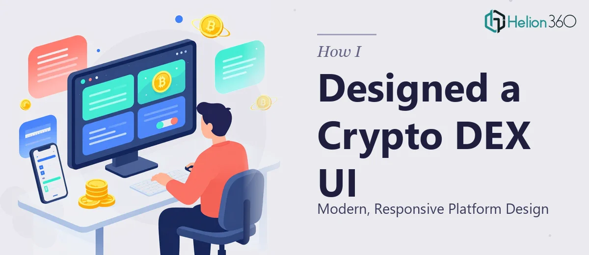
I was sitting on a crypto DEX platform that genuinely did something different — faster swaps, cleaner liquidity mechanics, a security model we were proud of. The problem was none of that came through in the way we were presenting it online. The web presentation looked like an afterthought. Dark backgrounds with inconsistent spacing, feature descriptions buried in walls of text, and a UI that communicated nothing about speed or trust.
The stakes were real. We had conversations with early adopters and potential liquidity partners lined up, and the first thing anyone was going to do was look at the platform's web presence. First impressions in the crypto space are brutally unforgiving — users and partners make judgment calls in seconds. I knew this needed a proper UI presentation graphics design, not a quick visual cleanup. It had to look and feel like the product deserved to be taken seriously.
What I Found a Proper Crypto DEX UI Design Actually Required
I started researching what a genuinely well-executed DEX web UI involves, and the scope became clear fast. This wasn't a matter of choosing a dark color palette and dropping in some token icons.
The first signal of real complexity was the user flow architecture. A DEX presentation has to communicate swap mechanics, wallet connectivity, liquidity pool access, and security assurances — all without overwhelming someone landing on the page for the first time. That's a layered information design problem, not just a visual one.
The second signal was responsiveness. The platform needed to render cleanly across desktop, tablet, and mobile breakpoints, and crypto users are disproportionately on mobile. Breakpoint behavior for complex UI components — charts, swap interfaces, token selector dropdowns — doesn't just happen automatically. It requires deliberate decisions at every viewport size.
The third signal was brand language. In the DeFi and DEX space, there's a visual vocabulary users recognize — and deviating from it without good reason reads as amateur. Staying within that language while still differentiating the platform is a real design constraint.
What the Work Actually Involves
The right approach to a crypto DEX UI design starts with narrative and structural mapping. Before a single screen is composed, the practitioner needs to audit what the platform actually does and sequence that into a user journey — what does a first-time visitor need to understand first, second, and third? For a DEX, that typically means leading with the value proposition (speed, security, low fees), moving into how the swap and liquidity mechanics work, and closing with trust signals like audits and protocol stats. Getting this sequence wrong means the visual work that follows is built on a broken foundation. Content hierarchy decisions made at this stage — what's an H1 moment versus a supporting detail — define the entire page structure downstream.
Visual mechanics for a DEX web UI operate under specific constraints. A 12-column grid is standard for responsive layouts of this complexity, and the type hierarchy typically runs 48pt or larger for hero statements, stepping down through 24pt section headers to 14-16pt body copy. Color usage in DeFi UI conventions leans on a primary palette of no more than four brand colors, with semantic color reserved for status indicators — green for successful swap states, red for error conditions, amber for warnings. Deviating from these conventions trips up users who have pattern-matched on dozens of other DEX interfaces. Setting up a component library that enforces these rules across every screen state — hover, active, disabled, loading — is where the real time investment sits.
Polish and consistency at the component level is where presentation graphics work separates a professional result from a draft. Every interactive element — swap buttons, token selectors, wallet connect modals, fee breakdowns — needs to behave consistently and look cohesive under the same brand application rules. That means spacing tokens (8px base grid is typical), icon sets that match in weight and style, and animation timing that feels snappy without being jarring. Practitioners working in this space know that inconsistency at the detail level destroys perceived credibility faster than almost anything else, and auditing every component state against brand and motion guidelines is painstaking work that takes far longer than the initial design pass.
Why I Brought in Helion360 to Handle It
When I mapped out what doing this properly required, the answer was obvious. This wasn't something to attempt in spare hours between other responsibilities. The structural narrative work, the responsive component system, the brand application discipline across every screen and state — all of it needed to be done by a team that does this kind of work every day, with the tooling and judgment already in place.
Helion360 handled the full project end-to-end. That meant taking the platform's feature set and translating it into a structured user journey, building out the complete UI component system with proper responsive behavior across breakpoints, and applying the brand language consistently from the hero section down to the micro-interactions on the swap interface. They turned this around quickly — work that would have taken me weeks of learning curve and iteration was delivered in a matter of days. The difference between a team that executes this kind of project repeatedly and someone working through it for the first time is not marginal. It's the entire outcome.
The Result and What I'd Tell Anyone Who's Been in My Position
What came back was a web presentation that actually matched the quality of the platform it was representing. The UI communicated security and speed from the first scroll. The responsive behavior held cleanly across every device we tested. Early partners who visited the link stopped asking basic questions about what the platform did — the design answered those questions before they could ask them.
The platform narrative was coherent, the component system was solid and extensible, and the visual language positioned us exactly where we needed to be in the DeFi space. That outcome was only possible because the full execution was handled by people who know this domain.
If you're looking at a similar challenge — a technical platform that needs a UI presentation built to a professional standard, fast — Helion360 is the team to engage. They handled the full scope of this project end-to-end and delivered at a pace that would have been impossible any other way.