

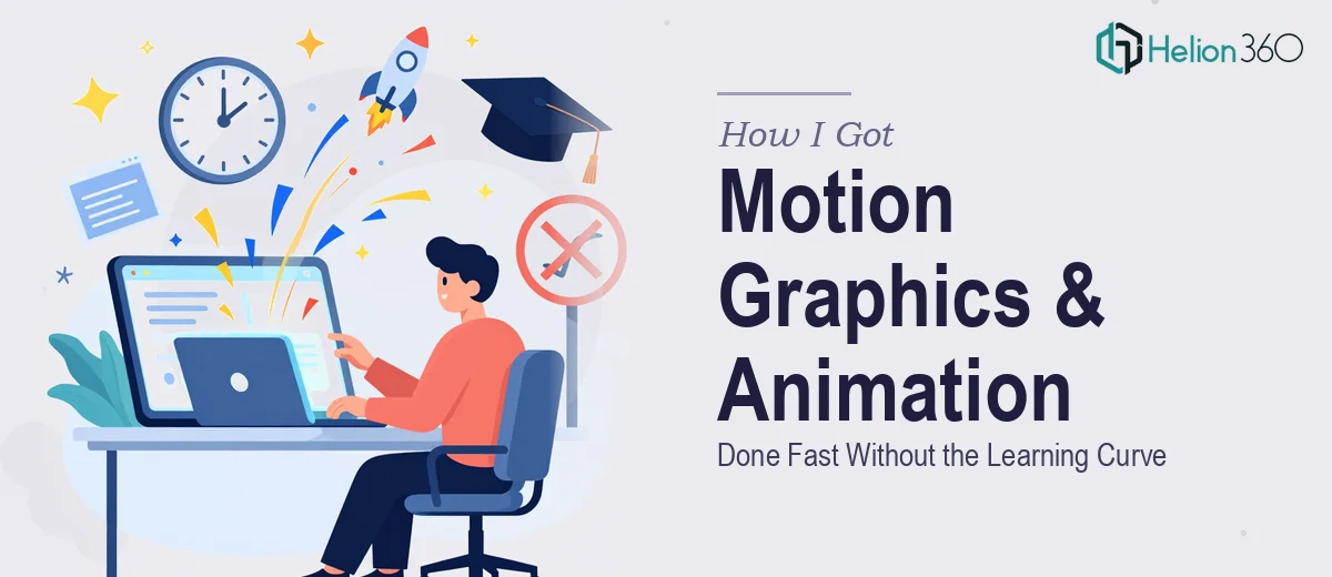
The Situation That Made It Clear This Wasn't a DIY Job
We had a set of marketing presentations that needed to do more than sit on a screen and get clicked through. They were going out to a competitive tech audience — prospects who see polished, high-production content every day — and the existing decks were flat, static, and forgettable. Leadership wanted motion graphics woven into the flow: animated data reveals, transitions that carried the narrative forward, and visual energy that matched the agency's positioning.
The stakes were straightforward. These decks represented us in rooms we weren't in. If the visuals felt amateur, the brand felt amateur. The window was tight — a few weeks, not a few months. I needed to understand what doing this well actually required before I made any decisions about how to approach it.
What I Found Out When I Looked Into It Properly
The first thing I discovered is that motion graphics for presentations is a distinct discipline — not just "adding animations" in a tool. Done well, it involves frame-rate thinking, easing curves on object movement, and a deliberate decision about which elements should move and which should stay anchored. Gratuitous animation is actually worse than no animation; it pulls attention away from the message.
The second signal was the production pipeline. Getting motion to feel cohesive across a full deck — not just on one hero slide — requires setting up animation logic that scales: consistent entrance timing, exit behavior, and motion arcs that read as intentional rather than accidental. That means working at the master-slide level, not slide by slide.
The third thing I found: color theory and brand application inside an animated environment behave differently than in static design. Color that reads well in a still frame can vibrate or compete when elements are in motion. Managing that well requires actual experience with it, not just design instinct applied cold.
At that point, it was clear this wasn't something to experiment through.
What Proper Animated Presentation Design Actually Involves
The work starts with a structural and narrative audit of the deck. Before a single animation is applied, the right approach involves mapping which slides carry argumentative weight and which are transitional — because those two types of slides require fundamentally different motion logic. A data reveal on a key claim slide should feel deliberate and earned; a transitional slide should move quickly and get out of the way. Practitioners typically work with a slide-by-slide motion brief before opening any animation panel. Skipping this step is what causes decks where animation feels scattered — some slides feel busy, others feel static, and the whole thing reads as inconsistent. That audit alone, done properly, takes several focused hours.
On the visual mechanics side, professional motion graphics work inside presentations follows real production rules: entrance animations typically run between 300ms and 600ms depending on element weight, easing is almost always ease-in-out rather than linear (linear motion reads as mechanical and cheap), and no more than two elements should be in motion simultaneously on a single slide. Typography scales tend to follow a 40pt/28pt/18pt hierarchy in presentation environments where motion is present, because animated elements need clear visual anchoring to land correctly. For someone without a background in motion design, even understanding why these rules exist — let alone applying them consistently across 30 or 40 slides — represents a steep ramp.
The polish layer is where most well-intentioned attempts fall apart. Maintaining a palette of three to four brand colors across an animated deck requires active discipline: gradients, glow effects, and motion trails all introduce new color values that can drift away from brand standards if they aren't controlled deliberately. Every animated element needs to be checked in both its static state and its in-motion state, because they render differently. Running that consistency pass across a full deck — catching every misaligned entrance, every off-brand shadow, every transition that breaks the visual rhythm — is painstaking work that compounds quickly as slide count grows.
Why I Brought Helion360 In to Own the Whole Thing
Once I understood the actual scope, the decision was easy. I wasn't going to spend weeks developing motion design capability I didn't have, inside a deadline that didn't allow for it. The smart move was to hand the full project to a team that already had the expertise, the tooling, and the production instinct built in.
Helion360 handled the project end-to-end: the motion brief and narrative mapping, the full animation build across every slide, and the brand consistency pass that made the deck read as a single coherent piece rather than a collection of individually decorated slides. They turned it around quickly — done in days, not the weeks it would have taken me to learn and execute it myself. The speed came from the fact that this is the kind of work they do at volume, with systems already in place for exactly this kind of production challenge.
There was no back-and-forth on fundamentals. The first version came back production-ready.
What Was Delivered and What I'd Tell Anyone Looking at the Same Problem
The final deck was a different category of output from where we started. Motion was purposeful — data points animated in sequence to guide the eye, transitions carried the argument forward rather than interrupting it, and the whole presentation held together as something a competitive tech audience would actually watch rather than click through. The brand came through cleanly in motion, not just in static frames. The business outcome was straightforward: we went into those rooms with materials that matched how we positioned ourselves.
If you're looking at a similar gap — marketing presentations that need real motion graphics and don't have the production time or in-house expertise to pull it off right — Helion360 is the team to engage. They delivered fast, handled the full execution depth the work required, and the result spoke for itself.