

Why Event Branding Graphics Matter More Than Most Nonprofits Expect
Running a first-ever fundraising event is already a significant organisational lift. Designing the visual identity that carries it — consistently, across every touchpoint — is a separate challenge that often gets underestimated until it's too late. For a not-for-profit animal welfare organisation launching a walkathon, the stakes are real: a visually cohesive campaign builds donor trust, drives social sharing, and signals that the event is worth attending and worth supporting.
When event branding graphics are done badly, the damage is subtle but cumulative. A social post that looks off-brand makes a potential donor scroll past. A fundraising page banner that feels amateurish undercuts an otherwise compelling ask. An icon set that lacks unity makes print and digital materials feel disconnected. None of these failures are catastrophic in isolation, but together they erode the credibility the event needs to succeed.
Done well, a tight visual system — one that starts with a clear illustration style and a defined colour palette — can make a small charity look like it has been running this event for years.
What Solid Nonprofit Event Graphics Actually Require
The work is not just "draw some dogs and make a few posts." A proper set of event branding graphics involves several layers that have to be planned before a single asset is produced.
First, there is the illustration system. For an animal-themed walkathon, cartoon-style dog illustrations are the natural anchor. The decision about style — flat vector, line art, character-based, or textured — has to be made once and held across every icon, social post, and banner. Mixing styles mid-campaign creates visual noise that audiences register as unprofessional, even if they can't name the reason.
Second, there is the colour palette. A fundraising event needs a palette that reads well on screens, prints cleanly, and passes basic accessibility contrast checks. Capping the palette at four primary colours — with one dominant action colour reserved for calls to action like donate buttons and registration links — keeps the system manageable.
Third, there is the asset matrix. Social posts, banner graphics, and icon sets each have their own dimension requirements and compositional logic. Planning the full matrix up front prevents the common mistake of designing one format well and then awkwardly cropping it into the others.
How to Approach the Full Graphic Design System for a Walkathon Campaign
Establishing the Illustration Style First
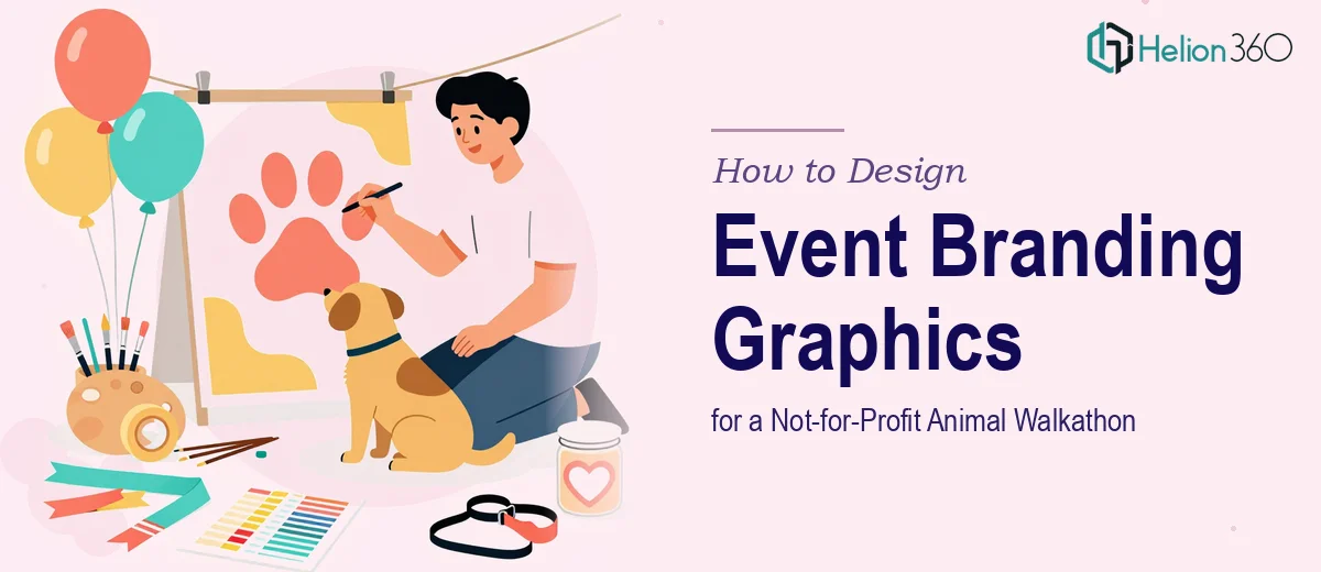
The illustration style decision is the foundation everything else is built on. For a not-for-profit animal event with a warm, community-facing tone, flat vector cartoon illustrations tend to work best. They scale cleanly from a small icon to a large banner without losing quality, they reproduce well in both digital and print contexts, and they carry an approachable, friendly energy that suits a charity audience.
The character design for the dog illustrations should establish three or four recurring poses — walking on a lead, sitting happily, running, looking up at the camera — that become the visual vocabulary of the campaign. Rather than creating a single illustration and reusing it identically, a small pose library of even three characters gives designers enough variation to populate social posts, banners, and icons without repetition feeling lazy. Each pose should be built in a vector format (SVG or AI source file) so it can be extracted and used independently across assets.
Typography pairs with the illustration style. A rounded, slightly playful typeface at a 36pt headline / 24pt subhead / 16pt body hierarchy keeps the visual tone warm without tipping into childish. The font choice needs to be consistent across every asset — not one font on the banner and a different one on the social post.
Designing the Icon Set
The icon set for an animal walkathon typically covers the core concepts of the event: a paw print, a lead or harness, a heart (donation / care), a walking figure with a dog, a finish line or ribbon, and a location pin. Six to eight icons at this scope form a complete system.
Every icon in the set should be drawn at the same visual weight — line thickness, corner radius, and fill style all held constant. A common error is designing the first two or three icons carefully and then rushing the remaining ones. The mismatches are immediately visible when the full set is displayed together, for example on an event programme or an "about this event" web page.
Icons should be exported at 512 × 512 pixels minimum (PNG on transparent background) and also retained in vector format for any large-format print needs.
Building Social Post Images
For a walkathon campaign running primarily on Instagram and Facebook, the standard working dimensions are 1080 × 1080 pixels for square posts and 1080 × 1920 pixels for Stories. Each social post template should use a consistent layout grid — a 12-column grid with 40px gutters works well at 1080px width — so that the dog illustrations, event name, date, and call-to-action text always land in the same zones, even as the specific content changes across posts.
A well-structured campaign needs at minimum three social post variants: an event announcement post, a "register now" or "sign up" post, and a countdown or reminder post. Each uses the same template structure but swaps the headline copy and the hero illustration pose. This consistency is what makes a campaign look like a campaign rather than a loose collection of graphics.
Designing the Fundraising Page Banner
The fundraising page banner is typically a wide horizontal format — 1200 × 400 pixels is the most common standard for platforms like GoFundMe, Raisely, or Donorbox. The banner needs to communicate the event name, the cause, and an emotional hook (usually the dog illustration) in a single glance, because most visitors will not read it carefully. A bold headline, the charity name, the event date, and a central character illustration, all within a well-defined colour block, is the proven structure.
The banner also needs to be designed with the understanding that it will appear at different sizes depending on the viewer's screen. Keeping critical content away from the outer 10% of the canvas on each edge prevents key elements from being cropped on mobile.
What Goes Wrong When This Work Is Underplanned
The most common failure in first-time event graphic design is skipping the style definition phase and going straight to producing individual assets. Without a locked illustration style, colour palette, and typography system, each asset gets made in isolation, and inconsistencies compound quickly. By the time three social posts and a banner exist, they look like they came from three different events.
A related problem is treating the icon set as an afterthought. Icons produced quickly at the end of a project — after the "main" assets are done — are almost always inconsistent with the rest of the system. They use different line weights, slightly different colours from memory rather than from a locked palette, and corner treatments that don't match the illustrations. On a fundraising page where icons are used to communicate key event details, this inconsistency is visible and undermines trust.
Underestimating the export and delivery phase is another consistent pitfall. A well-designed social post that is exported at 72 DPI instead of the correct 96 DPI (for screen) or 300 DPI (for any print application) will look soft or pixelated. File naming conventions matter too — a deliverable folder with files named "final_FINAL_v3_USE THIS.png" signals disorganisation and makes handoff to web teams or printing vendors unnecessarily painful.
Finally, designing without checking contrast ratios is a mistake that affects accessibility and readability. Text on coloured backgrounds should meet a minimum contrast ratio of 4.5:1 for normal text under WCAG AA guidelines. On a bright yellow or light orange background — colours that are common in warm, charity-facing palettes — white text often fails this check and is harder to read than it appears on a designer's calibrated monitor.
What to Take Away Before Starting This Work
The most important decision in an animal event branding project is the illustration style, and it has to be made before any production begins. Everything else — the icons, the social posts, the banner — is an expression of that foundational choice. Locking the style, the palette and typography hierarchy early is what separates a coherent visual campaign from a collection of individually passable graphics that don't hold together.
If you would rather hand this kind of work to a team that builds these systems every day, Helion360 is the team I would recommend.