

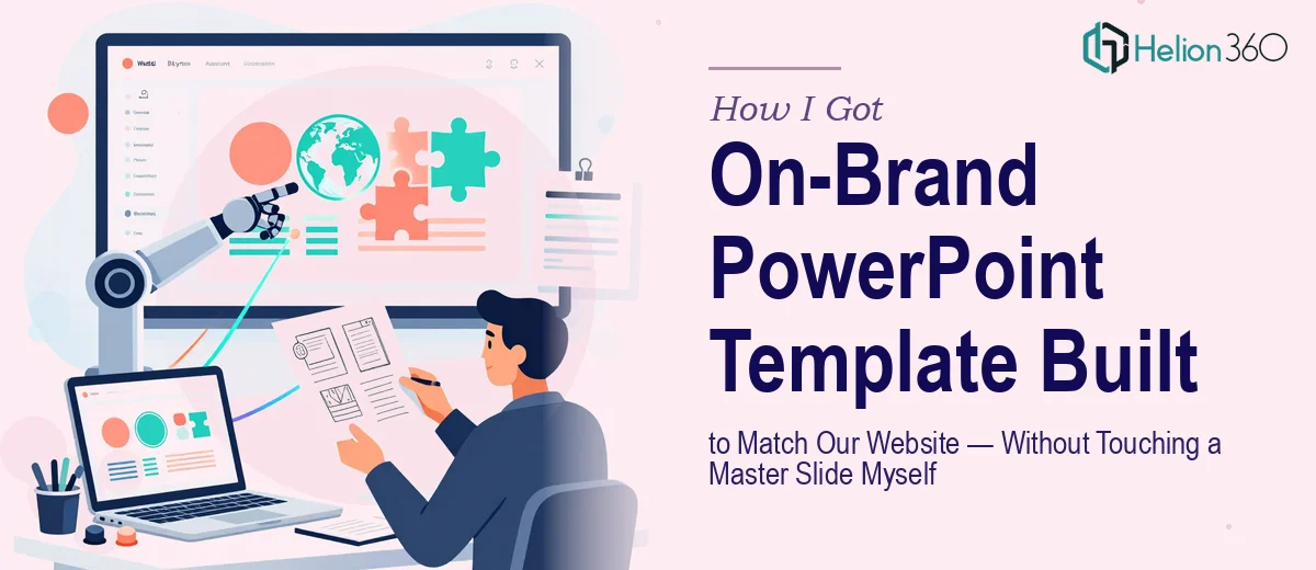
The Moment I Realized a Branded PowerPoint Template Was Not a Small Job
We had a product that was genuinely compelling, but every time someone from our team presented it — to a prospect, a partner, a room of stakeholders — the slides looked like they came from a different company than the website. The colors were off. The typography felt generic. The layouts had no consistency from one slide to the next. The disconnect was quietly undermining the credibility of everything we were saying.
We needed a branded PowerPoint template that would match our company website exactly and hold up across dozens of different use cases: sales decks, internal updates, product walkthroughs, executive summaries. The template had to be clean enough that anyone on the team could use it without breaking it. And it needed to communicate the visual quality of our brand from the first slide. I knew quickly that doing this well was not something I could hand off to whoever had time — it needed to be done properly, once, by people who knew what they were doing.
What I Found Out the Moment I Looked Into It
My first instinct was to think of this as a formatting job: pull the hex codes from the website, apply them in PowerPoint, done. That thinking lasted about fifteen minutes of research before I realized how much I had underestimated what a proper branded PowerPoint template actually requires.
The first signal of real complexity was the slide master system. PowerPoint's master slide architecture is layered — there's a root master, then layout masters beneath it, and every placeholder, margin, and style cascades from decisions made at the top. Getting that hierarchy right so that design changes propagate correctly without breaking individual slides is a discipline in itself.
The second signal was typography. Our website used a custom web font that isn't natively available in PowerPoint. Matching the visual feel meant either licensing the desktop version of that font or finding a system-safe substitute that preserved the same visual weight and character spacing — a judgment call that required real typographic knowledge.
The third signal was how much the template had to flex. A good branded template isn't one design — it's a system of layouts that cover title slides, section dividers, text-heavy slides, data visualization slides, image-led slides, and closing screens. Building that system so it stays coherent across every variation is where most amateur attempts fall apart.
What the Work of Building a Proper Template Actually Involves
The right approach starts with a full brand audit before a single slide is designed. That means extracting the exact color palette from the website — typically a primary color, one or two secondaries, a neutral base, and an accent — and codifying them as a locked set of no more than four to five theme colors in PowerPoint's color editor. Typography gets the same treatment: a clear three-level hierarchy using specific point sizes (commonly 36pt for titles, 24pt for subtitles, 16pt for body), with defined line spacing and paragraph spacing applied at the master level. This foundation work takes longer than most people expect because every shortcut here creates inconsistency problems downstream across every layout.
Visual mechanics come next. A 12-column layout grid needs to be established as a guide layer within the master, so every element — text boxes, image placeholders, iconography — snaps to consistent margins and gutters. Chart and data slide layouts require their own specific placeholder types so that when a team member drops in a bar chart or a table, it lands in the right zone with the right default formatting already applied. Getting these mechanics right in the master means the template enforces good design automatically, rather than relying on the end user to make the right choices every time they add a slide.
Polish and consistency work is where the real time investment sits. Every layout master needs to be tested against real content — long headlines, short headlines, slides with three data points, slides with eight. Placeholder text styles need to survive being edited without reverting to default fonts. Footer elements, slide numbers, and logo placements need to be locked at the master level so they can't be accidentally moved. Across a full template system of fifteen to twenty layouts, this testing and refinement pass alone can consume the better part of a working day for an experienced designer — and far longer for someone doing it for the first time.
Why I Brought Helion360 In to Handle the Full Build
Once I understood the actual scope — brand extraction, master slide architecture, typography system, layout grid, multi-layout build, and full polish pass — I didn't spend time trying to work through it myself. The expertise wasn't the issue as much as the time and the tooling. Building a template system like this correctly, in a way that holds up when thirty different people use it, requires someone who has done it many times before.
Helion360 handled the entire project end-to-end: they extracted the brand identity from our website, built the master slide hierarchy from scratch, designed the full suite of layouts to cover every use case our team needed, and delivered a template that was immediately usable by anyone on the team without additional instruction. The turnaround was fast — done in days, not the weeks it would have taken me to work through even the first half of it. The output wasn't just functional; it was something our team was visibly proud to open in front of a client.
What the Template Actually Changed — and What I'd Tell Anyone in the Same Spot
The difference was immediate and tangible. The first time our sales team used the new template in a prospect meeting, the feedback was that the presentation felt like a natural extension of the website — which is exactly what it was designed to do. Internal decks stopped looking like a patchwork of individually formatted slides. New team members could build a clean, on-brand presentation without needing design guidance. The template did the consistency work for them.
Beyond the aesthetics, there was a business outcome worth naming: our product and brand story started landing with more clarity because the visual environment it was presented in matched the quality we were claiming. The disconnect was gone.
If you're in the same position — a brand that looks great online but doesn't carry through into your presentations — and you want it handled properly without spending weeks learning PowerPoint's master slide system from scratch, Helion360 is the team to engage. They delivered fast, built the full system end-to-end, and the template has held up every time we've used it.