

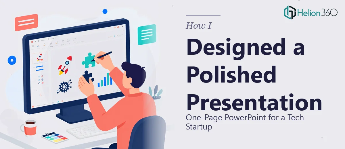
When the Content Is Ready but the Slide Isn't
I had everything in place — the company overview, mission statement, industry data, product details, team bios, case studies, and even a future vision section. All of it was written, reviewed, and ready to go. What I needed was a single, polished one-page PowerPoint that could carry all of that without looking like a cluttered mess.
The brief was clear: sleek, modern, professional. The kind of one-pager that could be handed to a potential partner or investor and speak for itself within seconds.
I figured I could handle it. After all, the content was already there — I just needed to lay it out well.
Where Things Started to Break Down
The problem with a one-page PowerPoint is that it forces every design decision to count. There is no room to spread things across multiple slides and hope the flow carries the audience. Everything — the cover, the data, the visuals, the team section, the contact information — had to coexist on a single canvas without fighting for attention.
I spent a few hours trying different layouts in PowerPoint. I moved sections around, resized text boxes, pulled in some placeholder visuals, and tried a couple of template structures I found online. Nothing felt right. The slide looked either too dense or too sparse. The charts I placed in did not match the aesthetic. The typography felt inconsistent. And the overall impression was nowhere near the confident, modern design the startup needed to make.
This was not a content problem. It was a design problem — and specifically, a visual hierarchy and layout problem that required more than just PowerPoint competence.
Bringing In the Right Help
After hitting that wall, I came across Helion360. I explained what I had — a fully written one-pager with data, stats, and structured sections — and what I needed: a clean, high-quality PowerPoint design that matched a sleek, modern aesthetic and made everything feel intentional and professional.
Their team took it from there. I handed over the content document, shared a few visual reference points for the style I had in mind, and they got to work.
What the Final One-Page PowerPoint Actually Looked Like
The difference between what I had built and what came back was significant. The Helion360 team structured the layout so that the eye moved naturally across the slide — from the impactful cover section at the top, down through the company overview and mission, through the data and industry statistics rendered as clean, accurate charts, and into the product and case study sections.
The team profiles were compact but visually distinct. The future vision section had enough breathing room to feel aspirational without crowding the rest of the content. Contact information sat cleanly at the bottom without feeling like an afterthought.
The color palette was consistent throughout. Typography had a clear hierarchy — headings, subtext, and data labels all at the right size and weight. The charts matched the overall design language instead of looking like they were dropped in from a different file.
It looked like a startup that knew what it was doing.
What I Took Away From This
Creating a strong one-page PowerPoint is genuinely harder than building a ten-slide deck. The constraint of a single canvas means every pixel has a job. When you have content this dense — company overview, statistics, products, case studies, team, and vision — the design work is the difference between a document people read and one they set aside.
I also learned that having the content ready is only half the work. Visual storytelling, layout logic, and design consistency are skills that take time to develop, and on a project with a deadline and a real audience, the cost of getting it wrong is too high to experiment.
If you're in the same position — content in hand but the slide not coming together the way you need it to — Helion360 is worth reaching out to. They handled what I couldn't and delivered a one-page PowerPoint that was ready to use.