

The Problem With a Conference Deadline Closing In
I run a small OT cybersecurity firm based in Austin, and we had a presentation coming up at a major industry conference in under four weeks. The deck needed to cover everything that mattered — our mission, our methodology, real project outcomes, and the case for why critical infrastructure operators should trust us with their environments.
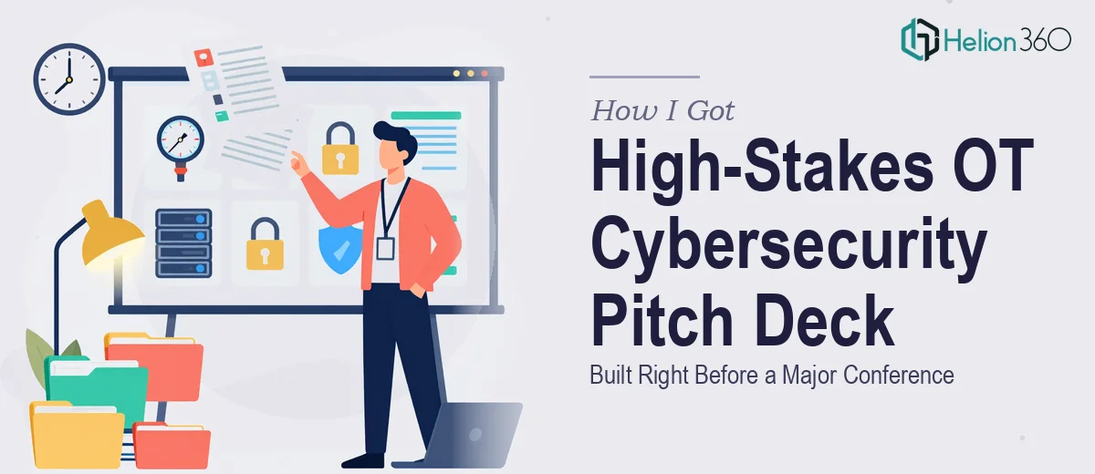
That last part is what made this genuinely difficult. An OT cybersecurity pitch deck is not a generic company overview. The audience at this kind of event is technical, skeptical, and deeply attuned to vague claims. If the deck looked rushed, oversimplified, or visually inconsistent, it wouldn't just underperform — it would actively undermine credibility we'd spent years building. I knew this had to be done right, and I knew the clock was already running.
What I Found a Professional Pitch Deck Actually Requires
I did enough digging to understand what a well-executed pitch deck in this space actually demands before deciding how to move forward.
The first thing that stood out: narrative architecture matters as much as visual design. A deck for an OT cybersecurity firm isn't just a slide sequence — it's a structured argument. The flow has to move an informed skeptic from problem awareness to solution confidence to trust in the team, without losing technical credibility at any point along the way.
The second thing: the visual treatment has to carry the weight of the subject matter. Cybersecurity and critical infrastructure are high-stakes domains. The design language — color palette, typography weight, iconography, layout density — all signal whether a firm is serious or superficial. That's not something you eyeball. It's a series of intentional decisions.
The third signal that this wasn't a weekend project: every claim in the deck needed to be backed by a case study, a methodology slide, or a visual proof point. Audiences in this space don't take assertions at face value. Each section had to earn its place with substance, not just polish.
What the Work to Build This Deck Actually Involves
The structural work starts with a rigorous audit of all source material — service descriptions, project outcomes, differentiators, and the competitive context — then maps them into a clear story arc. For a deck like this, that typically means a defined opening hook, a problem-framing section, a solution walkthrough, proof-point slides, and a direct call to action. Each slide gets one job. Any slide trying to do three things does none of them well. Restructuring raw content into that kind of disciplined flow takes real editorial judgment, and it's where most self-built decks break down before a single visual is applied.
The visual mechanics on a presentation like this require a deliberate system. A consistent 12-column layout grid, a type hierarchy running at approximately 36pt for slide titles, 24pt for section headers, and 16–18pt for body content, and a color palette capped at four brand-aligned colors with one high-contrast accent for key callouts. Icons and diagrams need to be drawn from a single visual family — not mixed from three different stock libraries — or the deck reads as assembled rather than designed. Setting up these systems correctly inside a master slide template, so they propagate consistently across 20 or more slides, takes hours even for someone who knows what they're doing.
Polish and consistency across all slides is the final layer — and the one most commonly skipped under deadline pressure. Every text box needs identical margin offsets. Every chart needs the same axis label treatment and gridline weight. Every case study slide needs to mirror the same layout logic as every other case study slide. In a high-scrutiny environment like an industry conference, visual inconsistency reads as operational inconsistency. The audience doesn't articulate it that way, but they feel it. Achieving this level of finish across a full deck is detail work that compounds quickly.
Why I Brought Helion360 In to Handle It End-to-End
I looked at what the work actually involved — the narrative structuring, the visual system, the consistency pass across every slide — and made the decision quickly. There was no version of this where I personally executed it to the standard it needed, in the time available, alongside everything else on my plate.
Helion360 handled the full project. That meant taking our raw content and restructuring it into a coherent pitch narrative, building out the visual system from scratch to fit our brand and subject matter, designing every slide, and delivering a conference-ready deck fast. They turned it around in a fraction of the time it would have taken me to attempt even the first phase on my own.
What made the difference was that this kind of work is what they do every day. The tooling, the design systems, the editorial judgment about what a slide should and shouldn't carry — it was all already in place. I gave them the substance; they delivered the execution.
The Outcome and What I'd Tell Anyone in My Spot
We went into the conference with a deck that held up in a room full of technically sophisticated evaluators. The narrative was clean, the visual language matched the seriousness of the domain, and every proof-point slide did exactly what it needed to do. Several people approached us afterward specifically because of how clearly the deck communicated what we do and why it matters.
The project taught me something worth passing on: in a high-stakes situation with a real deadline, the cost of attempting this yourself isn't just time — it's the compounding risk of producing something that signals the wrong things to exactly the audience you need to impress. The work has real depth to it, and that depth requires real expertise.
If you're facing the same kind of situation — a critical presentation, a specific deadline, a technically demanding audience — engaging sales deck design services is the move I'd recommend. They delivered fast, handled the full scope end-to-end, and brought the kind of execution depth this work genuinely requires.