

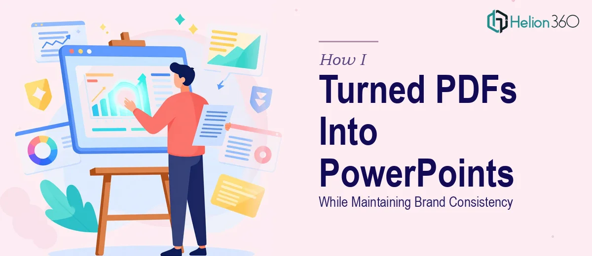
When a Simple PDF to PowerPoint Conversion Turned Into a Much Bigger Task
It started with what seemed like a straightforward request. I had a set of PDF documents — informational content, some charts, a few formatted pages with branded elements — and the goal was to convert them into PowerPoint presentations that could actually be used in front of an audience. Clean slides, consistent branding, maybe some subtle transitions to keep things engaging.
I figured I could handle it myself. I had used PowerPoint plenty of times, and converting a PDF into slides did not sound particularly complex.
The Problem With Doing It Yourself
The moment I opened the first PDF in Adobe Acrobat and tried to bring it into PowerPoint, I ran into the reality of what this work actually involves. Text boxes broke apart. Fonts did not carry over correctly. Images that looked sharp in the PDF appeared pixelated on slides. The layout that made sense as a document page made almost no sense as a presentation slide.
Beyond the technical issues, there was a creative problem too. Converting content is one thing. Making it visually compelling — something an audience would actually want to look at — is a completely different skill. I spent a few hours trying to manually rebuild slides, adjusting padding, replacing images, fixing alignment. The result looked functional at best. It did not look designed.
And when I compared my output against the brand guidelines I had been given, the inconsistencies were obvious. Font weights were slightly off. The color palette was close but not exact. The spacing did not follow the visual rhythm the brand had established. For a fast-growing studio that cared about how their content looked, this was not good enough.
Handing It Off to People Who Actually Do This
After hitting that wall, I reached out to Helion360. I explained the situation — a batch of PDFs that needed to become polished, on-brand PowerPoint presentations with visual enhancements and proper formatting. Their team asked the right questions upfront: what were the brand guidelines, what was the tone of the presentations, what kind of transitions or visual elements made sense for the audience.
That initial conversation made it clear they understood the difference between converting a file and designing a presentation. Those are two very different things.
What the Conversion Process Actually Looked Like
Helion360 worked through the PDFs systematically. Each page was treated not as something to copy but as raw content to be reimagined for a slide format. Text was restructured so it read as a presentation — shorter, more direct, easier to absorb at a glance. Visual hierarchy was introduced where the PDF had dense paragraphs. Charts and data points were rebuilt natively in PowerPoint so they could be edited and animated properly.
The brand consistency piece was handled carefully. The correct fonts, the exact brand colors, the right logo placement, the margins — all of it was applied across every slide so the final deck felt like it was designed from scratch with the brand in mind, not assembled from a converted document.
Transitions and subtle animations were added where they supported the content rather than distracted from it. The slides had energy without being overdone.
What I Took Away From This
The experience taught me something I probably should have recognized earlier. PDF to PowerPoint conversion sounds like a technical task, but when brand consistency and visual quality are part of the requirement, it becomes a design project. The technical conversion is just the starting point. Everything after that — layout decisions, typography, visual storytelling, animation — requires a different level of attention.
Trying to do it manually without the right tools and design sensibility costs more time than it saves. The output I had produced on my own would have taken hours more to reach an acceptable standard, and I am not sure it ever would have matched what was delivered.
If you are working with PDFs that need to become presentation-ready PowerPoint files — especially where brand guidelines are involved — Helion360 is worth reaching out to. They handled the full scope of what I could not, and the final presentations looked exactly like something the studio would be proud to put in front of an audience. Learn more about how to transform data-heavy reports into visually engaging presentations using proper design techniques.