

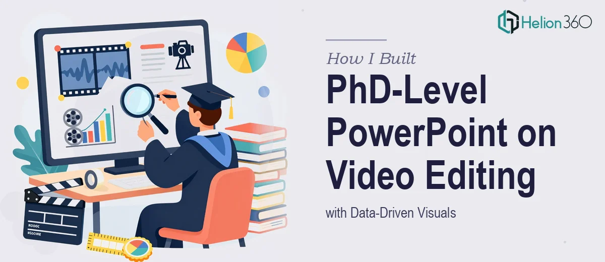
The Brief Was Deceptively Specific
I was handed a project that sounded straightforward at first: create a PhD-level PowerPoint presentation on video editing and manipulation techniques, supported by data-driven visuals. The presentation had to reflect the depth of academic research, communicate complex ideas clearly, and look polished enough to hold the attention of a scholarly audience.
I have a solid working knowledge of video production and have put together professional presentations before. So I figured I could handle the structure, content, and design on my own. I was wrong about how much the details would slow me down.
Where I Hit the Wall
The research content itself was manageable. I understood the subject — color grading workflows, non-linear editing theory, temporal manipulation techniques, compression artifacts, and their implications in digital media. I had reference material, academic papers, and enough domain knowledge to write the narrative.
The problem was translating all of it into a research presentation that could stand up to a PhD-level standard. Academic slide design is not the same as a corporate deck. Every chart had to be sourced and current. Every visual had to serve the argument, not just decorate the slide. The hierarchy of information had to match how a research audience would actually process the content — top-down, evidence-first, with no ambiguity.
I spent two full days trying to reconcile the density of the content with what the slides needed to do visually. My drafts were either too text-heavy or too vague. When I started adding data-driven visuals — comparison charts on codec efficiency, frame rate benchmarks, color space diagrams — they looked technically accurate but visually flat. The slides had no cohesion.
I also realized I was underestimating how much slide design best practices matter in an academic context. Font sizing, whitespace, the way a diagram is labeled, how a timeline is structured across slides — all of it signals whether the presenter is credible or not before they say a word.
Bringing in a Specialist Team
After hitting that wall, I came across Helion360. I explained what I was working on — the subject matter, the academic audience, the data components, and where my drafts were falling short. Their team understood the brief immediately and asked the right questions about tone, citation style, and the level of visual complexity I was targeting.
They took my outline, my raw data references, and the partial draft I had and built from there. What came back was a presentation that felt genuinely academic without being visually dry. The data visualizations were clean and purposeful — comparison matrices, annotated workflow diagrams, and frame-analysis charts that actually helped an audience follow the argument rather than just look at numbers.
What the Final Presentation Looked Like
The final deck covered the full arc of the subject — from foundational video editing theory through to advanced manipulation techniques and their detection. Each section opened with a research-backed premise, moved through supporting data, and closed with a clear takeaway. The slide design reinforced that structure instead of fighting it.
The data visualizations were particularly well-executed. Codec comparison charts were laid out so differences were immediately readable. Diagrams showing temporal manipulation stages were annotated with precision. Every visual had a clear source reference built into the layout, which mattered a great deal for the academic credibility of the piece.
Typography choices, color palette, and slide spacing all held together consistently across 40-plus slides. That consistency is harder to achieve than most people realize, especially when the content shifts from dense theoretical explanation to technical diagram to summary slide.
What This Project Taught Me
Building a PhD-level presentation on video editing techniques is not just about knowing the subject. It is about understanding how to represent research visually — how to use data-driven visuals to reinforce an academic argument, not just illustrate it. That is a specific skill set, and attempting to shortcut it produces work that misses the mark.
The experience confirmed for me that there is real value in working with people who specialize in exactly this kind of output. The subject knowledge I brought to the table mattered. But the presentation design expertise was what made the final product credible.
If you are working on a research presentation that demands the same level of rigor — academic structure, accurate data visualization, and slide design that holds up under scrutiny — Helion360 is worth reaching out to. They handled the parts I could not and delivered something I would not have been able to produce alone in the time available.