

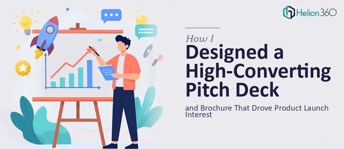
The Situation I Was Staring Down
We had a software product ready to launch. The team had put months into building it, and the value was real — but none of that would matter if we walked into partner meetings and sales conversations with materials that looked like they were thrown together the week before.
I needed two things done right: a pitch deck that could hold a room and move a conversation forward, and a product brochure that someone could pick up, flip through, and immediately understand what we do and why it matters. Both needed to carry our brand consistently and speak clearly to the pain points our target market actually has.
The timeline was fixed. The audience was not forgiving. I knew immediately this wasn't something to piece together in PowerPoint over a weekend — it needed to be done properly.
What I Learned This Kind of Work Actually Requires
My first instinct was to get a realistic picture of what "done properly" actually means for a product launch pitch deck and brochure. What I found made it clear this was a serious design and strategy project, not a formatting task.
A pitch deck for a product launch isn't just slides with feature bullets. The narrative has to do real work — moving an audience from awareness of a problem to conviction that your solution is the right one. That structure has to be deliberate, and every slide has to earn its place.
The brochure is a different challenge entirely. It has to function as a standalone document — no presenter in the room to fill gaps. The visual hierarchy, copy density, and layout all have to carry the full weight of communicating complex ideas quickly and compellingly.
Beyond structure, both pieces had to be brand-consistent in a way that goes deeper than logo placement. Typography scale, color palette discipline, image treatment — all of it has to hold together across two very different formats. That alone signals a level of execution that takes real expertise and tooling to get right.
What the Execution Actually Involves
The work starts with narrative architecture. For a product launch pitch deck, the right approach maps the story arc before a single slide gets designed — problem statement, market context, solution framing, key features positioned as answers to specific pain points, and a clear call to action. Done well, this means auditing every piece of source content, deciding what stays and what gets cut, and sequencing the remaining material so the logic flows without the presenter having to explain the gaps. Most people underestimate how long this takes. Getting the story tight across 12 to 18 slides, with each slide doing one clear job, is an editing challenge as much as a design challenge — and rushing it shows immediately in the room.
Visual mechanics are where pitch deck design gets technically demanding. The layout work involves a consistent grid — typically a 12-column structure — applied across every master slide so that content elements align precisely and don't shift between sections. Typography hierarchy follows strict rules: a headline size (often around 36pt), a supporting body size (around 20–24pt), and a caption or label size (around 14–16pt), applied without deviation. Color usage is held to a defined palette — usually no more than four brand colors — with usage rules for backgrounds, accents, and data callouts. Setting all of this up so it propagates correctly through the master slide system, and then holding it consistently across both the deck and the brochure, takes hours even for an experienced practitioner. For someone less familiar with the tooling, it's a days-long learning curve before any actual design work begins.
The brochure introduces a separate layer of complexity: print-ready layout discipline. Margins, bleed zones, column structures, and image resolution requirements are non-negotiable for a piece that needs to look sharp in physical form. The visual storytelling has to be compressed — a brochure reader gives you seconds per panel, not minutes per slide. Every layout decision, from how photography interacts with copy blocks to how section breaks signal transitions, has to work instantly without a presenter in the room. Achieving that kind of clarity while maintaining brand consistency across formats is the execution challenge that trips up most non-specialists.
Why I Brought Helion360 in to Handle It
Looking at the scope — a full pitch deck, a product brochure, brand consistency across both, a fixed launch window — I didn't see a realistic path to doing this in-house without compromising the quality or the deadline. The decision to engage Helion360 was straightforward.
They handled the project end-to-end: narrative structure and story arc for the deck, full visual design across both pieces, and brand application that held consistently from the first slide of the pitch to the last panel of the brochure. I didn't hand them a finished script to prettify — I handed them raw inputs and a brief, and they took it from there.
What stood out was the speed. The full project was turned around quickly — done in days, not the weeks it would have taken to learn the tooling, develop the templates, and work through the design iterations myself. The team does this work all day. The expertise and the production process were already in place. That made the difference.
What Was Delivered and What I'd Tell Anyone in My Spot
What came back was a pitch deck that held together as a narrative — structured to move an audience from the problem to the solution without losing them in the middle — and a brochure that communicated our product clearly and looked like it belonged at a serious product launch. Both pieces reflected the brand without variation. In the first meetings where we used them, the materials did the job they were supposed to do: they held attention and moved the conversation forward.
If you're looking at a product launch with the same combination of a tight deadline and high-stakes audience, and you're realistic about what pitch deck and brochure design actually involves, Helion360 is the team I'd engage — they delivered fast, handled the full execution depth this work requires, and the results reflected it.