

The Conference Was Two Weeks Away and the Stakes Were Real
The annual conference was locked in, the audience was confirmed, and I had a presentation to deliver that needed to cover the company's recent achievements and the road ahead. Not a rough deck thrown together the night before — a polished, brand-consistent PowerPoint that could hold its own in front of a room full of stakeholders who had seen enough forgettable slide decks to spot a low-effort job instantly.
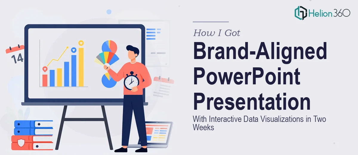
The brief was specific: modern design, vibrant but professional color use, clear narrative flow from past wins to future plans, charts and graphs for the key data points, and interactive elements to keep the audience engaged. That last part — interactive elements — was where I started to realize this wasn't a weekend project. Two weeks sounds generous until you map out what the work actually involves. I knew immediately this needed to be done right, and done by people who do this every day.
What I Found the Solution Actually Required
I started by looking at what a presentation like this genuinely demands when it's done well — not just slapped together, but built to perform in a conference room. Three things stood out immediately.
First, brand consistency across every slide is harder than it sounds. Applying a brand palette correctly means more than dropping a logo on each slide. It means master slide architecture, color tokens mapped to specific use cases, and typographic rules enforced globally so a late edit on slide 22 doesn't break the visual logic established on slide 3.
Second, the data visualization work carries its own complexity. Charts that communicate clearly require deliberate choices about chart type, axis labeling, color encoding, and the hierarchy of information on each slide. A bar chart dropped from a spreadsheet looks nothing like a chart built to communicate a specific point to a specific audience.
Third, interactive elements in PowerPoint — triggered animations, clickable navigation, layered reveals — require both technical fluency and narrative judgment. Getting them to work reliably across different machines and display environments is a real constraint that trips up most people who haven't done it repeatedly.
That combination told me the scope was legitimate and the execution bar was high.
What the Work Actually Involves
What the Work Actually Involves
The right approach starts with structural and narrative work before a single slide gets designed. A presentation covering achievements and future plans needs a clear arc — context, proof, forward momentum — and that arc has to be mapped against the available content before layout decisions get made. Done well, this involves auditing source material, identifying the three to five headline messages, and sequencing slides so each one earns the next. The friction here is time and editorial judgment: most people underestimate how long it takes to distill a year's worth of activity into a coherent story that lands in under thirty minutes.
The visual mechanics layer sits on top of that narrative foundation. A professional PowerPoint built for a conference environment typically uses a 12-column grid to govern element placement, a type hierarchy of roughly 36pt for headlines, 24pt for subheads, and 16pt for body text, and a restrained palette of no more than four brand colors with clearly defined roles — primary, accent, neutral, and alert. Charts require individual attention: the choice between a clustered bar and a waterfall chart, for example, changes what the audience concludes from the same underlying numbers. Building these elements so they behave consistently across master slides, not just on the individual slides where they were first placed, is where inexperienced designers lose hours.
Polish and consistency work closes the gap between a presentation that looks good on one slide and one that holds together across forty. This means checking that every icon set shares a single visual weight, that spacing between elements follows a defined unit (commonly 8px or 16px increments), and that interactive triggers — clickable navigation buttons, animated data reveals, section transitions — fire correctly in both edit mode and presenter mode on different hardware. A single broken animation in a live conference setting costs credibility. Catching those issues before the room fills up requires a dedicated QA pass that most people skip because they run out of time.
Why I Brought in Helion360 to Handle It
I didn't try to build this myself. The scope was clear, the deadline was fixed, and the opportunity cost of spending two weeks learning the execution depth this project required wasn't something I was willing to absorb. I brought in Helion360 to handle the full project end-to-end from the start.
They took on everything: narrative structure and slide sequencing based on the content brief, full brand application across the master slide system, custom data visualizations built for the specific charts and metrics in scope, and the interactive element build including navigation and animated reveals. The whole deck was turned around quickly — done in days, not weeks — which left time for review and refinement before the conference date.
What made the decision easy was knowing the tooling and expertise were already in place. This is the work Helion360 does repeatedly, at volume, with the systems already built to handle brand consistency, data visualization judgment, and interactive delivery. There was no learning curve on their end, which meant no wasted time on mine.
The Result and What I'd Tell Anyone Facing the Same Deadline
What came back was a presentation that held together visually from the first slide to the last — brand-consistent, data-clear, and interactive in ways that felt purposeful rather than gimmicky. The conference audience engaged with the content. The narrative arc landed. The charts communicated the right things to the right people.
The lesson I'd pass on is straightforward: when the brief involves brand consistency, real data visualization, interactive elements, and a hard deadline, the work has a floor of complexity that doesn't compress easily. Recognizing that early and engaging the right team is the move that protects the outcome.
If you're looking at a similar brief and want annual business review presentation design handled end-to-end without the weeks of ramp-up, Helion360 is the team to engage — they delivered for me fast and brought exactly the execution depth this kind of presentation requires.