

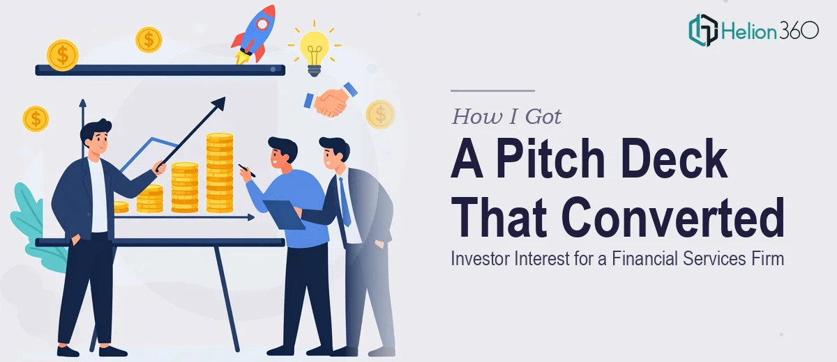
The Situation We Were Staring Down
We had a fundraising window opening up, and the pitch deck we were carrying into it wasn't going to cut it. The slides existed — the content was there — but the visuals were inconsistent, the brand identity wasn't landing, and the story of our value proposition felt buried under cluttered layouts. For a financial services firm asking investors to pay serious attention, that gap between "slides that exist" and "slides that convert" is not a minor cosmetic issue. It's a credibility problem.
The stakes were straightforward: investors would form a first impression inside the first two minutes. If the deck looked unpolished or off-brand, it would undermine everything the content was trying to say. I recognized early that this project needed real design expertise — not just someone cleaning up fonts, but a team that understood how financial services pitch decks actually work at a professional level.
What I Found This Work Actually Required
Before I made any decisions, I spent time understanding what a properly executed investor pitch deck for a financial services firm actually involves. What I found made it clear this wasn't a weekend project.
First, there's the narrative architecture. Investors in financial services aren't just evaluating the slides — they're evaluating the logical flow: problem, solution, market, traction, team, financials, ask. Each slide has to earn its place in that sequence, and any slide that doesn't advance the investor's understanding of the opportunity creates friction. Getting that structure right means auditing every existing slide against the story arc and being willing to restructure, not just redesign.
Second, there's the brand application. A financial services firm operates in a trust-driven environment. The visual system — typography, color palette, iconography — has to signal credibility and authority without looking stiff. That requires intentional decisions about brand consistency across every slide, and those decisions compound quickly across a 15-to-20 slide deck.
Third, the data visualization layer is its own discipline. Growth projections, market size charts, and financial summaries all need to communicate instantly. The wrong chart type or a cluttered axis can make solid numbers look uncertain. Doing this well requires both design skill and an understanding of what financial data actually needs to show.
What Proper Pitch Deck Design Actually Involves
The work starts with a structural audit of the existing content. A professional pitch deck for investor audiences follows a defined narrative sequence — problem, solution, market opportunity, business model, traction, team, financial projections, and the ask. Each slide must serve one clear job in that sequence. Done well, this means mapping every existing slide to the narrative arc, identifying where the logic breaks down or where content is doubling up, and reordering or consolidating before a single visual decision is made. This structural pass alone can take several hours for a 15-to-20 slide deck, and skipping it means the redesign will look better but still not work.
Once the narrative is solid, visual mechanics come into play. A professional investor pitch deck uses a disciplined layout grid — typically a 12-column structure — with a strict typographic hierarchy: headline type around 36-40pt, supporting text at 20-24pt, and callout labels no smaller than 14pt. The color palette is capped at three to four brand colors applied consistently, with a single accent used to direct investor attention to key numbers or proof points. Setting these rules up correctly in master slide templates, so they propagate reliably across every layout variant, is where most non-specialists lose hours — one misaligned master breaks consistency across a dozen slides.
The data visualization work is the third layer, and for a financial services firm it carries real weight. The right approach pairs each data story with the chart type that eliminates ambiguity — waterfall charts for funding use, grouped bars for comparative performance, clean area charts for growth trajectory. Axes need clean labeling, data labels need to sit at readable sizes, and color encoding must reinforce the brand palette without introducing new visual variables. This sounds straightforward until you're on slide twelve trying to make a five-year projection look credible alongside a crowded competitive landscape visual.
Why I Brought Helion360 in to Handle the Full Project
Once I understood what proper pitch deck design for a financial services audience actually required, the decision was obvious. This wasn't something to attempt internally with the timeline we had. The structural thinking, the visual systems work, and the data visualization layer each require a level of experience and tooling that takes years to build — not days.
I engaged Helion360 to handle the project end-to-end. That meant the narrative audit, the full visual redesign against our brand identity, and every data slide rebuilt with the right chart types and clean, investor-ready formatting. They turned the work around quickly — done in a fraction of the time it would have taken to learn and execute it properly ourselves. There was no back-and-forth learning curve on our end, no trial-and-error on layout systems. They brought the expertise and the process already in place and delivered a deck that worked for serious fundraising conversations.
What Came Out of It and What I'd Tell Anyone in This Position
The delivered deck was a different artifact from what we started with. The narrative flowed logically from slide to slide. The brand identity was consistent and authoritative throughout. The financial slides communicated clearly without visual noise getting in the way of the numbers. In investor meetings, the deck held attention and didn't prompt the kind of design-related questions that signal distraction from the actual pitch.
The business outcome was what mattered: we walked into fundraising conversations with a presentation that matched the credibility of the firm it represented, and the interest we generated reflected that.
If you're looking at a similar gap — slides that exist but don't yet work at the level your audience requires — Helion360 is the team I'd engage. They handled the full execution fast and brought exactly the depth this kind of work needs.