

The Deck Wasn't Working and the Meeting Was a Month Away
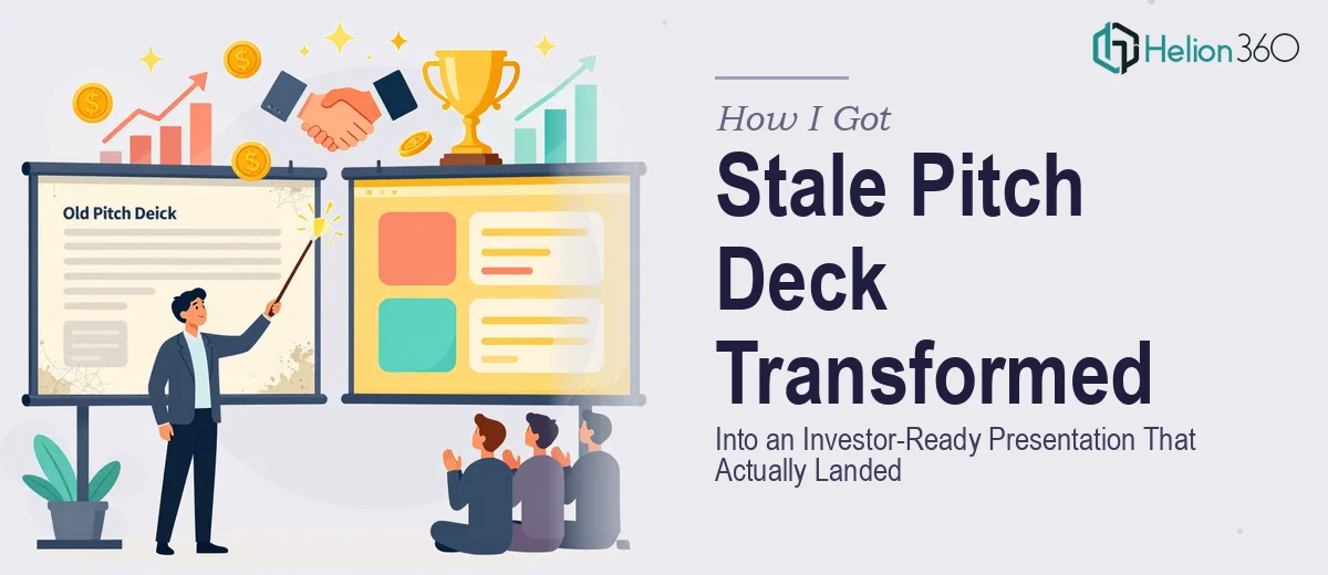
I had a PowerPoint that had been through too many hands. Slides built at different times, fonts that didn't match, a story that wandered. It wasn't terrible — but it wasn't investor-ready either, and that distinction matters enormously when you're walking into a room where people are deciding whether to write a check.
The meeting was locked in. The audience was serious. And the deck was the first thing they'd see before I said a word. I knew immediately that "cleaning it up over the weekend" wasn't a real option. A pitch deck redesign for an investor audience isn't a formatting job — it's a complete rethinking of how your business story is told visually and structurally. I needed it done right, and I needed it done fast.
What I Found a Proper Pitch Deck Redesign Actually Requires
I started by researching what separates a forgettable deck from one that holds a room. What I found made the scope of the work a lot clearer — and a lot bigger.
A proper investor pitch deck redesign isn't just about making slides look polished. It starts with narrative architecture: identifying the core message of each slide, cutting anything that dilutes the argument, and making sure the flow builds logically toward an ask. That alone is a full editorial pass on content most people aren't equipped to make objectively about their own business.
Then there's the visual layer. Investor audiences read decks quickly and form impressions within seconds. Typography hierarchy, color discipline, and chart clarity all signal whether a team is credible. And for fintech specifically, there are conventions around how financial data gets visualized that carry real weight in the room. Get those wrong and the substance gets discounted before it's even absorbed.
It was obvious this was not a one-person, one-weekend project.
What the Redesign Work Actually Involves
The structural work comes first, and it's the part that takes longest to get right. A proper pitch deck audit means going slide by slide — identifying which slides carry weight, which ones repeat what's already been said, and which ones are missing entirely. Investor decks follow a known arc: problem, solution, market size, traction, team, financials, ask. Each section has to earn its place, and the transitions between them have to feel inevitable rather than forced. Cutting a founder's favorite slide because it breaks the flow is a real editorial call, and it requires both storytelling instinct and category knowledge to make confidently.
The visual mechanics layer is where the deck becomes something people actually want to look at. A 12-column layout grid establishes alignment discipline across every slide. Typography runs on a clear hierarchy — typically 36pt for headlines, 24pt for subheads, 16pt for body — applied consistently through a properly configured slide master, not slide by slide. Charts need to use the right type for the data: a bar chart for period comparisons, a waterfall for cash flow, a scatter plot for cohort distribution. Using the wrong chart type for a financial metric doesn't just look amateur — it obscures the story the number is trying to tell. Setting this up so it holds across 15 or 20 slides without breaking takes hours for someone who doesn't live in this work.
Polish and brand consistency is the final layer, and it's what separates a deck that looks assembled from one that looks built. A disciplined palette means no more than 4 brand colors with defined usage rules — primary, secondary, accent, neutral — applied the same way on every slide. Icons need to come from a single family at a consistent weight. Image treatments need to follow the same mask and opacity rules throughout. These details are invisible when done right and glaring when they're not. Maintaining this consistency across a full redesign while also incorporating new content and restructured slides is the part that trips most people up.
Why I Brought in Helion360 to Handle the Full Project
I didn't attempt any of this myself. The combination of editorial judgment, visual mechanics, and brand discipline — applied consistently across a deck that needed to perform in front of investors — was clearly a job for a team that does this work every day.
Helion360 handled the project end-to-end and delivered fast. The narrative audit, the slide restructure, the visual system build, and the final polish all came back in a fraction of the time it would have taken me to work through each layer on my own. They handled the content decisions — what stays, what gets cut, how the story flows — alongside the full visual execution. The financial slides were formatted to the conventions that matter in fintech investor contexts. The slide master was built properly so every element stayed consistent without manual correction slide by slide.
The turnaround was done in days, not weeks. That timeline would have been impossible to hit working from scratch without the tooling and expertise already in place.
The Result and What I'd Tell Anyone in the Same Spot
The deck that came back was recognizably the same business — same story, same data — but it read like a completely different company had built it. The narrative was tighter. The slides had a visual confidence that the original lacked entirely. Going into the investor meeting, I wasn't apologizing for the deck in my head before I walked in.
The outcome justified the decision to engage the right team rather than attempt it myself. When the stakes are a real investor meeting and the timeline is real, the learning curve on investor pitch deck design isn't something you absorb in a few days — and even if you could, the editorial distance required to redesign your own deck objectively is nearly impossible to manufacture.
If you're looking at a similar situation — a deck that needs a full redesign before a high-stakes meeting — what it takes to build an investor pitch deck properly is exactly what Helion360 brings to every project. They handled the full project end-to-end, delivered fast, and brought exactly the depth of execution this kind of work requires.