

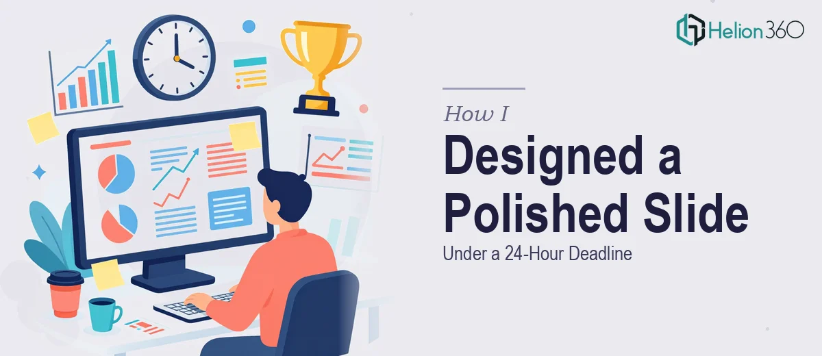
It started with a message I did not expect on a Tuesday evening. A board meeting was scheduled for the next morning, and the team needed a single PowerPoint slide — a clean quarter-end summary that captured our key achievements, a handful of statistics, and one strong image. Simple enough on paper. But with less than 18 hours to go and no margin for error, even one slide suddenly felt like a very high-stakes task.
The Problem With "Just One Slide"
There is a common assumption that a single slide is easy work. It is not — at least not when it has to look board-ready. The content needs to be structured so that the most important numbers land first. The layout has to breathe without feeling empty. The typography and color choices need to align with the existing brand. And everything has to be pixel-perfect because a board room is not a forgiving audience.
I opened PowerPoint and started arranging the statistics and summary points the team had sent over. I had the image. I had the copy. What I was struggling with was making it all fit together in a way that looked intentional rather than assembled. The first version looked cluttered. The second looked too sparse. I was going in circles, and the clock was not stopping.
When the Clock Pressure Changes Everything
At some point, the pressure of a hard deadline stops being motivating and starts creating mistakes. I knew what I wanted the slide to communicate. I just could not get the visual execution to match that vision within the time I had left. That is when I decided to reach out to Helion360.
I sent them the content — the statistics, the summary points, the image, and a brief note about the tone and audience. Their team responded quickly, asked a couple of focused clarifying questions about brand colors and preferred layout direction, and then got to work. There was no back-and-forth overload. They understood the brief and moved.
What Came Back and Why It Worked
The slide Helion360 delivered was exactly what a board meeting requires. The key statistics were prominent without being overwhelming. The supporting points were concise and visually separated in a way that guided the eye naturally from one element to the next. The provided image was placed purposefully, not just dropped in as an afterthought. The whole thing had a clean, professional presentation design that felt like it belonged in a polished corporate deck — not something assembled in a panic the night before.
More importantly, it was ready well before the morning meeting. I had time to review it, make one small adjustment to a label, and send it off to the team with confidence.
What I Learned From This Experience
One slide can carry a lot of weight when the audience is a boardroom. The difference between a slide that communicates clearly and one that just shows information is almost entirely in the design decisions — hierarchy, spacing, color, and restraint. Those decisions take skill and time, and when you are short on one, you need someone who can bring the other.
I also learned that having a reliable team to hand off time-critical design work to is not a sign that the task was too hard. It is a sign that you know how to manage a deadline intelligently. The goal was a polished, accurate slide delivered on time. That goal was met.
If you are ever facing a tight turnaround on a presentation slide — especially one destined for a board room or executive audience — Helion360 is worth reaching out to. They stepped in at exactly the right moment and delivered work I could stand behind the next morning.