

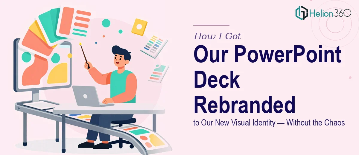
The Rebrand Was Done — But the Slides Were Still Living in the Past
Our company had just completed a full rebrand. New logo, updated color palette, refreshed typography, a completely overhauled tone of voice. It was a meaningful shift — from a brand that felt dated to one that felt modern, clean, and confident. The leadership team was proud of it. The marketing rollout was underway.
Then someone pulled up our PowerPoint deck in a client meeting.
Every slide still carried the old logo. The colors were wrong. The fonts didn't match. Charts and graphs were styled in a palette that no longer existed in our brand guidelines. In a moment, the story our new brand was trying to tell completely fell apart. The stakes were real — we had a board presentation in two weeks, and client-facing decks going out before that. I knew immediately this wasn't something to patch over the weekend. It needed to be done properly, and it needed to be done fast.
What I Found the Rebrand Actually Required
I started by mapping out what a proper rebrand of existing slides actually involves, and the scope became clear quickly.
This wasn't a find-and-replace exercise. The new brand guidelines specified primary and secondary color values in exact HEX and RGB codes, a strict typographic hierarchy using new typefaces, logo placement and clearspace rules, and updated tone guidelines that affected how headlines were written — not just how they looked. Every one of those rules had to be applied consistently across every slide, including master slides, layouts, charts, data tables, and footers.
Three things signaled real complexity. First, the deck had accumulated slides over years — inconsistent formatting, ad hoc layouts, charts built outside the template. There was no clean underlying structure to just restyle. Second, the chart and graph formatting in PowerPoint lives at a different layer than the slide design — each chart's fill colors, axis labels, gridlines, and data series had to be updated individually. Third, brand guidelines exist as a document, not as a PowerPoint theme — translating written brand rules into a functioning master slide setup requires knowing both the software and the design system deeply.
This was a full rebuild disguised as a reskin.
What the Work Actually Involves at Every Layer
The work starts with a structural audit of the existing deck before a single design decision is made. Done well, this means cataloguing every layout variant in use, identifying slides that deviate from any underlying template, and mapping which content blocks — headers, body text, callouts, footers, and dividers — need to be rebuilt versus restyled. A typographic hierarchy for the new brand typically runs something like 36pt for section titles, 24pt for slide headlines, and 16pt for body copy, with specific font weights assigned to each level. Establishing that hierarchy correctly inside the slide master — so it cascades down to every layout — is the foundation. Get it wrong at the master level and every slide inherits the error, which multiplies the correction work significantly.
Visual mechanics are where the time investment becomes serious. Charts and graphs don't inherit from the slide master — each one carries its own formatting properties. For a deck with 30 or 40 slides containing data visuals, that means opening each chart, updating every data series fill to the new brand palette, restyling axis lines, gridlines, labels, and legends to match the new visual language, and verifying the result reads clearly at presentation scale. The new palette also needs to be tested for contrast and legibility — particularly on darker background slides — because brand colors that look elegant in print don't always pass accessibility standards on screen.
Polish and consistency across the full deck is the final layer, and it's where most DIY attempts break down. Brand application isn't just swapping colors — it's ensuring that logo clearspace is respected on every slide where it appears, that the footer is formatted identically across all 40-plus slides, that pull quote treatments and icon styles follow the new visual system, and that the overall tone of slide copy has been adjusted to reflect the updated brand voice. A completed rebrand should feel as if the deck was built from scratch inside the new identity — not like the old deck was repainted.
Why I Brought Helion360 in to Handle the Full Project
Once I understood what the work actually required, attempting it internally wasn't a realistic option. We didn't have the time, and we didn't have someone who worked at the intersection of brand systems and PowerPoint production at this level of detail.
I engaged Helion360 to handle the project end-to-end. That meant the full audit of the existing deck, rebuilding the master slide structure to reflect the new brand guidelines, updating every chart and data visual across the deck, applying logo placement, typography, and color rules consistently throughout, and reviewing the final output against our brand guidelines document before delivery.
The turnaround was fast — the rough draft came back well within the first week, giving us time for review and revision before the board presentation deadline. What would have taken me weeks of learning curve and late nights was handled in a fraction of that time by a team that does exactly this work every day, with the tooling and expertise already in place.
What Was Delivered — and What I'd Tell Anyone Facing the Same Situation
The finished deck was unrecognizable from where we started — in the best way. Every slide reflected the new brand accurately and consistently. The master slide structure was clean and reusable, which means future decks will actually build off a proper foundation. The charts read clearly. The typography hierarchy worked. The brand story the leadership team had invested in finally came through in the materials we were putting in front of clients and the board.
If you're looking at a deck that hasn't caught up with your new brand identity and you have a deadline that doesn't leave room for trial and error, visual enhancement of presentation is the solution — they delivered the full project fast and handled every layer of execution that this kind of work actually requires. Learn more from how teams have successfully tackled PowerPoint rebrand unified company visual identity and achieved visual consistency across slides at scale.