

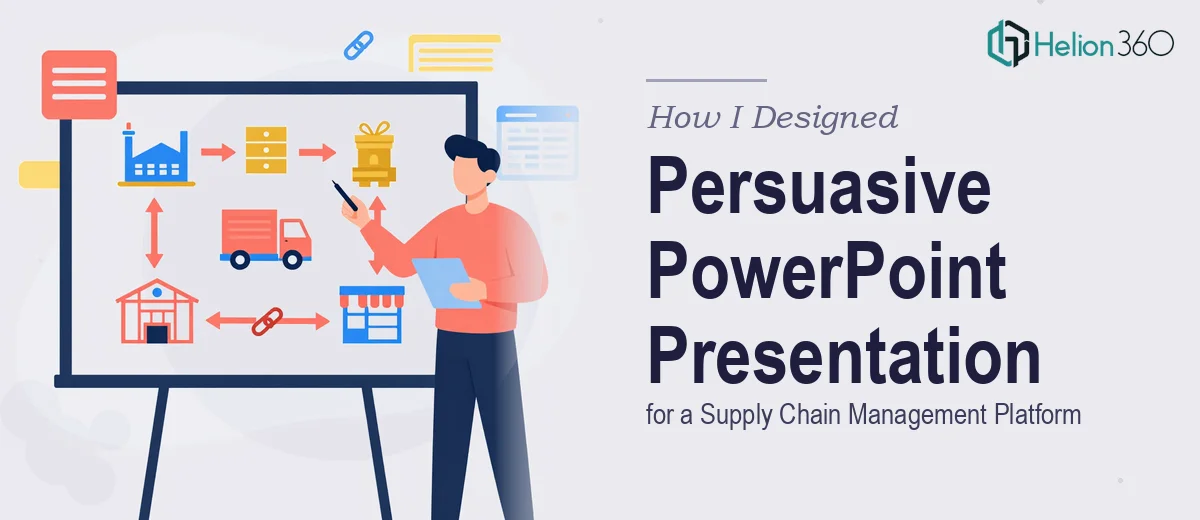
When a Startup Platform Needs More Than Just a Slide Deck
We had built something genuinely useful. Our platform pulled together open-source data to help public sector organizations manage their supply chains more efficiently. The logic was solid, the features were ready, and the team believed in it. What we needed next was a Product Introduction Deck that could actually communicate all of that to decision-makers who would be evaluating us for the first time.
This was not going to be a simple overview deck. The audience — procurement heads and operations leads in government organizations — expected accuracy, credibility, and clarity. Every claim needed to be backed up. Every feature had to be explained in terms of real-world benefit. And on top of that, we needed case studies showing how similar platforms had worked in other industries.
I figured I could draft the structure and put something together internally. I knew the platform well enough. How hard could it be?
Where the Internal Draft Broke Down
Harder than expected, as it turned out.
The content itself was not the problem. I had plenty of material — feature documentation, data comparisons, notes from conversations with potential clients. The challenge was turning all of that into a presentation that was both informative and visually compelling without it feeling like a dense report.
I started with a rough PowerPoint layout. The slides were organized, but they looked flat. When I tried to add infographics to illustrate how open-source data feeds into the platform, the visuals felt inconsistent. The case study slides were the worst — blocks of text with no clear hierarchy, nothing guiding the reader's eye through the story.
I also realized that for a supply chain management presentation aimed at the public sector, the bar for visual professionalism is higher than I had assumed. These audiences compare decks. If yours looks rough next to a competitor's polished presentation, the content stops mattering.
After a few days of revisions that were going in circles, I stepped back and looked for a better path.
Bringing in a Team That Could Execute It Properly
I came across Helion360 while searching for presentation design support for platform-focused decks. I reached out, explained what we were building, who the audience was, and what the existing draft looked like. They asked the right questions — about tone, brand guidelines, the type of data we wanted to visualize, and how many case study slides we needed.
From there, they took over the design work completely.
The team restructured the flow of the presentation so it followed a logical narrative: platform overview, core features, key benefits for public sector organizations, supporting data, and then case studies from adjacent industries. Each section transitioned cleanly into the next.
The infographics they built for the data visualization slides were particularly strong. Instead of raw numbers sitting in a table, the information was broken into visual layers that made it easy to see how the platform's data integrations actually worked. The case study slides were rebuilt as visual stories — specific, scannable, and credible.
What the Final Deck Actually Looked Like
The finished PowerPoint presentation was thorough without being overwhelming. It was designed to be walked through in a live meeting but also to hold up as a leave-behind document that clients could review independently.
The branding was consistent throughout. The slide layout used clean typography, organized spacing, and a color system that felt professional without being generic. The data-heavy slides had been transformed into clear, readable charts and infographics that reinforced the platform's value rather than burying it.
We hit the three-to-five day turnaround we had originally set as a target. That mattered — we had a meeting coming up and the deck needed to be ready.
What I Took Away From This
Building a presentation for a supply chain management platform is genuinely different from building a standard company overview. The content is technical, the audience is analytical, and the stakes are high enough that visual shortcuts show up immediately.
I could write the content. I understood the platform better than anyone. But translating that into a well-structured, visually persuasive PowerPoint deck — especially one with custom infographics and multi-section case studies — required a level of design skill and time that I did not have in that window.
If you are in a similar position — solid content, a specific audience, and a deadline that does not leave room for trial and error — Helion360 is worth reaching out to. They took what I had built in rough form and delivered a presentation I was confident putting in front of serious decision-makers.