

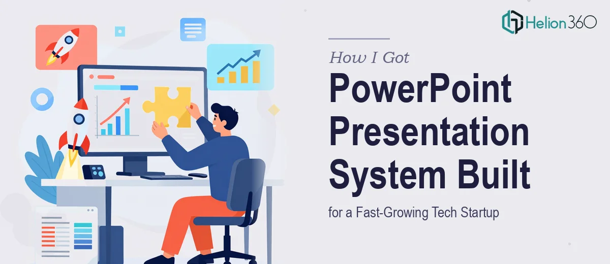
The Situation We Were Facing
We had a product launch coming up and almost nothing to show for it visually. The deck we were using internally looked like it had been stitched together over six months of late nights — inconsistent fonts, mismatched slide layouts, no coherent brand language. For internal standups, that was fine. For the launch itself, presenting to press, early customers, and potential partners, it was not going to cut it.
What we needed wasn't a single polished deck. We needed a full product launch presentation system — a master template, a set of slide layouts, brand-compliant components — something the team could use across every touchpoint going forward. The stakes were real: first impressions at a launch tend to stick, and ours needed to signal that we were a serious, well-resourced team with a product worth paying attention to.
I knew almost immediately that this wasn't something we could handle internally.
What I Found the Solution Actually Required
I started by looking at what building a proper presentation system for a startup actually involves, and the scope was bigger than I'd expected.
First, there's the brand translation problem. A startup at launch stage rarely has fully resolved brand guidelines. The logo exists, maybe a color palette, possibly a font choice. But translating those loose assets into a slide system that behaves consistently across 30 or 40 different layout types is a different challenge entirely. It requires design decisions that go well beyond choosing colors.
Second, there's the master slide architecture. A well-built PowerPoint template doesn't just look good on the title slide — it has to hold up across section headers, data slides, full-bleed image layouts, two-column comparison slides, and everything in between. Getting that structure right requires deep knowledge of how PowerPoint's slide master and layout hierarchy actually works.
Third, the typography system alone — defining heading scales, body copy sizes, caption styles, and making sure they all render correctly across screen sizes and projectors — is a nontrivial body of work. Each of those details, done poorly, compounds into a deck that feels amateurish no matter how good the content is.
What the Work Actually Involves
Building a complete presentation system starts with a structural audit and narrative mapping. The right approach is to inventory every use case the deck needs to serve — investor conversations, sales calls, product demos, internal updates — and then map a slide architecture that covers all of them without redundancy. This typically means defining 12 to 18 core layout types before any visual design begins. The friction here is that most teams skip this step entirely, jumping straight to visual execution and then discovering three weeks later that they have 40 slides and no consistent logic connecting them. Retrofitting structure after the fact is significantly harder than building it in from the start.
The visual mechanics of a professional slide system are more exacting than they appear from the outside. A 12-column underlying grid governs every layout, ensuring that text blocks, images, and data elements align across slides without manual nudging. Typography follows a strict hierarchy — typically 40pt for primary headings, 24pt for subheadings, 16pt for body, and 11pt for captions — applied through slide master styles so that changes propagate automatically. Color usage is constrained to a palette of four brand colors maximum, with defined roles for each: one dominant, one accent, one neutral, one for data emphasis. Setting all of this up in a way that actually holds across a full template library takes considerable time, and small errors in the master structure cascade visibly across every layout that inherits from it.
Polish and consistency across a full system is where most DIY attempts fall apart. Every slide needs to feel like it belongs to the same family — same shadow depth on icons, same border radius on image masks, same spacing between section labels and body text. This kind of cross-slide consistency isn't achievable through eyeballing; it requires a disciplined component library and a final QA pass that checks every layout against the brand standard. For someone unfamiliar with the tooling, this stage alone can consume more time than all the earlier work combined.
Why I Brought in Helion360 to Handle It
Once I understood what the work actually required, I didn't spend time debating whether to attempt it ourselves. The scope was clear, the deadline was fixed, and we didn't have anyone on the team with the specific combination of PowerPoint architecture knowledge, brand design fluency, and production discipline this kind of project demands.
I engaged Helion360 to handle the full project end-to-end. That meant the brand translation work, the slide master architecture, the full layout library, and the final QA pass. They turned it around quickly — what would have taken us weeks of trial, error, and iteration came back in a fraction of that time. The team already had the systems, the tooling, and the production workflows in place for exactly this kind of work. There was no learning curve on their end, which meant there was no delay on ours.
The result was a complete, production-ready presentation system we could hand to anyone on the team and trust that every deck they built would look like it came from the same professional organization.
What the Finished System Delivered — and What I'd Tell Anyone in This Spot
What we received was a fully structured PowerPoint template system: a resolved slide master with 16 layout variants, a brand-compliant color and typography system, icon and image component libraries, and a usage guide the team could reference independently. Every layout had been tested across projector, screen share, and PDF export. Nothing broke. Nothing looked off.
The launch went exactly as it needed to — the visuals signaled competence and consistency at every touchpoint, and the team has continued using the system for every deck since.
If you're looking at a similar gap — a launch coming up, a presentation system that doesn't exist yet, and a timeline that doesn't allow for weeks of internal trial and error — Helion360 is the team I'd engage. They handled the full scope fast, and the execution depth they brought to this work is exactly what a project like this requires.