

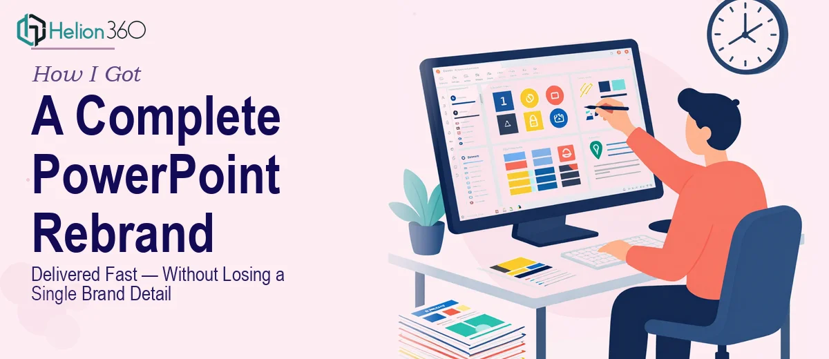
The Presentation Was Outdated and the Stakes Were Real
I had a marketing campaign coming up — events, stakeholder walkthroughs, platform shares — and the presentation we were planning to use looked like it hadn't been touched in years. Mismatched fonts, inconsistent colors, slide layouts that varied wildly from one section to the next. The brand had evolved, but the deck hadn't followed.
The problem wasn't just aesthetics. This presentation was going to represent us in rooms that mattered. Sending something that looked off-brand or visually inconsistent would undercut the message before a single word was spoken. A PowerPoint rebrand wasn't a nice-to-have — it was the bare minimum for showing up credibly.
I knew immediately that this needed to be done properly. Not a quick color swap and a new logo drop. A full overhaul — visual system, content flow, brand alignment, the works.
What I Found the Solution Actually Required
I spent time researching what a real presentation rebrand involves before deciding how to approach it. What I found made it clear this wasn't a weekend project.
A proper PowerPoint rebrand starts with the slide master. Every layout, every placeholder, every font style and spacing rule needs to be rebuilt from the ground up against the new brand guidelines — not patched on top of the old structure. Get the master wrong and every slide in the deck inherits the problem.
On top of that, rebranding a presentation means making content decisions, not just visual ones. Which slides still hold up logically? Which sections need restructuring so the story flows correctly under the new brand identity? Those are editorial calls that require someone who understands both communication design and brand strategy.
And then there's the consistency problem. A deck used across multiple events and platforms can't have one slide that looks slightly different from the others. Palette discipline, spacing rules, icon weight, image treatment — all of it has to hold across every single slide. The more slides in the deck, the harder that is to police manually.
What a Proper PowerPoint Rebrand Actually Involves
The foundation of the work is structural. Before a single visual is touched, the right approach audits the existing deck for content integrity — identifying slides that no longer align with the updated brand message, flagging sections where the narrative logic breaks down, and mapping a clear story arc from opening slide to close. This is where presenters commonly underestimate the scope: a rebrand isn't just applying new colors to old content. If the underlying structure is weak, the polished visuals will sit on top of a shaky foundation. Rebuilding the slide master — setting correct font hierarchies at 36pt, 24pt, and 16pt across title, body, and caption levels — is the first concrete step, and it takes careful work to ensure it propagates correctly across all layout variants.
The visual mechanics layer is where the rebrand becomes genuinely technical. A 12-column layout grid needs to be established so that text blocks, images, and data visuals all sit in consistent positions across every slide type. Brand color application follows strict palette rules — typically a maximum of four brand colors, with primary, secondary, accent, and neutral roles clearly defined. Typography weight and spacing need to match the brand guidelines exactly, which means matching specific typefaces, adjusting line height, and setting consistent paragraph spacing. For anyone without deep familiarity with PowerPoint's master slide system, this alone can consume days of trial-and-error troubleshooting.
Polish and consistency across the full deck is the final — and most time-intensive — layer. Even after the master is correctly built, each individual slide needs a review pass: image crops aligned to the grid, icon weight consistent throughout, no orphaned text or overflow, and spacing symmetry verified across different content densities. A deck used across multiple events and platforms will be scrutinized at close range. One slide that looks slightly different from the others signals amateur execution, and audiences notice even when they can't articulate why. Catching every inconsistency across a large deck without a systematic review process is where most DIY rebrands fall apart at the finish line.
Why I Brought in Helion360 to Handle It
Looking at the full scope of what a proper PowerPoint rebrand required — master slide rebuild, narrative restructuring, brand alignment across every slide, and a thorough consistency pass — I recognized immediately that attempting this myself wasn't realistic. The time alone would have been prohibitive, and the execution depth required wasn't something I could develop on the fly with a campaign timeline pressing.
Helion360 handled the full project end-to-end: the slide master rebuild against our updated brand guidelines, the content restructuring to ensure the narrative arc was clean and logical, and the full polish pass across every slide in the deck. They turned it around quickly — done in days, not the weeks it would have taken me to research, learn, and execute it myself.
What made the difference was that this is the kind of work they do all day. The tooling, the process, the brand-application expertise — it was already in place. I handed off the brief, the brand guidelines, and the existing deck, and what came back was a presentation that looked like it had always belonged to the new brand.
What the Deck Delivered — and What I'd Tell Anyone in My Spot
The rebranded presentation was used across campaign events and platform shares without a single revision request on the visual side. The feedback from stakeholders was immediate — the deck looked professional, cohesive, and on-brand in a way the old version never had. More importantly, it let the content do its job. The visual system got out of the way and let the message land.
If you're looking at a similar situation — an outdated deck, an upcoming campaign, new brand guidelines that haven't been applied yet — and you want it handled properly without spending weeks learning a system that professionals have already mastered, Helion360 is the team I'd engage. They delivered fast, handled the full execution depth this kind of work requires, and the result was a presentation that held up in every room it entered.