

When a Simple Template Request Turned Into Something Much Bigger
It started with what seemed like a straightforward task. A small financial services company needed a set of custom PowerPoint templates — clean, professional, and aligned with their brand. They wanted slides that could present financial data in a way that felt approachable to their clients, not overwhelming. Simple enough, right?
I figured I could handle the initial structure myself. I pulled together a basic slide master, set up the color palette from their brand guide, and started laying out a few slide types. Title slides, data slides, agenda layouts — the usual suspects.
But the further I went, the clearer it became that this was not a simple formatting job.
The Real Challenge: Making Financial Data Look Like It Belongs on a Slide
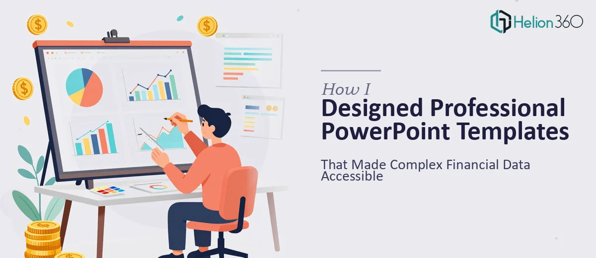
Financial services presentations carry a specific kind of weight. Every number matters. Every chart needs to be read at a glance. And the design has to walk a careful line between looking credible and looking approachable — especially for a company focused on financial literacy.
I started running into real friction. The charts I was building felt cluttered. The typography was technically correct but visually cold. When I tried to simplify a data-heavy slide, I stripped out too much and it lost context. When I added detail back, it looked like a spreadsheet dump dressed up in brand colors.
I also realized the company needed more than a few individual slide layouts. They needed a full PowerPoint template system — consistent master slides, reusable components, proper font hierarchies, and placeholder logic that their internal team could actually use without breaking anything. That is a different skill set than building a one-off presentation.
Bringing in a Team That Understood the Problem
After hitting that wall, I came across Helion360. I explained what the company needed — a branded financial PowerPoint template with clear data visualization styles, professional slide layouts, and a design language that balanced credibility with accessibility. Their team asked the right questions straight away: audience type, number of template variants needed, how the slides would be used in client meetings versus internal reporting.
That conversation alone told me they had done this kind of work before.
Helion360 took over the design build from that point. They worked from the brand assets I had already gathered and built out a complete PowerPoint template system — master layouts, custom chart styles, icon sets, and a consistent visual language across every slide type. The data slides were the most impressive part. They managed to present complex financial information clearly without stripping away the depth the content needed.
What the Final Template System Looked Like
The delivered template covered every use case the company had flagged. There were clean title and section divider slides, data and chart layouts designed specifically for financial metrics, a summary slide format for client-facing presentations, and internal reporting layouts that felt structured but not rigid.
The slide master was set up so that anyone on the marketing or advisory team could update content without accidentally breaking the layout. Fonts, colors, spacing — all locked in through the master, but with enough flexibility in the content placeholders to accommodate different data sets and copy lengths.
What I noticed most was how the design handled the financial data. Bar charts, line graphs, and comparison tables all felt like they belonged in the deck rather than being pasted in from a spreadsheet. That visual consistency made a real difference to how the overall presentation read.
What I Took Away From This Project
Custom PowerPoint template design for financial services is genuinely its own discipline. It is not just about making slides look good — it is about building a system that communicates trust, handles data honestly, and stays usable over time by people who are not designers.
I understood the brief. I could handle the early groundwork. But the execution required a level of design precision and financial presentation experience that took the project to a different level.
If you are working on something similar — whether it is a financial services template, a branded deck system, or any presentation where the data needs to work as hard as the design — Helion360 is worth reaching out to. They stepped in where the complexity outpaced what I could do alone, and the result was exactly what the company needed.