

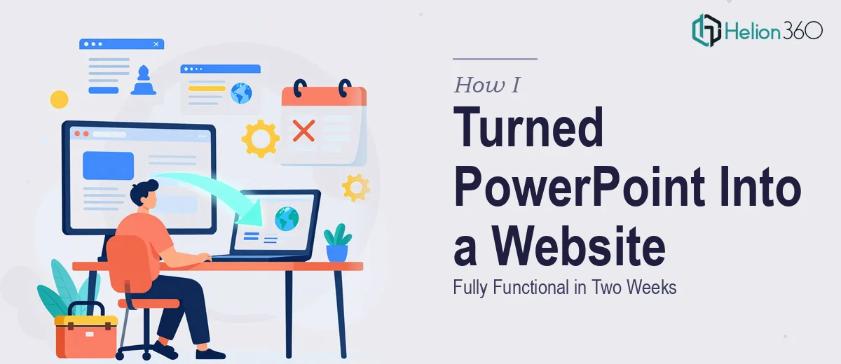
The Presentation Was Done. The Problem Was Just Beginning.
I had a polished PowerPoint deck — forty-plus slides covering our product line, competitive positioning, and core brand story. It had been built for internal pitches and looked sharp. But the ask that landed on my desk was different: take this presentation and turn it into a fully functional, publicly accessible website. Not a PDF. Not a slideshow embed. An actual site with navigation, responsive layouts, and live content.
The stakes were real. A product launch was tied to this site going live, and the window was tight — two weeks from green light to live URL. I knew immediately that this wasn't something I could attempt myself on evenings and weekends. The gap between a well-designed slide deck and a working website is enormous, and doing it poorly would mean a broken first impression at exactly the wrong moment.
What I Found This Work Actually Required
I spent a day mapping out what a proper PPT-to-website conversion actually involves — not just swapping slides for web pages, but genuinely translating a static visual format into a responsive, functional digital experience.
The first thing that stood out was structural translation. A PowerPoint is built around a linear sequence of slides. A website is built around a hierarchy of pages, sections, and navigation flows. Those are fundamentally different architectures. Every slide has to be evaluated — does it become a full page, a section, a component, or does it disappear entirely because the web context renders it redundant?
The second complexity was visual fidelity under responsive conditions. Fonts that read cleanly at 1920×1080 in a slide presentation behave completely differently when a browser resizes them at 375px on a mobile screen. Typography hierarchies, image ratios, and whitespace all need to be rethought, not just copied.
The third signal was content readiness. Slides are written for presentation delivery — short phrases, speaker-supported bullets, heavy visual dependency. Web content has to stand alone, be scannable, and work for SEO. That's a meaningful rewrite, not a copy-paste job.
The Real Execution Depth Behind a PPT-to-Website Build
The structural and narrative work is where a conversion like this either holds together or falls apart. A proper website audit of the source deck maps every slide to a web destination — page, section, or component — and identifies where slide content is too thin to carry a standalone web section without a rewrite. Typography conventions shift significantly: on the web, a clear hierarchy typically runs 48pt or larger for hero headings, 24-28pt for section headers, and 16-18pt for body copy, with line-height and letter-spacing tuned for screen reading rather than projection. Getting that wrong across thirty-plus converted sections produces a site that looks unfinished even if the underlying layout is correct. Setting up a consistent type system that propagates cleanly through every page takes focused time and real familiarity with how web typography behaves across browsers and devices.
The visual mechanics layer involves translating every layout from a fixed 16:9 canvas into a fluid, responsive grid — typically a 12-column CSS grid system with defined breakpoints at 1280px, 768px, and 375px. Images that were composited into slides as decorative elements often need to be re-sourced or rebuilt as properly optimized web assets, since exporting from PowerPoint produces compressed files that degrade noticeably on retina displays. Data visualizations and infographics embedded in slides present a particular challenge: static chart images rarely survive the move to web without being rebuilt as scalable vector formats or interactive components. Each of these decisions requires someone who has done this translation dozens of times and knows exactly where the edge cases live.
Polish and brand consistency across the full site is the layer most people underestimate. It means applying a defined palette — typically four colors or fewer — as CSS variables that govern every button, link state, hover effect, and background across every page. It means ensuring that spacing increments are standardized (an 8pt base grid is common) so that nothing looks arbitrarily placed. It also means a final pass across every viewport to catch the small inconsistencies that accumulate during a build of this scale: a heading that wraps awkwardly at tablet width, a section that loses its visual balance at 375px, a footer that drifts out of alignment on certain browsers. That kind of systematic QA pass takes hours even for experienced teams.
Why I Brought in Helion360 to Handle It
I recognized within twenty-four hours of scoping this project that attempting it in-house was not a realistic path. Not because of effort, but because the combination of structural thinking, web design discipline, responsive execution, and brand consistency work — all under a two-week deadline — required a team with this capability already in place.
Helion360 handled the full project end-to-end: the slide audit and site architecture map, the full responsive build, and the brand consistency pass across every page and breakpoint. What I handed them was a PowerPoint deck and a brand guide. What came back was a live, polished site — delivered fast, in a fraction of the time it would have taken me to piece together the skills and tooling this work demands. The turnaround was done in days, not weeks, and the depth of execution matched exactly what the launch required.
The Result — and What I'd Tell Anyone in This Spot
The site launched on schedule. The product line had a professional, navigable web presence in time for the launch window. More importantly, it looked like something that had been designed for the web from the start — not a slide deck that had been awkwardly stapled into a browser.
What I learned from this project is that PowerPoint-to-website conversion is a discipline in its own right. It sits at the intersection of content strategy, web design, and responsive front-end execution. None of those pieces is optional, and none of them is fast to learn from scratch.
If you're looking at a similar conversion and want it handled end-to-end without the weeks of learning curve, discover what a responsive Squarespace website build entails — Helion360 is the team to engage. They have the expertise and tooling already in place, and they delivered for me fast.