

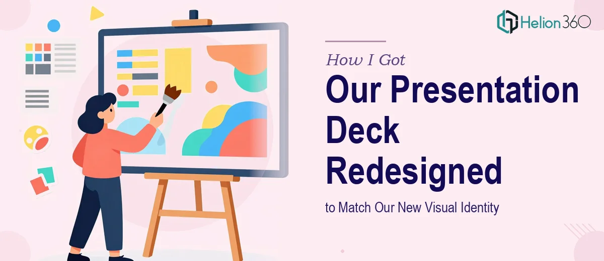
The Problem With Our Existing Slides
We had just gone through a full brand refresh — new color palette, updated typography, a refined logo, and a clearer set of visual guidelines. The brand work looked great on paper. The problem was that every slide deck we used in meetings, pitches, and internal reviews still reflected the old identity. Old blues, inconsistent fonts, misaligned layouts. Every presentation we sent out was quietly undermining the new brand before anyone said a word.
The stakes weren't abstract. We had board reviews, client pitches, and a partner briefing all coming up within weeks. Showing up with slides that contradicted our freshly minted brand identity wasn't an option. I knew a presentation redesign was necessary — and I knew it needed to be done properly, not just patched together overnight.
What I Found the Solution Actually Required
Before doing anything, I spent time understanding what a proper presentation redesign for a visual identity rollout actually involves. It's not just swapping colors and changing a font. Done well, this kind of work requires a complete audit of every existing slide to identify what structural elements carry over, what gets rebuilt, and what needs to be retired.
Three things immediately signaled the complexity. First, the new brand guidelines specified exact hex codes, type scales, and spacing rules — all of which need to be encoded into the master slide and layout templates, not applied manually slide by slide. Second, charts, icons, and diagrams throughout the deck had to be rebuilt or replaced to reflect the new visual language — you can't just recolor a chart and call it brand-aligned. Third, the decks weren't uniform in structure; some were sales-facing, some internal, some executive summaries — each requiring its own treatment within the same identity system. This was clearly not a weekend fix.
What the Work Actually Involves
The foundation of a presentation redesign built around a new visual identity starts with the master slide and layout architecture. The right approach encodes the brand system directly into the master — primary, secondary, and accent colors mapped to theme slots, a type hierarchy running at approximately 36pt for titles, 24pt for subheadings, and 16pt for body text, and a consistent margin and grid structure that governs every layout. Without this step done correctly, any brand alignment achieved is cosmetic and fragile. Setting up a master that propagates cleanly across 40 or 60 slides — without breaking existing content — requires methodical work and a solid command of how slide software handles inheritance. For someone without deep experience in slide architecture, this step alone can consume a full day just to get right.
Once the master is in place, the visual mechanics of each slide need to be revisited individually. Charts need to be rebuilt using the new brand palette — typically a controlled set of 4 colors maximum — with consistent axis labeling, no gridline clutter, and data labels placed for legibility rather than default positioning. Icons and illustrations must be sourced or recreated to match the new aesthetic register, whether that's flat, outlined, or illustrated. Diagrams that were built as freeform shapes need to be reconstructed on the new grid. This is where time compounds fast: a 50-slide deck with 20 data slides easily represents 15 to 20 hours of careful visual rebuild work, not counting reviews and adjustments.
Polish and cross-deck consistency is the layer that separates a professional result from a passable one. Every transition between slide types — cover to content, section break to data slide — needs to feel deliberate. Padding, alignment, and spacing need to be pixel-consistent across all slides, not just close. Brand assets like logos, taglines, and footer elements must sit in exactly the same position on every applicable layout. Achieving this consistency across multiple decks that will be used by different teams in different contexts requires a system-level approach, not slide-by-slide eyeballing. It's the kind of detail that takes significant time and a trained eye to enforce without introducing new inconsistencies.
Why I Brought in Helion360 to Handle It
Once I understood what this redesign actually required, the decision was straightforward. I wasn't going to spend weeks rebuilding slide masters and manually auditing 60 slides for brand compliance while also managing the actual business deadlines in front of me. The right move was to engage a team that already had the process, the tooling, and the experience in place.
Helion360 handled the full project end-to-end — from auditing the existing decks and mapping the new brand guidelines into a master template system, to rebuilding every data slide, diagram, and icon set to match the new visual identity. They also ensured consistency across the different deck types so everything felt like it came from the same system. The work was turned around quickly — done in days rather than the weeks it would have taken to attempt and learn through myself — and the output was ready for the board review without a single slide needing to be touched again.
What the Outcome Looked Like and What I'd Tell Anyone in My Spot
Every deck came back looking like it was built for the new brand from the start. The master templates were clean, the type hierarchy was consistent, the charts were rebuilt properly, and the cross-deck alignment was exactly what we needed to show up professionally to every audience. The brand refresh that had been invisible in our communications was now immediately visible every time someone opened a slide.
Anyone staring at a stack of legacy slides that need to reflect a new visual identity should be clear-eyed about what that work actually involves before deciding how to approach it. If you want it done right and done fast, Helion360 is the team to engage — they brought the full execution capability to this project and delivered it at a pace that made the difference when the deadline was real.