

When a Product Launch Deck Needs to Do More Than Look Good
We had a product launch coming up, and I was responsible for putting together the PowerPoint presentation. On paper, it seemed manageable. We had the feature list, some pricing details, a few competitive talking points, and a rough idea of what each slide should cover. I figured I could build it myself over a long weekend and have something presentable by Monday.
I was wrong about that.
The Problem With Starting From a Feature List
The issue wasn't the content — we had plenty of it. The issue was turning that content into something a customer would actually care about. A product overview slide that just lists specs doesn't do any work. It doesn't tell someone why this product matters to them. And when I looked at the draft I'd built after two days of work, it felt exactly like that: a formatted feature list, not a presentation.
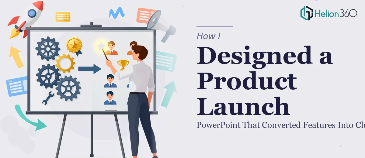
The Product Overview slide, which I'd imagined as an infographic-style visual, ended up looking like a table with some color applied to it. The benefits slide felt flat. The competitive comparison section had too much text and no clear hierarchy. I had the right structure in theory — overview, feature detail slides, benefits, competitive edge, pricing — but the execution wasn't landing.
I also realized I was spending more time adjusting margins and icon sizes than actually thinking about the message. The design work itself was pulling me away from the strategy behind the deck.
Bringing in the Right Support
After a few days of rework that wasn't moving the needle, I reached out to Helion360. I explained what we were building, shared the rough draft, and walked them through the slide goals — especially the Product Overview infographic and the benefits section, which needed to clearly communicate customer value over competitor offerings.
Their team asked the right questions upfront: Who is the audience? What action should they take after seeing this deck? What tone — technical, accessible, or somewhere in between? That conversation alone helped me crystallize things I hadn't fully thought through.
What the Redesigned Presentation Actually Looked Like
Helion360 took the draft and rebuilt it with a structure that made sense visually and narratively. The Product Overview slide became what I had originally envisioned — a clean infographic layout with icons representing each key feature, organized in a way that guided the eye naturally rather than overwhelming it.
The feature detail slides used a consistent visual language: a short headline, a supporting data point or chart, and a brief explanation. Nothing crowded. The charts were styled to match the overall color scheme, which was modern and professional without feeling generic.
The benefits slide was probably the biggest improvement. Instead of a paragraph-heavy layout, it used a side-by-side visual comparison that made the competitive advantage immediately obvious. Pricing and promotions at the end were laid out simply, with clear visual emphasis on the offer rather than fine print.
The whole deck felt like it was telling a story — from what the product is, to what it does, to why it matters, to what you should do next.
What I Took Away From This Process
Building a product launch PowerPoint is not just a design task. It is a communication task, and those two things require different skill sets working in sync. I could handle the content strategy side, but the visual execution of a product presentation — especially one that needs infographics, data charts, icon systems, and a coherent brand feel across twenty-plus slides — is a different discipline.
The final deck was ready within the agreed timeline. We went through one round of revisions, mostly small tweaks to wording and one layout adjustment on the pricing slide. Nothing significant. The presentation was used in the launch, and the feedback from the team was that it finally made the product feel as good as it actually was.
If you are working on a product launch presentation and the gap between your draft and what you need feels too wide to close on your own, Helion360 is worth contacting — they bring the kind of structured design thinking that turns a feature list into something that actually lands with an audience.