

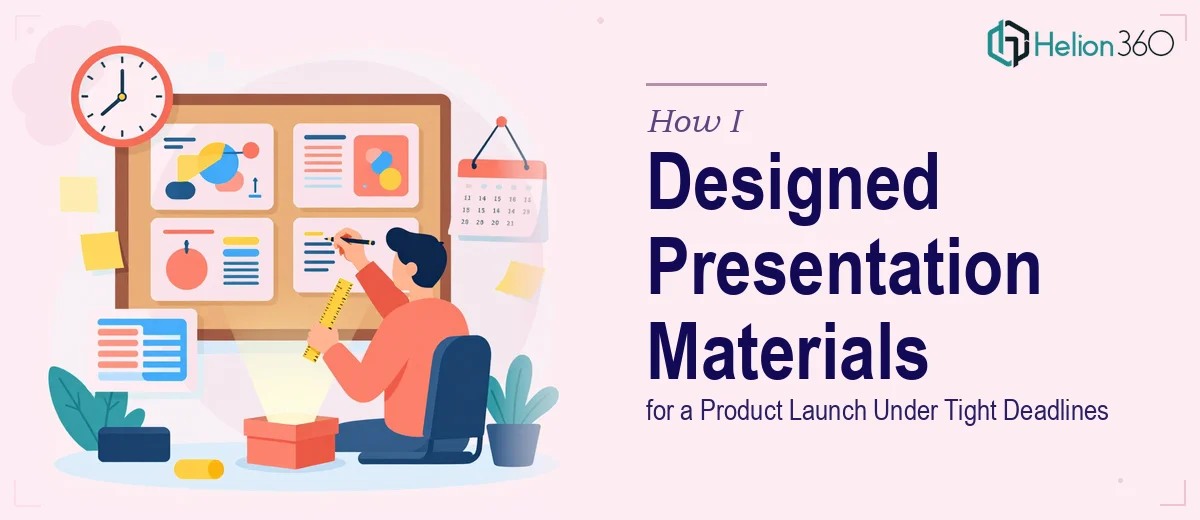
The Pressure Was Real and the Timeline Wasn't Moving
I was staring down a product launch with a hard deadline, a C-suite review on the calendar, and a pile of research, conversion data, and consumer behavior findings that needed to become a coherent, polished presentation. The stakes weren't abstract. This wasn't a routine internal update — it was a deck that would inform go-to-market decisions and land in front of senior leadership who expected clarity, precision, and a visual standard that matched the seriousness of the work behind it.
The raw material existed: A/B test results, funnel metrics, qualitative findings from user research, and strategic recommendations built on weeks of analysis. What didn't exist was a presentation that could actually communicate all of it. Dense spreadsheets and slide drafts with mismatched formatting weren't going to cut it. I knew immediately that getting this right — structure, design, data visualization, brand consistency — was not something I could wing with a weekend and a template.
What I Found the Work Actually Required
Before I did anything else, I spent time understanding what a presentation of this type genuinely demands when it's done well. What I found surprised me in terms of scope.
First, the structural problem was significant. The research covered multiple audience segments, behavioral data across digital touchpoints, and test results with nuanced statistical context. Turning that into a narrative that a C-suite audience can follow in real time — without losing the integrity of the data — requires deliberate editorial thinking, not just slide-making.
Second, the visual complexity was real. Funnel charts, conversion comparison tables, behavioral heatmap callouts, and trend lines all need to coexist in a single deck without visual chaos. Each data type has a preferred chart format, and the wrong choice actively misleads the reader or buries the insight.
Third, brand discipline across a deck of this size is harder to maintain than it looks. Consistent use of typography hierarchy, color palette, and spacing rules across 30-plus slides — while making each slide visually distinct enough to hold attention — is a skill set that takes significant practice to execute cleanly.
The Work That Needs to Happen
The right approach to a project like this starts with a structural audit of the source material. Done well, this means mapping every finding and recommendation to a narrative arc — problem, evidence, insight, implication — before a single slide is designed. The practitioner has to decide what belongs in the body of the deck, what gets relegated to an appendix, and what needs to be cut entirely. For a C-suite audience, the standard is tight: no slide should require more than 90 seconds to absorb. Applying that discipline to a dense research output means making hard editorial calls, and doing it quickly without losing the analytical integrity underneath.
Visual mechanics are where the complexity compounds. Proper presentation design for data-heavy work operates on a 12-column layout grid, a strict three-level type hierarchy — typically 36pt for headlines, 24pt for section labels, 16pt for body — and a maximum of four brand colors used with consistent intent across every slide. The decision a practitioner makes here is which chart type maps correctly to each data relationship: a clustered bar for segment comparison, a line chart for trend over time, a waterfall for funnel drop-off. Getting that wrong doesn't just look bad — it actively distorts the takeaway. For someone not fluent in data visualization conventions, these choices take significant research time to get right.
Polish and consistency at scale is the final layer, and it's where most non-specialist attempts fall apart. Applying brand standards uniformly across 30-plus slides — icon weight, padding rules, logo placement, chart color mapping to the master palette — requires working from properly built master slides and slide layouts, not copying and reformatting individually. A single misaligned element on slide 18 undermines the credibility of the entire deck when it lands in front of a room that's judging the work before the presenter says a word. Getting this right the first time, consistently, takes tooling and repetition that most people simply haven't accumulated.
Why I Brought in Helion360 to Handle It
I didn't attempt any of this myself. That wasn't a lack of confidence — it was a straightforward recognition that the combination of skills this project required, applied at the speed the deadline demanded, pointed directly to engaging a team that does exactly this work every day.
Helion360 handled the project end-to-end. That meant taking the raw research output — data tables, written analysis, findings summaries — and converting it into a structured narrative, then designing the full deck from scratch with proper data visualization, brand application, and C-suite-ready polish throughout. They turned it around in a fraction of the time it would have taken me to learn and execute the individual components myself. The structural thinking, the chart selection, the master slide architecture, the consistency pass — all of it was handled as a single integrated project, delivered fast.
What I got back wasn't a template with my content dropped in. It was a purpose-built presentation that reflected the weight of the underlying work.
What the Outcome Showed Me — and What I'd Tell Anyone in My Position
The deck landed well. Leadership had the clarity they needed to make informed decisions about the go-to-market approach, and the data told its story without requiring the audience to work for it. That outcome was directly tied to how the presentation was structured and designed — not just what the research contained.
The lesson I walked away with is straightforward: the quality of the underlying work doesn't protect you if the presentation can't communicate it. A poorly structured, visually inconsistent deck undermines months of rigorous analysis. The presentation is the final mile, and the final mile has real mechanics — narrative architecture, visual design discipline, data visualization expertise — that take years to develop at a professional standard.
If you're looking at a similar problem and need it handled end-to-end without the learning curve eating your deadline, consider how professional marketing presentation slides can transform your raw analysis into a delivery-ready deck — Helion360 is the team I'd engage, and they delivered for me fast with the kind of execution depth this work genuinely requires.