

The Situation I Was Staring Down
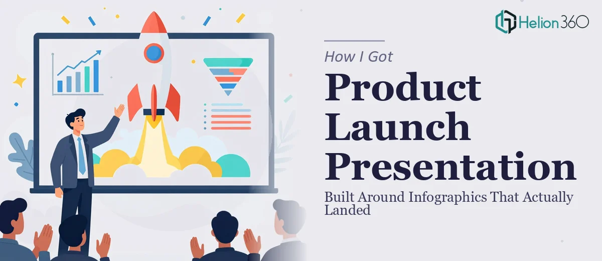
We had a product launch event coming up fast, and the stakes were real. This wasn't an internal update — it was a public-facing moment where our audience needed to walk away understanding who we are, what we'd built, and why it mattered. The brief was clear: showcase key product features, communicate company values, and make it visually engaging enough to hold attention in a room full of distracted people.
The problem was that the raw material was dense. Product specs, feature breakdowns, process diagrams, company culture content — all of it had to be distilled into something an audience could absorb at a glance. I knew immediately that a slide full of bullet points wasn't going to cut it. This needed real infographic design, the kind that transforms complex product information into visual storytelling that sticks. And it needed to be ready in time for the event.
What I Discovered Doing This Well Actually Requires
I started looking at what a proper infographic-driven presentation actually involves, and the complexity surfaced quickly.
The first thing I noticed was that infographic design isn't decoration — it's information architecture. Every graphic has to earn its place by making a specific idea faster to understand than text would. That means someone has to decide which data points are worth visualizing, what chart or diagram type serves each one best, and how those visuals connect to the narrative flow of the deck.
The second thing was the sheer volume of decisions involved. A single product feature infographic might require choosing between a process flow, a comparison matrix, or an icon-driven layout — and making the wrong call produces something that looks busy rather than clear. Multiply that across fifteen to twenty slides, and you're looking at a project that demands both design judgment and content strategy working in parallel.
The third signal was brand discipline. Every infographic had to feel like it came from the same visual system — same palette, same typographic scale, same icon style. Without that consistency, a deck of infographics looks like a collage rather than a presentation.
What the Work Actually Involves
The starting point for a project like this is always the content audit and story architecture. Every piece of source material — product specs, feature descriptions, company narrative, values content — has to be mapped against a clear slide-by-slide flow before a single graphic gets designed. The practitioner's job here is to identify which ideas are worth visualizing versus which ones belong as supporting copy, and in what order the audience needs to encounter them. Getting this wrong at the start means redesigning infographics later when the story arc shifts. That rework is expensive in time and coherence, and it's the single most common failure point on projects like this.
Once the structure is locked, the visual mechanics take over. Effective infographic design for a product launch typically operates within a constrained system: a 12-column layout grid, a palette of no more than four brand colors plus one or two accent tones, and a typographic hierarchy running something like 36pt for headlines, 22pt for section labels, and 14pt for body or caption text within graphics. Each infographic type — process flows, feature comparison grids, stat callouts, icon arrays — has its own internal logic for spacing, visual weight, and label placement. Learning those rules from scratch takes weeks. Applying them consistently across twenty or more slides, while keeping every graphic legible at projection scale, is a full-time effort for someone who already knows the system.
Polish and cross-slide consistency are where most self-directed attempts fall apart. It's not enough for each infographic to look good in isolation — every slide has to feel like it belongs to the same visual family. That means enforcing icon style uniformity (all outline, all filled, or all two-tone — never mixed), maintaining consistent internal padding inside graphic containers, and ensuring that color usage follows a hierarchy rather than appearing at random. A designer doing this professionally will run a visual audit pass at the end specifically to catch the edge cases: a heading that's one shade off, an icon that's a different weight, a chart axis label that didn't inherit the correct typeface. Without that audit pass, the deck looks almost right — and almost right in a launch presentation reads as unpolished.
Why I Brought in Helion360 to Handle It
Looking at the scope — content mapping, infographic design across multiple product and culture themes, brand consistency enforcement, and iteration rounds before the event — I recognized immediately that attempting this myself wasn't a realistic option. I didn't have weeks to climb the learning curve, and the event wasn't moving.
Helion360 handled the full project end-to-end. That meant taking the rough content outlines and working through the narrative architecture, designing the full suite of infographics to a consistent visual system, and delivering a presentation that was ready to present without a round of internal cleanup. They turned it around quickly — done in days, not weeks — which is exactly what the timeline required. The speed came from the fact that this is work they do continuously, with the design systems, templates, and review processes already built in. There was no ramp-up time. The project moved from brief to finished deck at a pace I couldn't have matched.
The Result and What I'd Tell Anyone in This Position
What came back was a cohesive, visually confident presentation built around infographics that made the product story genuinely easy to follow. The feature breakdowns landed clearly. The company values section felt human rather than corporate. The audience had something to look at that rewarded attention rather than demanding it. The launch event went well, and the deck held up when shared as a leave-behind afterward — which is a good sign that the visual logic was solid, not just surface-level.
If you're staring at a product launch, a keynote, or any presentation where complex information needs to become clear visual storytelling, and you're realizing the gap between what you have and what you need — Helion360 is the team to engage. They handle the full execution fast, and the quality of work they deliver reflects a depth of practice that simply can't be improvised on a deadline.