

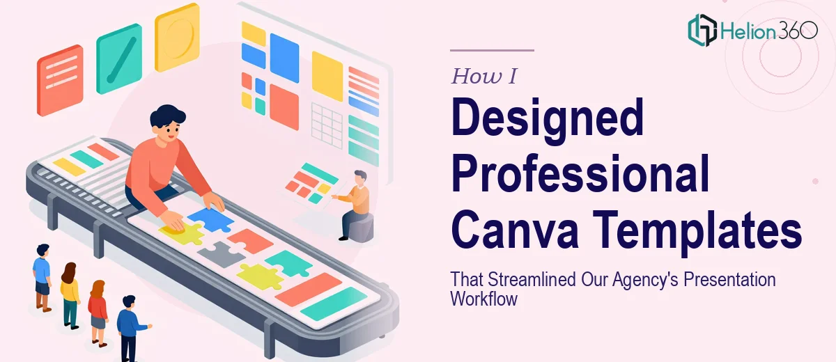
The Workflow Problem That Was Slowing Everything Down
Our agency was producing client presentations at a pace that our internal tools couldn't keep up with. Every new deck started from scratch — different fonts, inconsistent spacing, brand colors that drifted from one slide to the next. The result was a workflow that burned hours per project and still produced output that looked uneven across the team.
The stakes were real. Client-facing presentations are one of the most visible things an agency delivers. When they look inconsistent, the perception of the work suffers regardless of how strong the underlying strategy is. We needed a proper Canva template system — one that the whole team could use without producing a different-looking deck every time.
I knew immediately this wasn't something to patch together on a weekend. Done right, it meant building something systematic, not just cleaning up a few slides.
What I Found a Real Template System Actually Requires
When I looked into what a properly built Canva template library actually involves, the scope became clear fast. This wasn't about making slides look pretty. It was about building a design system that enforces consistency without restricting the team.
The first signal of real complexity: brand application at the component level. Every text style, color swatch, icon set, and image placeholder needs to be defined and locked so that individual slides can't drift. That kind of structural discipline doesn't happen by styling a few sample slides.
The second signal: Canva's template architecture works differently from PowerPoint master slides. The logic for how shared elements propagate — and where they don't — requires someone who understands the platform's constraints deeply, not just its surface features.
The third signal: workflow usability. A template that a designer built for themselves is not the same as a template system a team can use correctly under deadline pressure. Those are two very different design problems.
What the Build Actually Involves
The structural work starts with a content audit and slide taxonomy. A professional template system isn't a set of pretty layouts — it's a defined library of slide types: title slides, section dividers, data slides, quote slides, team pages, and cover variations. Each type needs a clear purpose and a locked structure. Practitioners typically map 15 to 25 distinct slide functions before a single layout gets designed. Skipping this step produces a template that looks complete but breaks the moment someone needs a slide type that wasn't planned for. That gap is what causes teams to go off-template and undo the consistency the whole system was meant to create.
Visual mechanics are where most of the technical debt accumulates. A properly built Canva template enforces a 12-column layout grid, a strict type hierarchy of 36pt/24pt/16pt across heading, subheading, and body, and a palette capped at four brand colors plus two neutrals. Every element — text frames, image blocks, icon placeholders — needs to be sized and positioned to the grid so that slides assemble cleanly when someone swaps in real content. Getting this right across 20-plus slide types takes significant time even for someone fluent in Canva's component logic. For someone learning it as they go, the rework cycles multiply fast.
Polish and brand consistency across the full library is the last layer and often the most underestimated. It means auditing every slide after the build for spacing parity, font rendering at different screen sizes, and color accuracy against brand hex values. It also means stress-testing the templates with real content — long headlines, short headlines, data-heavy slides, image-light slides — to find where the layouts break. This phase alone typically surfaces a dozen edge cases that require layout adjustments before the system is actually team-ready.
Why I Brought in Helion360 to Handle It
Looking at what this actually required, I didn't see a path to doing it well internally in the time we had. The expertise, the platform fluency, and the systematic approach to building a template library that a full team could rely on — that combination wasn't sitting on our bench.
I engaged Helion360 to handle the full project end-to-end. They took on the slide taxonomy work, the layout builds across all template types, and the brand consistency audit across the complete library. The whole system was turned around in a fraction of the time it would have taken us to learn and execute it ourselves.
What stood out was that they approached it as a workflow tool, not just a design asset. The templates came back structured for real team use — with clear naming, logical groupings, and layouts that held up when non-designers on our team started using them under deadline.
The Outcome and What I'd Tell Anyone in My Spot
The result was a template library our team actually uses consistently. Presentations that used to take three to four hours of formatting work now come together in under an hour. The brand looks coherent across every deck we send to clients, regardless of who built it. That consistency has a measurable effect on how the work is received.
More importantly, the system has held up. New team members can use it without a design briefing. The layouts handle the edge cases — long copy, data-heavy slides, mixed image formats — without breaking. That's what separates a properly built template system from a quick template someone styled in an afternoon.
If you're looking at a similar problem and want it handled end-to-end without the weeks of learning curve, Helion360 is the team I'd engage — they delivered for me fast and handled the kind of execution depth this work genuinely needs.