

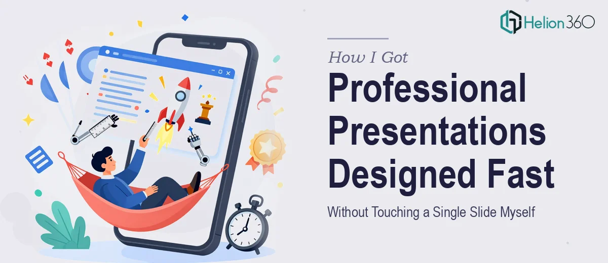
The Clock Was Running and the Stakes Were Real
I had a product launch event coming up in under two weeks. The audience included press, partners, and a room full of people who had seen a hundred of these presentations before. A generic slide deck thrown together from a free template was not going to cut it — not for this moment.
The presentation needed to carry the brand, tell a clear story, and land with the kind of polish that signals the product behind it is serious. Every slide would be visible on a large screen, projected in front of an audience that would form an impression in seconds. The stakes were concrete: if the deck looked rough, the product launch looked rough.
I knew immediately that the presentation design needed to be handled properly, by people who do this work every day. Attempting to cobble something together myself between everything else on my plate wasn't a real option.
What I Found Out a Great Launch Presentation Actually Requires
My first instinct was to understand what doing this well actually involves — not to execute it myself, but to know what I was asking someone to do.
A launch event presentation isn't just a set of slides with bullet points. The visual hierarchy has to guide the audience through a deliberate story arc — opening hook, problem framing, product reveal, proof points, and a closing that lands. Each of those beats requires a different visual treatment.
Beyond structure, the typography, color palette, and layout system all have to work in harmony — and they have to hold up at full screen size, under stage lighting, across dozens of slides. A heading that reads fine at 100% zoom on a laptop can look completely wrong at 1920×1080 projected large.
Then there's the brand application. A launch event is a brand moment. Every design decision — spacing, icon style, image tone, animation timing — either reinforces the brand or quietly undermines it. Getting that right across a 30- to 40-slide deck is not a casual afternoon task.
What the Work to Build This Actually Looks Like
The foundation of a professional launch presentation is narrative architecture — mapping the story before a single slide is touched. The right approach starts with auditing all the source material (product messaging, brand guidelines, talking points), identifying the three to five key audience takeaways, and sequencing the slides so the presentation builds momentum rather than just lists information. A practitioner working through this will typically identify a hard structure: opener (1–2 slides), context/problem (3–4 slides), product story (10–15 slides), proof (4–6 slides), and close (2–3 slides). Skipping this structural work and going straight into slide design produces decks that feel scattered — even when individual slides look attractive. Clients routinely underestimate how long narrative mapping takes to get right.
Once the structure is locked, visual mechanics take over. A well-built presentation master uses a 12-column grid, a strict three-level type hierarchy (typically 40pt headline / 24pt subhead / 16pt body), and a palette limited to four brand colors plus two neutrals. Each slide layout is built from the master so changes propagate cleanly across the deck without manual rework on every slide. The execution friction here is significant: building and maintaining master slides correctly in PowerPoint or Keynote requires fluency with the software that most non-designers don't have. One broken slide master can cause hours of cleanup across 35 slides.
Polish and consistency across the full deck is the third dimension — and the one that separates a presentation that looks designed from one that just looks assembled. This means checking that every text box sits on the grid, that icon weights and styles are uniform, that image treatments (color grading, crop ratios, overlay opacity) are consistent from slide one to slide forty. On a launch deck, this review pass can take as long as the initial build. The edge cases accumulate fast: a logo that resizes incorrectly on one slide, a chart whose axis labels use a different font, a transition that fires at the wrong speed. Each one is small; together they determine whether the deck reads as professional or merely adequate.
Why I Brought Helion360 in to Own the Full Project
Once I understood what the work involved, the decision to engage Helion360 was straightforward. I didn't have the time, and more importantly, this wasn't the kind of work where a partial effort was acceptable. The launch presentation needed to be done completely and correctly the first time.
Helion360 handled the project end-to-end — from narrative structure and slide architecture, through visual design and master slide setup, to the final polish pass. They turned the full deck around quickly, in a fraction of the time it would have taken me to learn the mechanics and execute it myself.
What stood out was that I didn't have to manage individual pieces or stitch together separate workstreams. The structural thinking, the visual design system, and the consistency review all came back as one finished product. Done in days, not weeks — which mattered enormously given the event timeline.
The Result, and What I'd Say to Anyone Looking at This Same Situation
The presentation was on screen at the launch event looking exactly the way a product launch presentation should look — structured, polished, and on brand from the first slide to the last. The audience experienced a clean, confident narrative. Internally, everyone who saw the deck before the event commented that it reflected the quality of the product itself.
The thing I'd tell anyone looking at a similar situation is this: understand what the work actually requires before you decide how to handle it. A launch event presentation isn't a formatting job — it's a narrative architecture, a visual design system, and a consistency discipline all working together across forty slides under real deadline pressure.
If you're looking at those same requirements and a hard event date, Helion360 is the team I'd engage — they handled the full execution fast, and the depth of the work showed in the final product.