

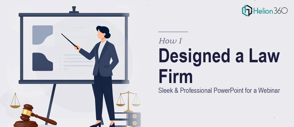
The Brief Was Simple. The Execution Was Not.
When the request landed in my inbox, it read straightforward enough: design a clean, professional PowerPoint presentation for a law firm's upcoming webinar. Packed agenda, multiple topics, clear slides, modern aesthetic. Easy, right?
Not quite.
The moment I started laying out the first few slides, I realized this was a different kind of design challenge. Legal content doesn't lend itself naturally to visual storytelling. Dense text, complex timelines, procedural flows, regulatory references — everything that makes a legal webinar informative also makes it visually difficult to manage.
Where the Design Started Getting Complicated
I'm reasonably comfortable with PowerPoint. I know my way around slide layouts, fonts, and color themes. But professional PPT design for a webinar — especially one with a packed agenda and multiple topic transitions — is a different discipline entirely.
The law firm needed slides that would hold attention on a screen while a speaker walked through nuanced legal concepts. That meant every slide had to do real work: present information clearly, guide the viewer's eye, and keep the tone authoritative without being stiff.
My first drafts felt either too corporate and cold or too casual for the context. The transitions felt abrupt. The text-heavy slides looked like documents, not presentations. I tried a few template approaches, but nothing quite captured the balance of modern design and legal professionalism the client was after.
It was clear that creating a polished, cohesive legal webinar presentation required more than good intentions — it needed dedicated presentation design expertise.
Bringing in the Right Support
After hitting a wall on the visual direction, I came across Helion360. I explained the project — the law firm context, the webinar format, the dense agenda, and the clean aesthetic the client had specifically requested. Their team asked the right questions and understood the challenge immediately.
They took over the design work from that point. What they came back with was exactly what the project needed.
What the Final Presentation Looked Like
The Helion360 team built a slide deck that balanced visual clarity with legal authority. Here's what stood out:
Clean, restrained color palette. Deep navy and white with muted gold accents. Professional without being generic. It felt appropriate for a law firm without looking like a courtroom document.
Typography that worked at scale. Since the presentation was for a webinar, text had to be readable on screen at varying sizes. The font choices were deliberate — clear hierarchy, no clutter.
Smooth topic transitions. One of the original pain points was the jarring shift between agenda items. The final deck used subtle section dividers and consistent slide structure to create a natural flow from one topic to the next.
Visual structure for complex content. Where the content involved processes or sequential steps, the team used clean timelines and icon-based layouts rather than walls of text. Legal information became scannable without losing precision.
Branded consistency. The firm's logo, color identity, and tone were woven through every slide — not as decoration, but as a cohesive design thread.
What I Took Away From This Project
The experience reinforced something I've come to understand more clearly over time: presentation design for specialized industries — law, finance, healthcare — requires more than aesthetic skill. It requires an understanding of how the audience will engage with the content, how the speaker will use the deck, and how each slide functions as part of a larger flow.
I had the content knowledge. I understood what the client needed. But the execution of a full PowerPoint presentation at that level of polish and coherence was a different kind of task — one better handled by a team that does this work every day.
The webinar went smoothly. The client was satisfied with how the slides looked on screen and how well the design held up across the full agenda. The feedback specifically mentioned how professional and easy to follow the deck felt — which was exactly the goal from the beginning.
Need Help With a Complex Presentation?
If you're working on a presentation that needs to look polished and communicate clearly — and you're finding the design side harder than expected — Helion360 is worth reaching out to. Their team steps in when the work gets too detailed or time-consuming to handle alone, and they deliver without the back-and-forth. If you're curious what that looks like under pressure, see how a startup business proposal came together under tight deadlines.