

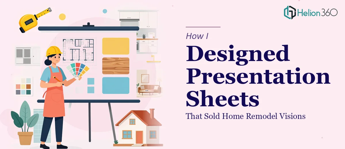
The Problem With Pitching a Remodel Without the Right Visuals
I was working with a home remodeling company that had strong project portfolios, solid contractors, and genuinely competitive pricing. The problem was simple but consequential: when they sat down with a homeowner to pitch a kitchen or bathroom transformation, they had nothing polished to show. A few printed photos, maybe a rough cost estimate on a plain document. Nothing that communicated the full vision of what the finished space would look like or why this team was the right one to trust with a six-figure renovation.
The stakes were real. These weren't impulse purchases. Homeowners were being asked to make major financial decisions based on a conversation and whatever materials landed in front of them. A well-designed presentation sheet — something that laid out the concept, the scope, the materials, and the outcome — could be the difference between a signed contract and a polite "we'll think about it." I knew immediately that this needed to be handled properly, not patched together overnight.
What I Found This Kind of Work Actually Requires
Before doing anything, I looked hard at what a genuinely effective remodel sales presentation sheet actually involves. The short answer: far more than most people expect.
The first thing that became clear was that the content architecture matters as much as the visuals. A homeowner needs to understand the before state, the proposed transformation, the materials and finishes, the timeline, and the investment — all in a logical flow that builds confidence rather than confusion. Getting that narrative sequence right is not a default outcome; it requires deliberate planning.
The second signal was visual complexity. Remodeling presentations live or die on the quality of the imagery, layout precision, and typographic hierarchy. A cluttered sheet with mismatched fonts and inconsistent spacing doesn't just look unprofessional — it actively undermines trust in the contractor's attention to detail. That's a direct hit to the sales conversation.
The third was brand consistency across multiple sheet types — a kitchen version, a bathroom version, an outdoor living version. Each needed to feel like part of a unified system, not a patchwork of separate documents.
What the Work Actually Involves
The foundation of any strong remodel presentation sheet is structural — mapping the story from problem to solution across a single designed surface. The right approach starts with auditing what the sales conversation actually covers: the homeowner's pain point, the proposed scope, key material callouts, and the investment summary. Done well, that narrative arc occupies distinct visual zones on the sheet, each anchored to a clear heading hierarchy — typically a 28pt project title, 18pt section labels, and 12pt supporting copy — so the eye moves naturally without the homeowner needing to hunt for information. Getting this architecture right before touching any design tool is what separates a sheet that guides a buyer from one that overwhelms them.
Visual mechanics are where the work gets technically demanding. A remodel sales sheet typically relies on a 12-column grid to manage the balance between imagery and text columns, with full-bleed photography scaled to a minimum of 300 DPI for print fidelity. The layout must handle before-and-after image pairings, material swatches, and a cost summary block — all without visual competition. Typography choices need to reinforce the brand's positioning: clean sans-serif for a modern feel, a grounded serif for a premium traditional aesthetic. These decisions propagate across every variant of the sheet, and a misstep in the master template means correcting it across the entire system. That kind of grid and type discipline takes real experience to execute without constant revision cycles.
Polish and consistency across the full sheet family is where most in-house attempts break down. A remodeling company might need five to eight distinct project-type sheets, all sharing a palette capped at four brand colors with defined usage rules — a primary, a secondary, a neutral background, and an accent used sparingly for calls-to-action. Every margin, every image frame, every icon style needs to be identical across the set. Even a small inconsistency — a slightly different button radius, a misaligned footer — reads as carelessness to a discerning homeowner. Applying that level of consistency manually, without a properly configured master style system, is the single biggest time sink in this kind of project.
Why I Brought in Helion360 to Handle It
Once I understood what this actually involved — the narrative architecture, the grid discipline, the cross-sheet consistency — it was obvious that attempting to build this system internally wasn't the right call. The learning curve alone on master template configuration would have consumed more time than the project could afford, and the sales team needed these materials quickly.
Helion360 handled the full project end-to-end. That meant going from a brief and raw project photography to a complete, print-ready sheet system — covering the content architecture, the visual design, the typography system, and the consistency pass across all variants. They turned the whole thing around in days, not weeks. The team already had the tooling, the template infrastructure, and the design judgment built in. There was no onboarding curve, no back-and-forth on basics — just a capable team that does this work every day, delivering fast.
The Result and What I'd Tell Anyone Looking at the Same Problem
The finished presentation sheets changed the sales dynamic immediately. Homeowners who previously needed multiple follow-up conversations to commit were engaging more decisively in the first meeting. The materials communicated competence before a single word was spoken — the layout, the photography treatment, the clear investment summary all signaled that this was a company that took their craft seriously.
The system also scaled. Adding a new project type meant applying an established template rather than starting over, which meant the investment kept paying off over time. The sales team had something they were genuinely proud to hand across a kitchen table.
If you're looking at a similar problem — sales materials that need to carry real weight in a high-stakes buying conversation — and you want it handled end-to-end without weeks of trial and error, Helion360 is the team I'd engage. They delivered for me fast, with the kind of execution depth this work genuinely requires.